
Leaderboard



Popular Content
Showing content with the highest reputation on 07/20/26 in all areas
-
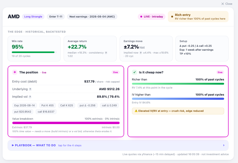
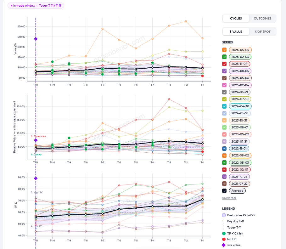
Update — at the open Markets opened, and here's AMD live: the strangle re-priced from $38.69 to $37.79, AMD gapped up to $512, and entry IV eased from ~87% to 84.6%. Marginally cheaper — but the verdict didn't budge: still "Rich entry," still richer than 100% of past cycles, still flagged for crush risk. On the charts, the live-value diamonds sit at the very top of every panel — value, relative value, and IV. Translation: the setup got a little bit cheaper, not cheap. It never dropped into its normal P25–P75 band, so the disciplined read is unchanged. Personnally I would pass, and let the backtest stay a backtest for this cycle. That's the tool doing its job: a 95% historical win rate is only worth having if you don't overpay to get in, from my POV. Romuald - OptionBench
 1 point
 -
@Romuald these revisions are a great step forward keep them coming1 point
-
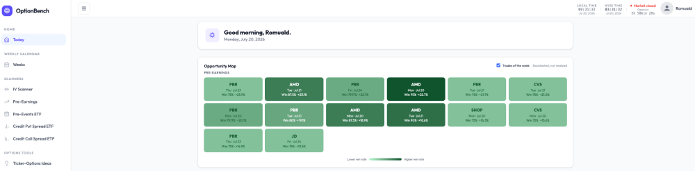
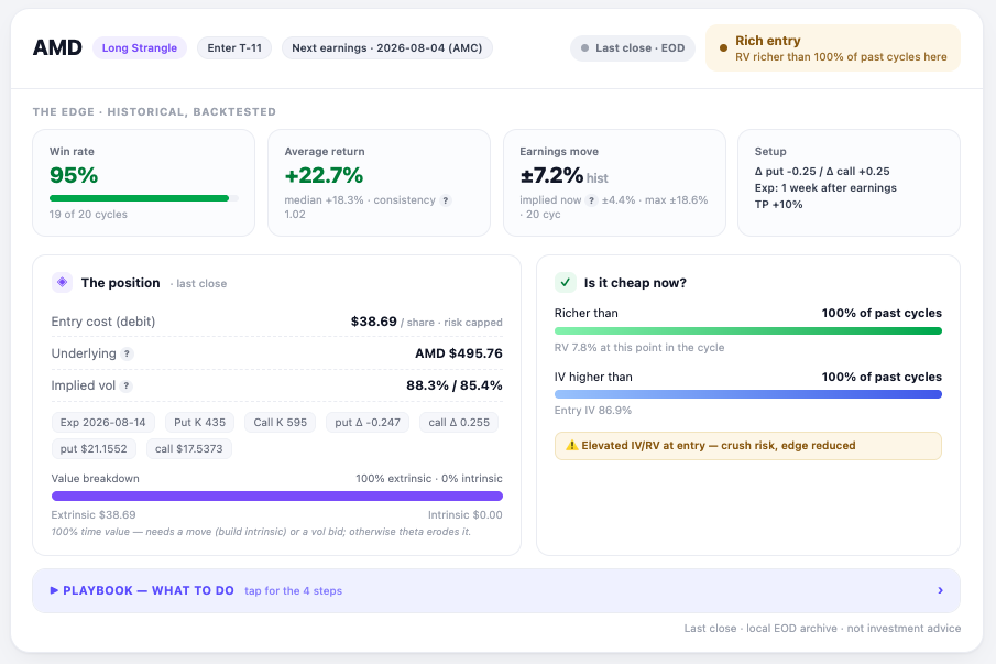
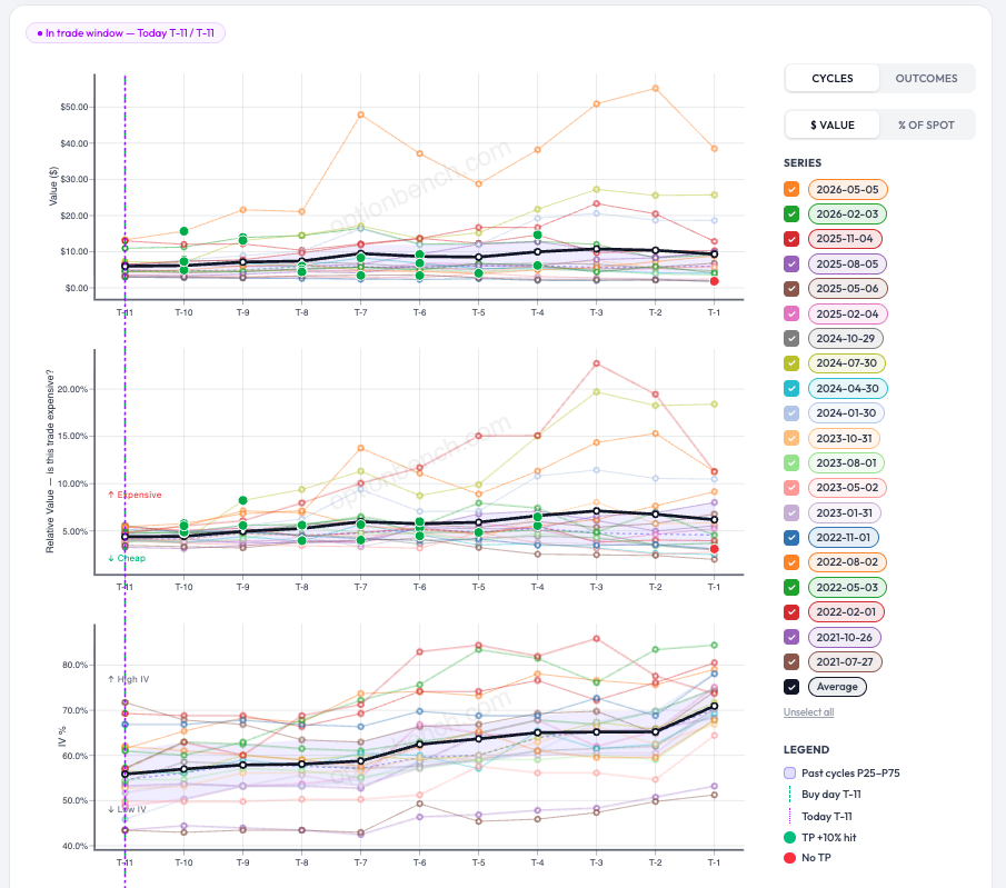
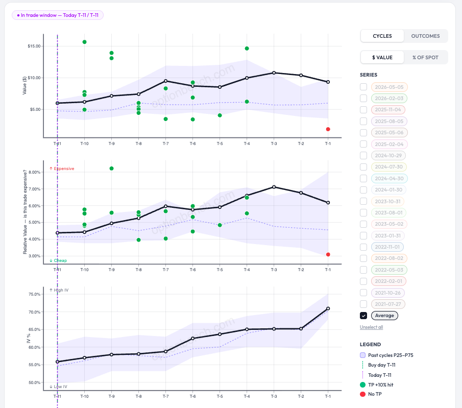
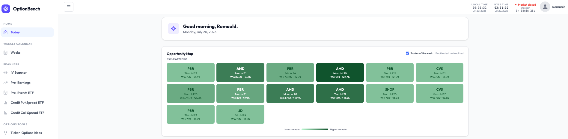
From a Green Tile to a Trade Decision: Inside OptionBench's Pre-Earnings Workflow Most screeners hand you a list. OptionBench hands you a decision — and then argues with you about it. Here's how that works, walking through a real setup on AMD. Start on the map The Today page opens on an Opportunity Map: where you can see one tile per backtested pre-earnings setup for the current week (or week ahead it it is the week-e,d). Each tile carries the ticker, the entry day, and two numbers: historical win rate and average return. The colour encodes the win rate: the darker the green, the more often the setup has worked across past earnings cycles. A "Trades of the week" toggle narrows the grid to the days just ahead, and the caption never lets you forget the key caveat: backtested, not realized. The darkest tile in this view is AMD — Mon, Jul 20 — Win 95% · +22.7%. Tempting. So we click it. One click into the analysis Clicking a tile doesn't dump you at the top of a table, it drops you straight onto that exact row in the scanner, ticker already in focus. For AMD, the setup is a long strangle entered eleven business days before the Aug 4 report and exited the latest about a week after, with a +10% take-profit. The top strip is the historical, backtested edge: a 95% win rate (19 of 20 cycles), a +22.7% average return, a +18.3% median, and a typical earnings move of ±7.2% versus ±4.4% implied today. On the backtest alone, this looks like one of the strongest setups on the board. The part that keeps you honest Here's where OptionBench stops cheerleading. The right-hand verdict reads "Rich entry — RV richer than 100% of past cycles here," and the cheapness panel flags elevated IV/RV at entry — crush risk, edge reduced. In plain terms: the strangle is currently more expensive than at any comparable point in its own history, so buying it now would mean overpaying for volatility, exactly how a great backtest quietly turns into a mediocre fill. One more detail to notice: the badge says "Last close · EOD." Markets are closed right now — it's Monday morning (in France), and the NYSE opens in about six hours — so every live number on the page is the last end-of-day snapshot, not a tradeable quote. The rich-entry read is real, but it's a photograph from Friday's close. The right move isn't to trade it. It's to wait for the open and see whether the morning re-prices the strangle cheaper, or confirms it's still rich. Reading the cycle charts To judge that, we drop into the cycle charts (next Figure). Three stacked panels track the trade from T-11 to T-1 (business days before earnings): the strangle's dollar value, its relative value (RV% — "is this trade expensive?"), and its implied volatility. Every faint line is one past earnings cycle; the bold black line is the average; green dots mark the cycles that hit the +10% target, red dots the ones that didn't. It's a lot to take in at once — so a single click ("unselect all," keep Average) strips it down to the essentials: the average path, the outcome dots, and a shaded band. What the shaded band means That band is the P25–P75 range — the middle 50% of past cycles at each point in the run-up. At every T-x day, we take all the historical cycles and shade from the 25th percentile up to the 75th; the dotted line running through it is the median (P50). Think of it as the setup's normal range. When today's live reading sits inside the band, the trade is priced about as usual; below it, cheaper than history; above it, richer than history. To be continued — at the open So AMD is a beautiful backtest with a currently rich entry, frozen at Friday's close. The interesting moment is only a few hours away: when the market opens, we'll watch whether the strangle cheapens back down into its normal band — and only then decide whether it's worth putting on. That's the whole idea. The map surfaces the opportunity; the analysis tells you whether today is a good day to take it. The discipline is in the gap between the two. See you at the open. Romuald - OptionBench Backtested results are historical and are not realized returns. Nothing here is investment advice. Figures: (1) Today — Opportunity Map · (2) AMD analysis header · (3) Full cycle charts · (4) Simplified view with the P25–P75 band.
 1 point
This leaderboard is set to New York/GMT-04:00