
Leaderboard



Popular Content
Showing content with the highest reputation since 09/20/26 in all areas
-
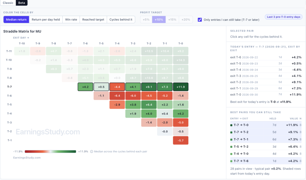
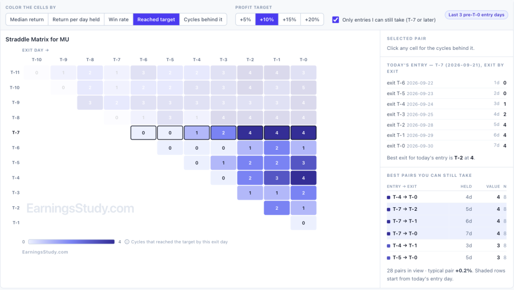
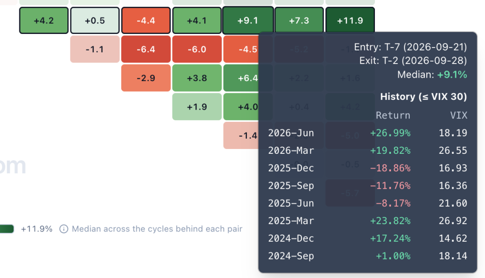
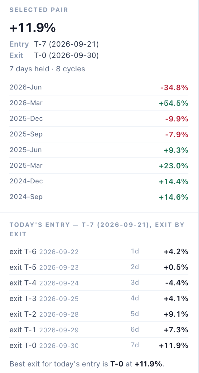
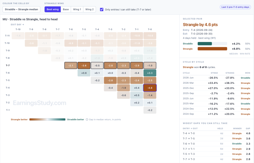
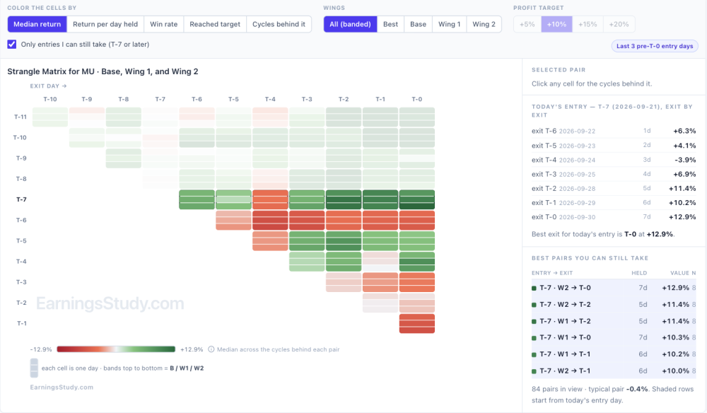
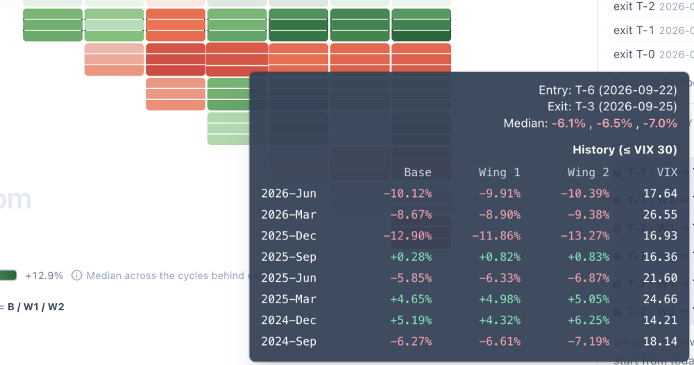
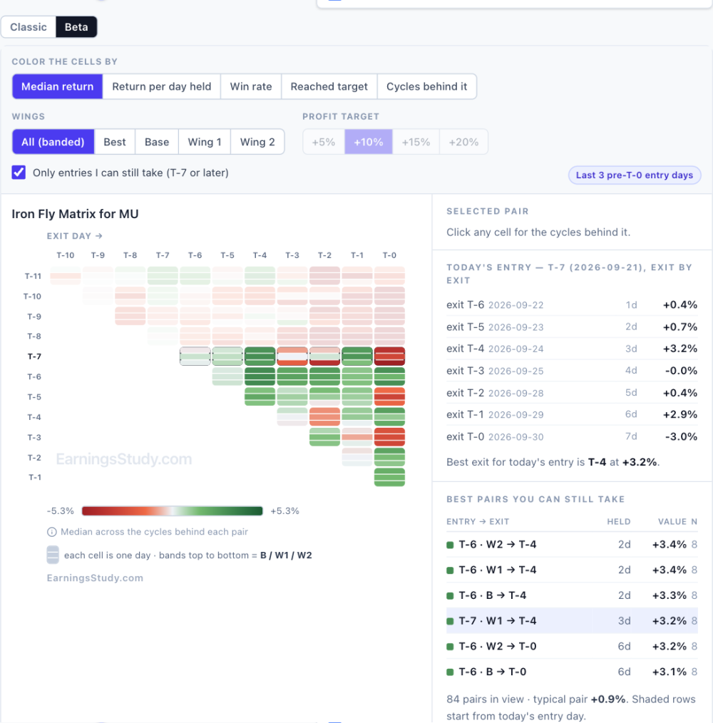
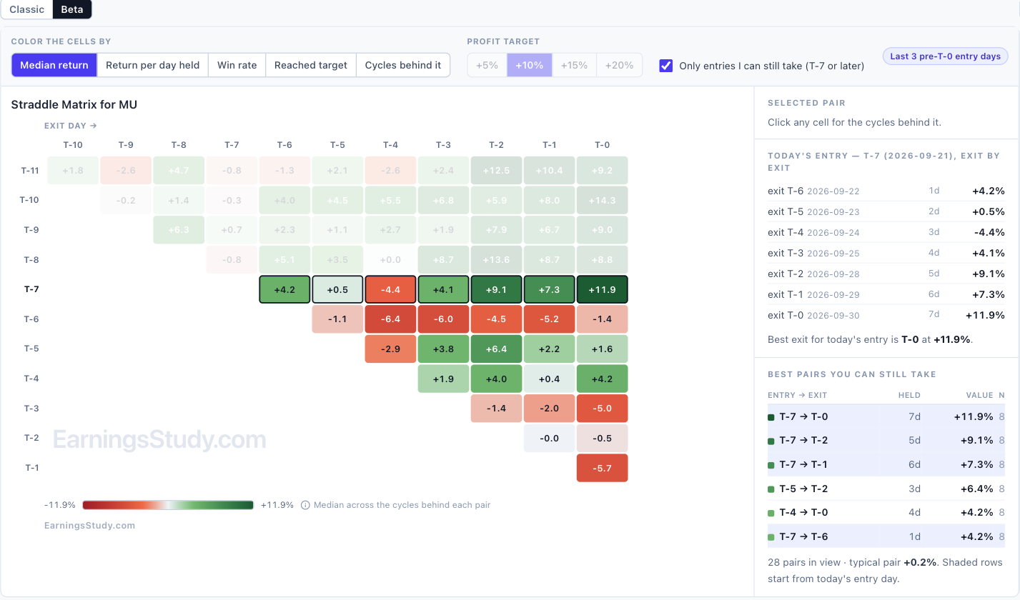
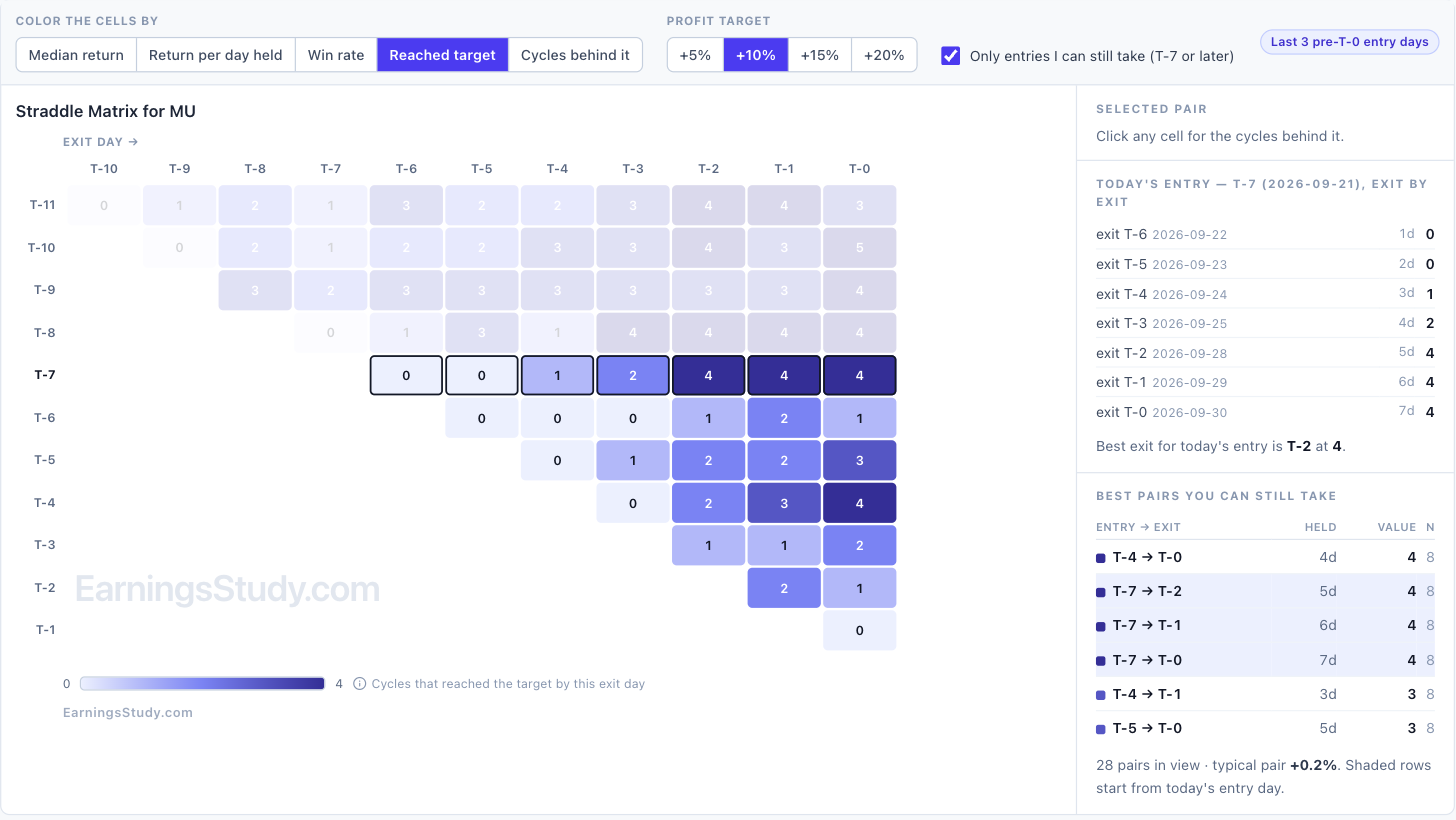
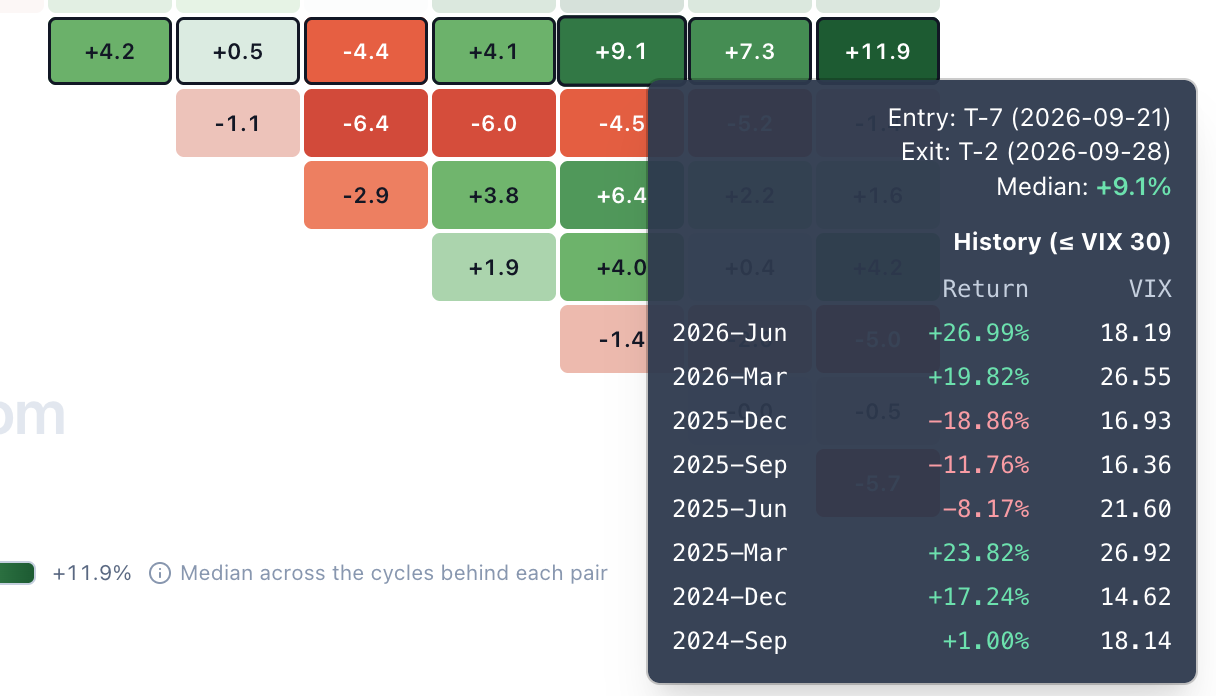
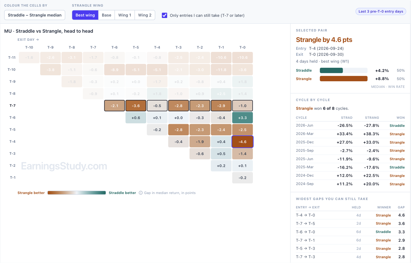
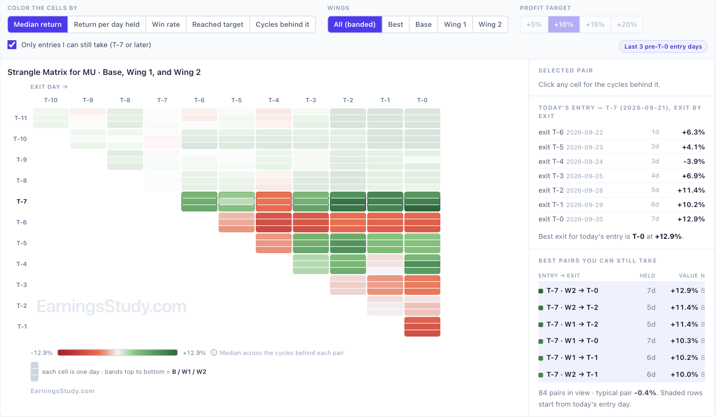
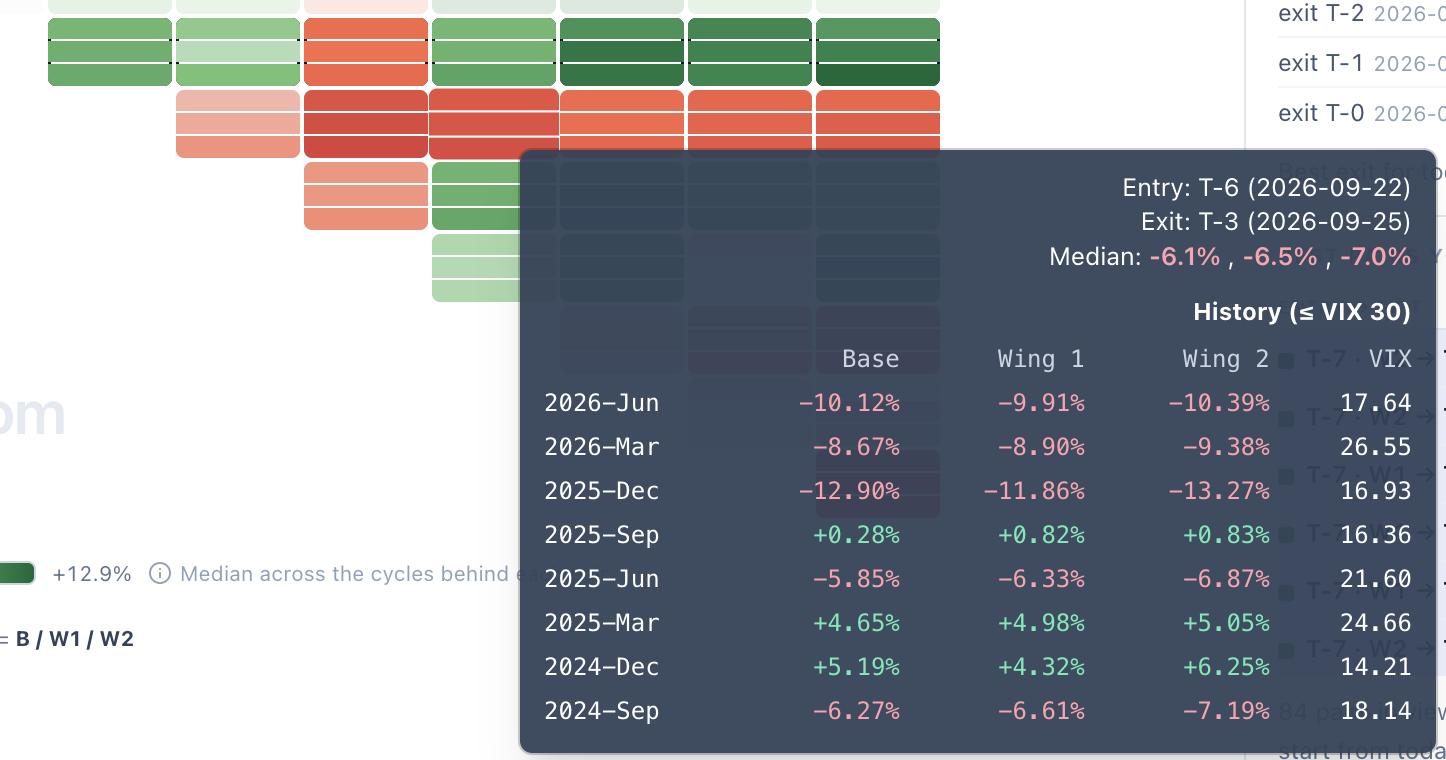
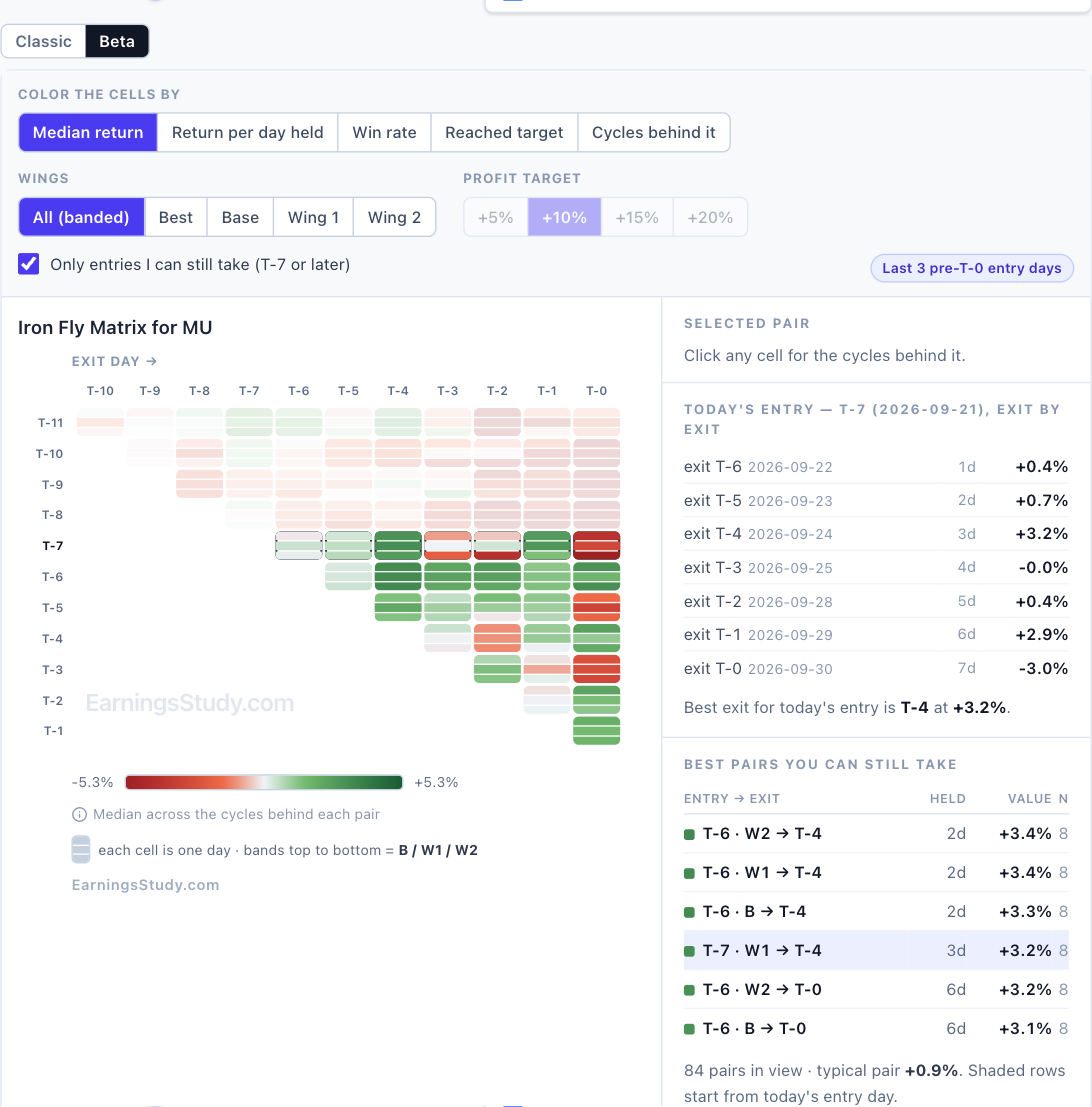
One grid, five questions — the new return matrix (Beta) The return matrix has always answered one question: what does the median cycle pay for every entry/exit pair? That is a good question. It is not the only one worth asking, and the same grid can answer the others without changing shape. The Beta matrix lets you change what the color means. Same entry × exit triangle, same history behind it, five different questions. It is live on every pre-earnings strategy page: Calendar, Straddle, Strangle, Iron Fly, Double Diagonal, Long Options, Call Debit Spread, etc., Screenshot 1 — MU straddle, colored by median return. Today’s entry, T-7, is the boxed row. The five questions Color the cells by The question it answers Median return What does a typical cycle pay? This is the Classic view. Return per day held Which pairs pay fastest? Median return divided by days held, so a two-day hold and a seven-day hold are compared on equal terms. Win rate How often did the pair finish positive at all? Reached target How many cycles reached +5%, +10%, +15% or +20% by that exit day? Cycles behind it How much history is each number actually built on? Reached target is the one I would look at first. Screenshot 2 — Same grid, now counting cycles that reached +10% by each exit day. On MU, a T-7 straddle reached +10% in 4 of 8 cycles by T-2 — and holding on to T-0 added no new ones. Those last two days bought more exposure, not more hits. The median view cannot tell you that; this one says it in a glance. The rows you can actually trade Half the triangle is entry days that have already passed. Only entries I can still take is on by default and fades them, so the ranking on the right lists only trades you can still put on today. It also makes the grid easier to read honestly. Look at the T-6 row in screenshot 1: one day later than today’s T-7 entry, the same straddle is red across the board. Every number opens up A median over eight cycles hides a lot. Hover any cell and you get every cycle behind it with the VIX that ruled it — gains in green, losses in red. Click it and the side panel pins the cycle list, with the actual calendar dates of your entry and exit. Screenshot 3 — Hover a cell: every cycle, its return and its VIX. Screenshot 4 — Click a cell: the side panel pins it, with real entry and exit dates. That is the honest read on MU’s best pair. T-7 → T-0 has a +11.9% median, but the individual cycles ran from −34.8% to +54.5%, and five of the eight were winners. A real edge with wide dispersion — size accordingly. Straddle vs Strangle, head to head Two matrices side by side ask you to subtract two colour scales in your head — and they were never on the same scale. In Beta, Compare with Strangle draws one grid instead: each cell is Straddle minus Strangle, teal where the straddle wins and amber where the strangle does. Click a cell for the cycle-by-cycle scorecard. Screenshot 5 — MU, T-4 → T-0: the strangle leads by 4.6 points (+8.8% against +4.2%) and won 6 of 8 cycles. The scorecard is the part two separate grids can never show. A small median edge that came from one lucky cycle looks identical to one that held up in six of eight — until you count them. It works the other way round from the Strangle page, and the wing selector lets you compare against a specific wing or the best one. Three wings, one row Strangle, Iron Fly and Double Diagonal each have three wings, which used to mean three rows per entry day and a matrix three times taller than the rest. Beta folds them into one row: each cell is split into three bands — Base, Wing 1 and Wing 2 from top to bottom. A third of the height, all three wings visible at once. Pick a single wing, or Best, and the numbers come back into the cells. Screenshot 6 — MU strangle: one row per entry day, one band per wing. Hover a banded cell and the three wings line up cycle by cycle: Screenshot 7 — MU strangle, T-6 → T-3: every wing lost in the same five cycles. When all three wings agree like that, the wing is not the problem — the timing is. Screenshot 8 — The same banded view on Iron Fly. Double Diagonal work the same way. How to turn it on Open any pre-earnings strategy page and load a symbol. Above the History Matrix, click Beta. Classic is one click away, and your choice is remembered. The VIX filter, earnings cycles and “3 days before current day” settings all carry over. It is labelled Beta because I want your feedback before it replaces anything. Tell me which view you end up using — and which question you wish the grid could answer that it cannot yet.
 3 points
 -
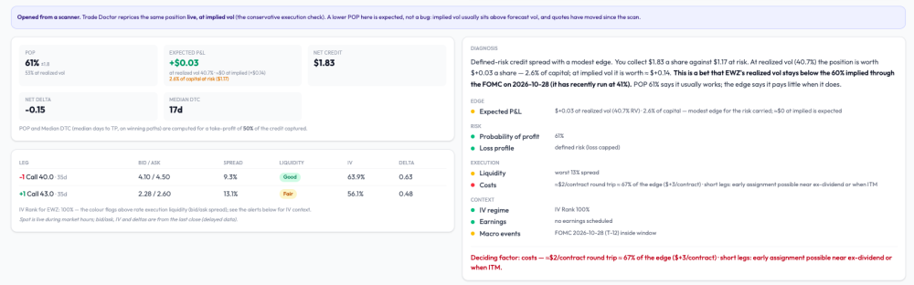
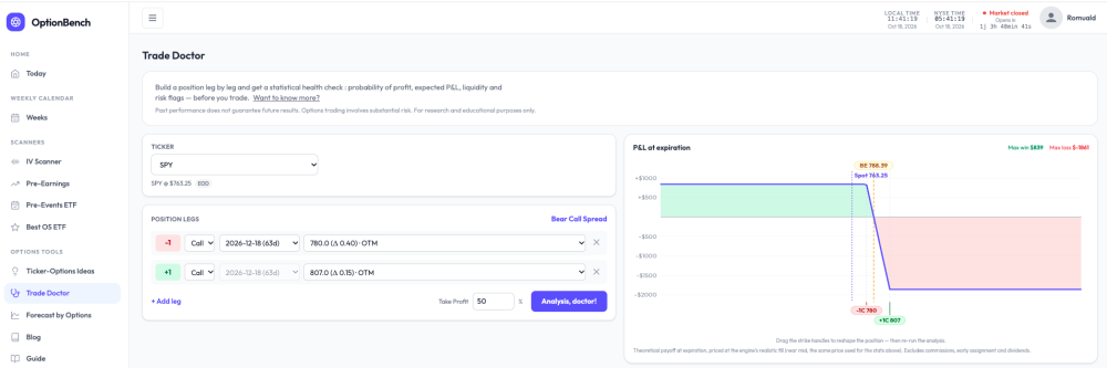
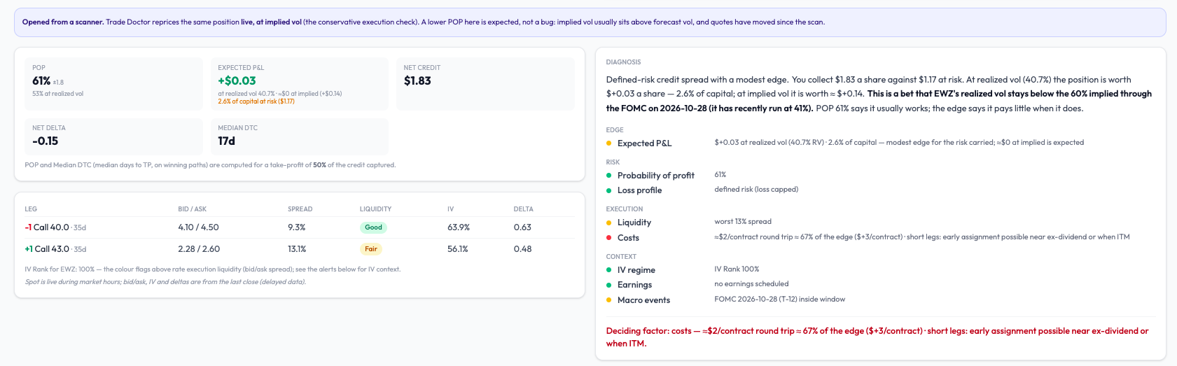
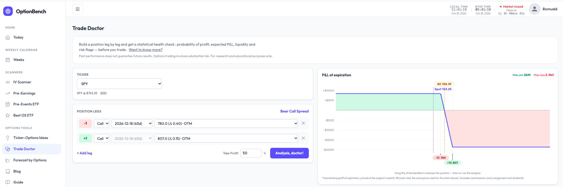
What are you actually betting on? A small change to how Trade Doctor reads a position. Every options tool shows a POP. Almost none tells you what the bet is. A bear call spread on SPY with POP 81% reads like a good trade — until you ask what has to be true for it to pay, and what it pays when it does. I rebuilt the diagnosis block of OptionBench’s Trade Doctor around that question. It now opens with a plain-language reading, computed, not written by a model. For that SPY spread (−780/+807 calls, Dec 18): Defined-risk credit spread with a modest edge. You collect $8.39 a share against $18.61 at risk. At realized vol (10.1%) the position is worth +$0.69 a share — 3.7% of capital; at implied vol it is worth ≈ $0. This is a bet that SPY’s realized vol stays below the 12% implied through the FOMC on Oct 28 (it has recently run at 10%). POP 81% says it usually works; the edge says it pays little when it does. Then four questions — edge, risk, execution, context — one finding per line, one number per finding, all in the same convention. And one last line naming what weighs most: Deciding factor: the edge — +$0.69 a share at realized vol, 3.7% of capital. A rise in realized vol toward implied erases it. No verdict. The tool doesn’t say take it or pass. It says what the bet is, where it’s thin, and what would break it — the three things you need to decide for yourself, in the order you need them. On an EWZ spread it wrote “Deciding factor: costs — a $3/contract edge against ≈$2 of commissions; little is left after the broker.” That sentence has saved a few of us from a few trades. The point isn’t the SPY spread. It’s that “81% POP” and “pays little when it works” are both true of the same position, and most screens only show you the first one. Romuald - OptionBench
 2 points
 -
We are doing another round of research on traders' views around psychology. The survey is now live: https://www.surveymonkey.com/r/steadyoptions2 points
-
Not sure if it helps to community but Schwab and ThinkOrSwim seems to be experiencing outages of completely not letting users login nor do transactions once logged in (website seems to allow login). Seems to be consistent with DownDetector dot com reports...2 points
-
Thank you, and that’s a fair ask. Two things on it. Self-reported results are the wrong instrument for a win rate: people report wins more readily than losses, and twenty fills from five people can’t move a figure built on hundreds of cycles. What subscriber fills can teach, and what the backtest can’t, is execution: the gap between the card’s mid ±0.5% and what the market actually gave. That gap is the whole game on thin names (LEVI two weeks ago), and it is invisible from the data side. So here’s what I’d suggest instead: post your fills here (ticker, structure, entry date and debit, exit date and credit) and I’ll line each one up against what the card assumed on that day. Over a quarter that gives us something no backtest has: a measured slippage per name. The win rate itself I’ll keep measuring the only way that holds up, on the full history, and publishing with the sample size next to it.1 point
-
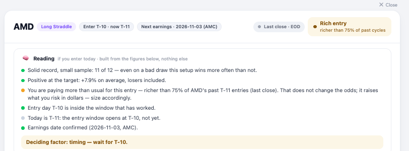
“Reload cheapness” was pricing the first eight tiles of the map and stopping there: each tile is a live chain fetch, so the cap was deliberate, but nothing on the page said so, and a blank tile reads as “no data”. As of today it prices every pre-earnings tile, three at a time, with a counter so you can see it working. Until ~9:45 ET it’s Friday’s close for all of them; after that, live. One more thing you’ll see on each card now: a short “Reading” block under the header (record, return at the target, entry cost, entry day, date, liquidity) and one deciding line. On AMD this morning it says exactly what you’d expect: solid record, richer than usual entry, nothing wrong with the setup, size for the price.
 1 point
 -
@Romuald The new opportunity map is great! Cant wait to test it!! May be you can ask subscribers to inform you of their results, with some details so that you can estimate the win rate and what the subscribers did right & what they need to be cautious about.1 point
-
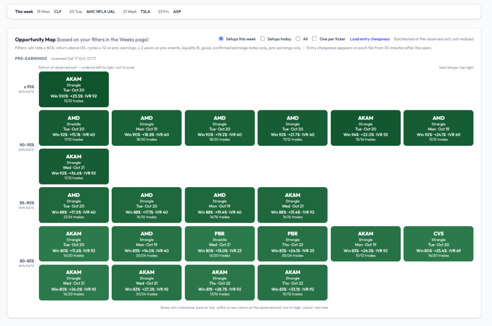
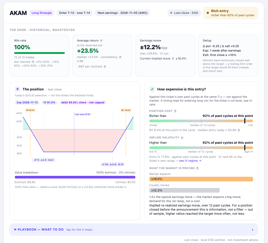
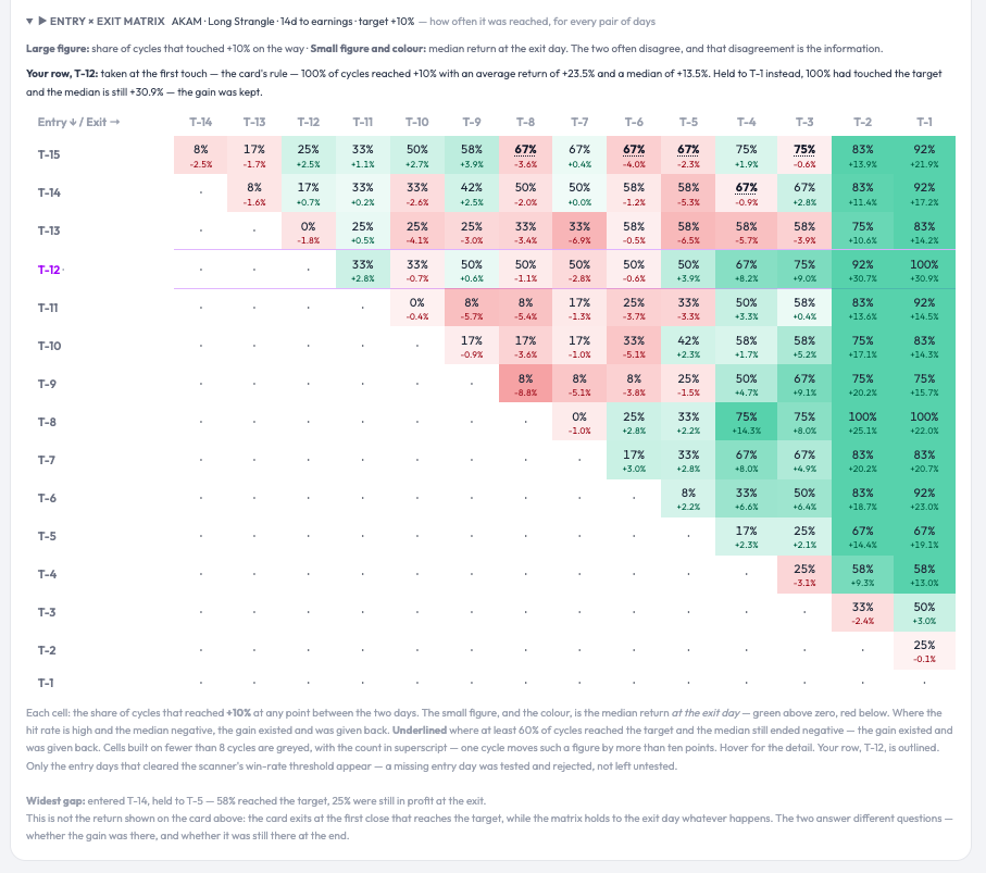
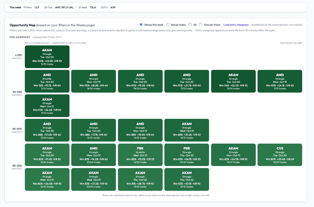
A good-looking pre-earnings week — on paper. The entry will decide. Next week’s scanner is unusually rich in pre-earnings setups with long, clean records: AMD (reports Nov 3, confirmed), AKAM (Nov 5, confirmed), CVS (Nov 4, confirmed), PBR (Nov 10, confirmed). Screenshot below, filtered to confirmed announcement dates only, win rate ≥ 80 %, at least 12 cycles, liquidity B or better. Two things changed in how the grid reads on optionbench, and I’d rather explain them than let you guess. The layout is now an X-Y ranking. Rows are win-rate bands, best on top (≥ 95 %, 90-95 %, 85-90 %, 80-85 %). Within a row, tiles are ordered left to right by return at the observed exit, low to high: ordered, not to scale. So the best setups sit top right, and a tile’s position tells you two things at once without reading it. Colour still encodes win rate. Every tile shows the sample as a fraction (12/12, 18/20) next to the percentage, because 100 % on 12 is not the same evidence as 90 % on 20. The return is “at the observed exit.” That’s the close of the day the position first crossed +10 %, which overshoots the target: AKAM’s +23.5 % average comes with a +13.5 % median. A resting limit at +10 % books less. Both figures are on the card. Now the part that matters. AKAM at T-12 is the strongest line of the week: 12 of 12 cycles reached +10 %, and the entry×exit matrix shows the gain was still there at T-1 in 100 % of them (median +30.9 % held: unusual; on most names the gain exists and has to be taken). Yet today the same card reads Rich entry - richer than 92 % of past cycles at this point, IV higher than 92 % of them, implied move 18 % against a 12 % realised average. The historical record says the setup works; the gauge says Friday’s close was a poor moment to pay for it. Both are true, and the gauge is the one that has been monotonic out of sample: the richer the entry, the worse the outcome, at every level. So the week is promising and no tile is a trade. On each entry day, after the first half hour, the live gauge on the card decides — cheaper than the median, or pass. Click any tile and you get the full card: the historical edge, the live position with its gauges, the playbook (what to do, in four steps), and the entry×exit matrix that shows, for every pair of entry and exit days, how often +10 % was touched and what the median return was if held — the two numbers that usually disagree, and that disagreement is the point. One correction on labelling, since someone will check: when a date shows “estimated”, it means our calendar source has not published a report time yet — the company may well have announced it. The screenshot excludes those on purpose. Romuald - OptionBench.com
 1 point
 -
An OptionBench member asked me whether “rich” pre-earnings vol means we should be selling it. Worth answering in public, because the premise is where most people trip. “Rich” on our gauge is relative: the straddle today versus that same name’s past cycles at the same distance from earnings. It says nothing about absolute vol; and absolute vol is low right now (SPY sits at IV rank 13). Selling index premium here collects little for the same risk. Our structure scanner (it sweeps straddles, strangles, condors, butterflies, debit and credit spreads on 26 ETFs and ranks them by expected value over risk at realized vol) built a SPY bear call spread on Friday and rejected it at 2.4% EV/risk: under the 3% we treat as the friction floor. Selling vol isn’t missing from the toolbox; the toolbox is saying it doesn’t pay this week. Selling single-name vol into earnings because the straddle is rich is a different trade: short gamma into a gap. We backtested that family this summer. The seller’s edge holds as long as nothing moves and collapses on the moves above 10%: a 75% win rate with the losses doing all the work. Not something I’d publish with a win rate attached. What does make sense in a rich regime is what the member actually did: he passed. Entry richness is the strongest single predictor we’ve measured on 95,000 pre-earnings cycles, and it’s monotonic — the richer the entry, the worse the outcome, at every level. Waiting is a position.1 point
-
Please take a look: https://steadyoptions.com/forums/forum/topic/51-email-notifications/?page=4#findComment-216778 It's always worth to enable notifications and/or follow the contributors. Also it is better to post in the members forum and not the public forum.1 point



This leaderboard is set to New York/GMT-04:00