Leaderboard


Popular Content
Showing content with the highest reputation on 03/28/19 in all areas
-
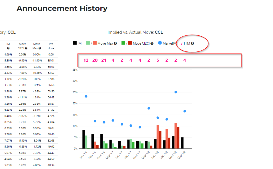
In the Historical Earnings Announcement section I have added a bar chart to compare the implied against the actual earnings move (intraday in lighter color, and at day end in stronger color graphically, and for a longer history in a table). The blue dots represent VIX values, should help to see in one glance how the overall market IV may have influenced the implied move. The pink numbers represent the remaining life of the options used to calculate the implied move at the time of the earnings announcement (TTM = time to maturity. If the TTM is further out, the implied move (IM) might be inflated). So in the CCL example, you see in the top table that weekly options started trading in February 2017, which corresponds with the longer TTM values prior to 2017-03 in the chart above. The pink numbers have caused some confusion, and I agree one needs to get used to it. I tried to add a '?' with tooltips everywhere. But if you still have a better idea please let me know.
 1 point
 -
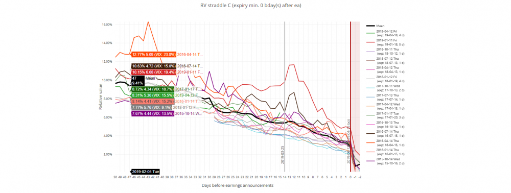
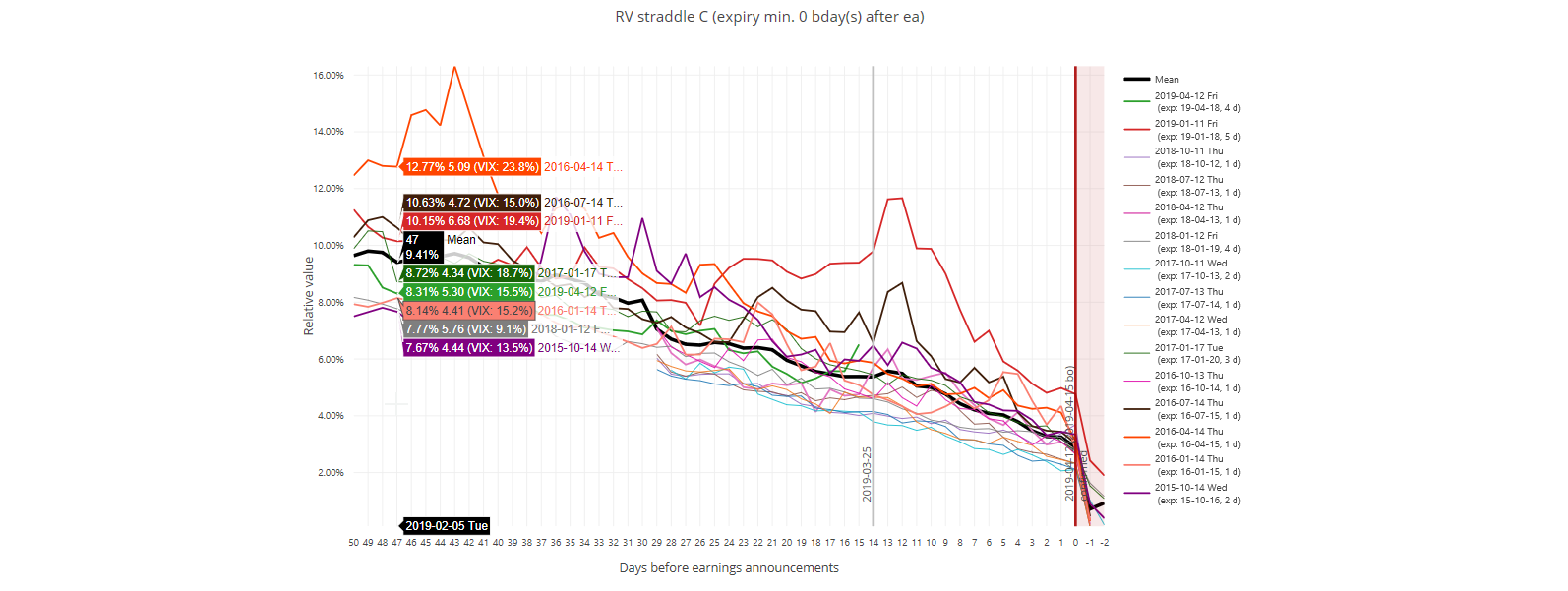
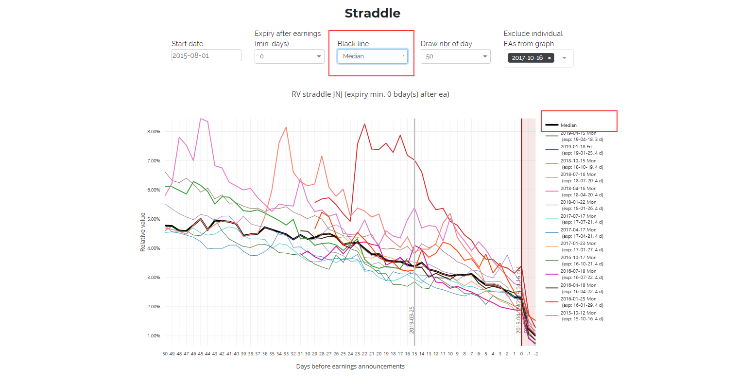
Two more things on RV charts: Line Thickness depending on Market IV To get a better feeling for the actual line with regard to the market IV regime in comparison to other cylces, the line thickness on the RV chart now corresponds to the market IV during the respective cycle (while each day's exact VIX value is contained in the hover legend): The line thickness is currently determined as follows: 0% - 14% VIX -> 1 pt. 14% - 23% VIX -> 2 pt. 23% - 30% VIX -> 3 pt. >30% -> 4pt. Possibly other values make more sense. Let me know - it can be changed easily. Line thickness can easily be overlooked if you are not aware of it (thanks @ales19 for pointing it out). Mean and Median On every RV chart it is possible now to chose between the mean (as we had it before) and the median value as the average for the black line. Both will respect the excluded cycles from the dropdown (the average will recalculate when you add or delete a cycle in the dropdown, but not when you 'only' click on it in the legend)

 1 point
 -
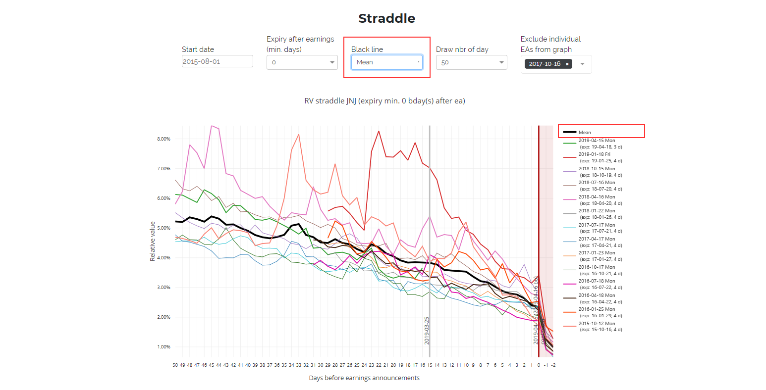
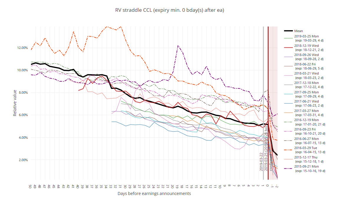
A few improvements I tried to do on RV charts: When there are (or were in earlier times) no weekly options available, the next monthly expiry used in RV calculation we know can be further out than one week. Further out options have higher intrinsic value, leading to higher RV which can suggest that your (weekly) straddle candidate is a bargain when in fact it is not. Therefore, such 'further out' straddles are now plotted using dotted lines to indicate that their maturity is longer out than what is selected in the dropdown:
 1 point
This leaderboard is set to New York/GMT-04:00