
Leaderboard




Popular Content
Showing content with the highest reputation since 09/24/26 in all areas
-
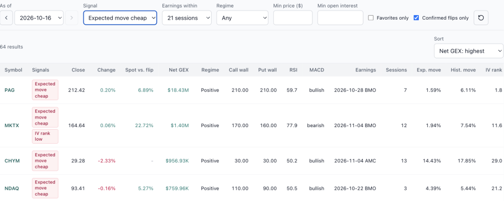
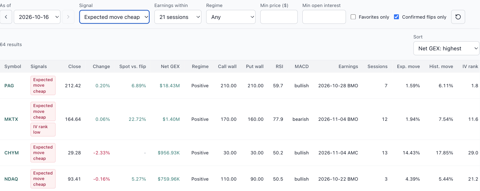
Coming soon: Market Structure, a nightly scan of every optionable stock The GEX page answers questions about one symbol at a time. The next release, Market Structure, asks the same questions of every optionable stock at once, every evening, from EOD data. It isn't open yet, but it's far enough along that I want to show you what it does and hear what you'd want from it. On Oct 16's data it scanned 5,991 symbols and counted what stood out, in three groups: Positioning: stocks whose net gamma flipped positive or negative, plus call wall and put wall moves. Momentum: RSI overbought and oversold, MACD crosses, and Bollinger Band squeezes and breaks. Earnings pricing: expected moves priced richer or cheaper than the stock's own history, reports the options haven't priced in yet, and IV rank high or low. Market Structure preview, EOD Oct 16. Each count opens the list behind it. Here's the one I expect earnings traders to use most: expected move cheap, for stocks reporting within the next 21 sessions. It found 64. Compare the Exp. move column (what the options price in for the report) with Hist. move (what the stock actually did in past cycles). NDAQ, reporting Oct 22, priced 4.39% against a 5.44% history. CHYM priced 14.43% against 17.85%. These are examples, not picks. Expected move cheap, earnings within 21 sessions, EOD Oct 16. A scan like this needs judgment as well as signals. PAG shows 1.59% priced against 6.11% historical. A gap that large usually means thin options rather than a bargain, which is why the list has minimum price and open interest filters, and why you'd still check the spread cost on the Summary page before believing it. I'm finishing it now and will post here when it opens. If there's a signal you'd want in the scan, send it through the Ask button in the top bar while it's still easy to add. Educational research only, not trade advice.

 2 points
 -
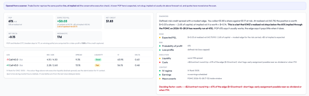
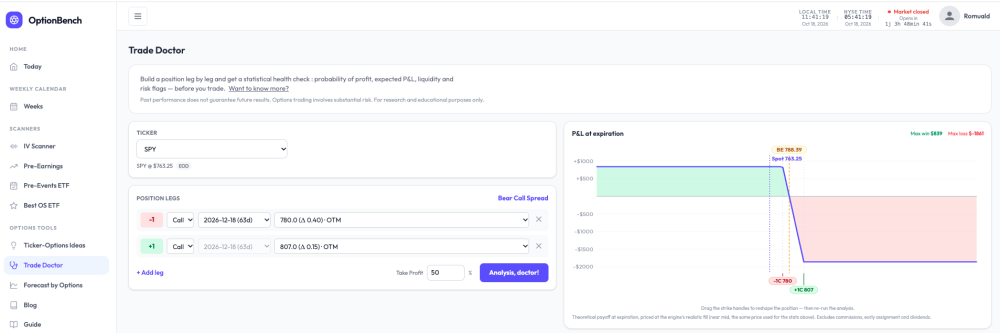
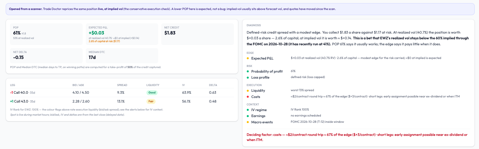
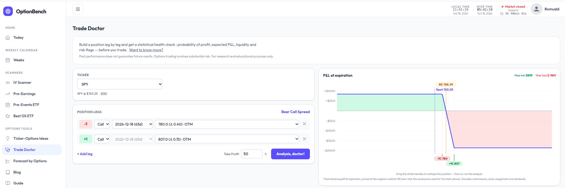
What are you actually betting on? A small change to how Trade Doctor reads a position. Every options tool shows a POP. Almost none tells you what the bet is. A bear call spread on SPY with POP 81% reads like a good trade — until you ask what has to be true for it to pay, and what it pays when it does. I rebuilt the diagnosis block of OptionBench’s Trade Doctor around that question. It now opens with a plain-language reading, computed, not written by a model. For that SPY spread (−780/+807 calls, Dec 18): Defined-risk credit spread with a modest edge. You collect $8.39 a share against $18.61 at risk. At realized vol (10.1%) the position is worth +$0.69 a share — 3.7% of capital; at implied vol it is worth ≈ $0. This is a bet that SPY’s realized vol stays below the 12% implied through the FOMC on Oct 28 (it has recently run at 10%). POP 81% says it usually works; the edge says it pays little when it does. Then four questions — edge, risk, execution, context — one finding per line, one number per finding, all in the same convention. And one last line naming what weighs most: Deciding factor: the edge — +$0.69 a share at realized vol, 3.7% of capital. A rise in realized vol toward implied erases it. No verdict. The tool doesn’t say take it or pass. It says what the bet is, where it’s thin, and what would break it — the three things you need to decide for yourself, in the order you need them. On an EWZ spread it wrote “Deciding factor: costs — a $3/contract edge against ≈$2 of commissions; little is left after the broker.” That sentence has saved a few of us from a few trades. The point isn’t the SPY spread. It’s that “81% POP” and “pays little when it works” are both true of the same position, and most screens only show you the first one. Romuald - OptionBench
 2 points
 -
We are doing another round of research on traders' views around psychology. The survey is now live: https://www.surveymonkey.com/r/steadyoptions2 points
-
Not sure if it helps to community but Schwab and ThinkOrSwim seems to be experiencing outages of completely not letting users login nor do transactions once logged in (website seems to allow login). Seems to be consistent with DownDetector dot com reports...2 points
-
Doing pretty well with calendar screener on this tool. This week I am up: V calendar up 30% BA calendar up 24% Looks like that has also been the most winning trades based on the earnings study data: https://i.imgur.com/FXSlvG2.png1 point
-
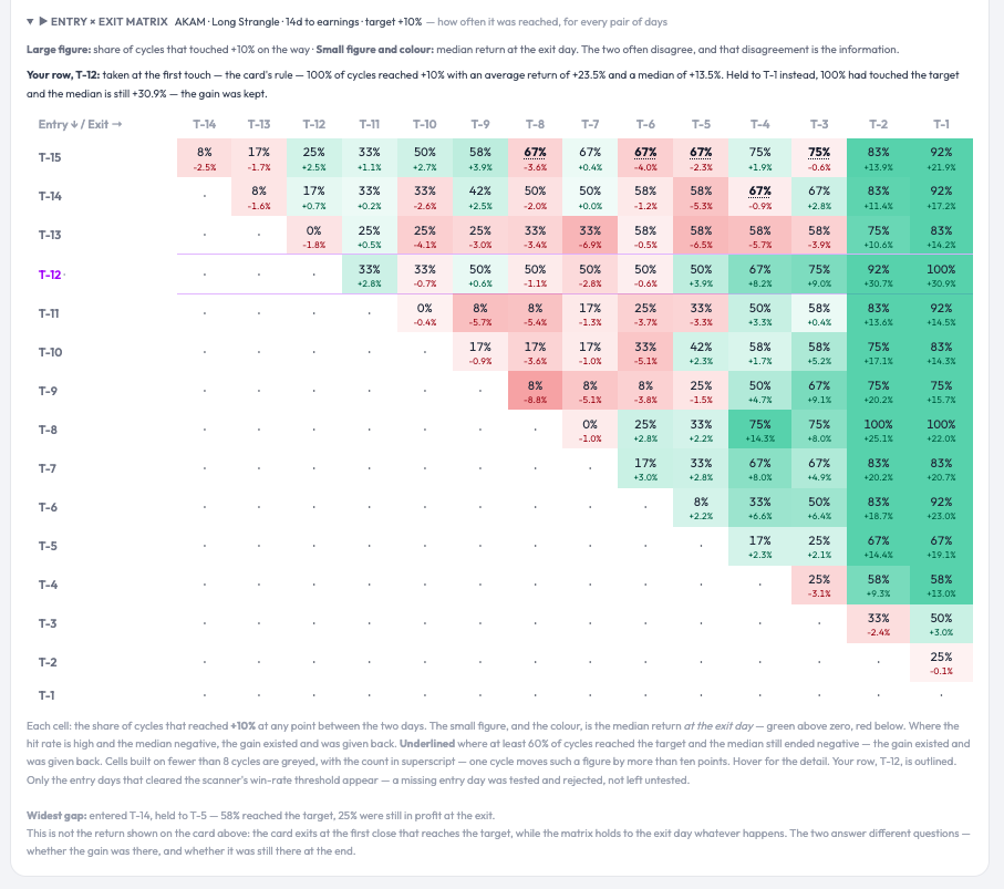
Thanks for the demonstration, @krisbee. The Earnings Study tool is becoming quite feature-rich. The narration above will be quite helpful, especially to newcomers to SO who haven't had the benefit of being part of the years of forum dialog that have led to the creation of the various SO strategies and the tool itself. The Median return matrix is helpful, but the the "Reached Target" option adds a dimension that I find very useful, since it allows me to examine potential quicker in-out trades with a possibly lower target. I'm also looking forward to using the spread builder/modeler you mentioned. Keep it up.1 point
-
Thank you, and that’s a fair ask. Two things on it. Self-reported results are the wrong instrument for a win rate: people report wins more readily than losses, and twenty fills from five people can’t move a figure built on hundreds of cycles. What subscriber fills can teach, and what the backtest can’t, is execution: the gap between the card’s mid ±0.5% and what the market actually gave. That gap is the whole game on thin names (LEVI two weeks ago), and it is invisible from the data side. So here’s what I’d suggest instead: post your fills here (ticker, structure, entry date and debit, exit date and credit) and I’ll line each one up against what the card assumed on that day. Over a quarter that gives us something no backtest has: a measured slippage per name. The win rate itself I’ll keep measuring the only way that holds up, on the full history, and publishing with the sample size next to it.1 point
-
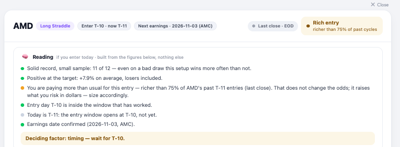
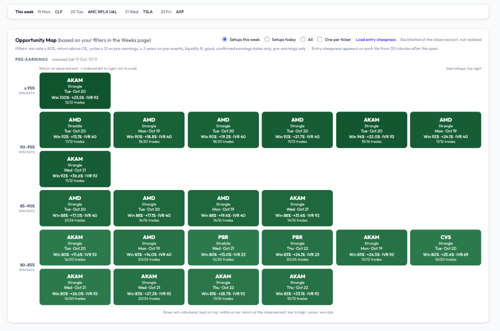
“Reload cheapness” was pricing the first eight tiles of the map and stopping there: each tile is a live chain fetch, so the cap was deliberate, but nothing on the page said so, and a blank tile reads as “no data”. As of today it prices every pre-earnings tile, three at a time, with a counter so you can see it working. Until ~9:45 ET it’s Friday’s close for all of them; after that, live. One more thing you’ll see on each card now: a short “Reading” block under the header (record, return at the target, entry cost, entry day, date, liquidity) and one deciding line. On AMD this morning it says exactly what you’d expect: solid record, richer than usual entry, nothing wrong with the setup, size for the price.
 1 point
 -
@Romuald The new opportunity map is great! Cant wait to test it!! May be you can ask subscribers to inform you of their results, with some details so that you can estimate the win rate and what the subscribers did right & what they need to be cautious about.1 point
-
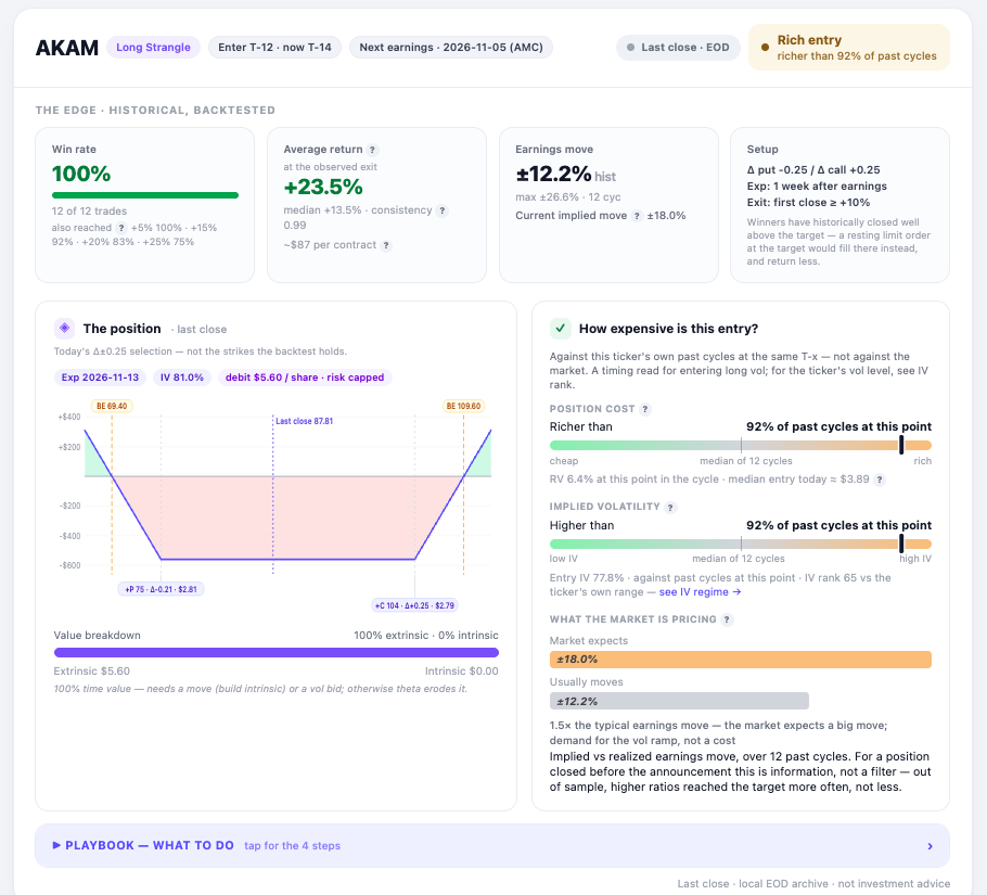
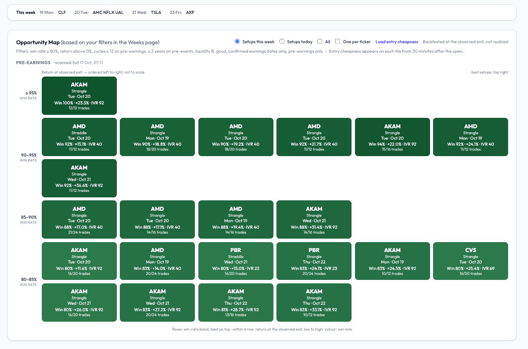
A good-looking pre-earnings week — on paper. The entry will decide. Next week’s scanner is unusually rich in pre-earnings setups with long, clean records: AMD (reports Nov 3, confirmed), AKAM (Nov 5, confirmed), CVS (Nov 4, confirmed), PBR (Nov 10, confirmed). Screenshot below, filtered to confirmed announcement dates only, win rate ≥ 80 %, at least 12 cycles, liquidity B or better. Two things changed in how the grid reads on optionbench, and I’d rather explain them than let you guess. The layout is now an X-Y ranking. Rows are win-rate bands, best on top (≥ 95 %, 90-95 %, 85-90 %, 80-85 %). Within a row, tiles are ordered left to right by return at the observed exit, low to high: ordered, not to scale. So the best setups sit top right, and a tile’s position tells you two things at once without reading it. Colour still encodes win rate. Every tile shows the sample as a fraction (12/12, 18/20) next to the percentage, because 100 % on 12 is not the same evidence as 90 % on 20. The return is “at the observed exit.” That’s the close of the day the position first crossed +10 %, which overshoots the target: AKAM’s +23.5 % average comes with a +13.5 % median. A resting limit at +10 % books less. Both figures are on the card. Now the part that matters. AKAM at T-12 is the strongest line of the week: 12 of 12 cycles reached +10 %, and the entry×exit matrix shows the gain was still there at T-1 in 100 % of them (median +30.9 % held: unusual; on most names the gain exists and has to be taken). Yet today the same card reads Rich entry - richer than 92 % of past cycles at this point, IV higher than 92 % of them, implied move 18 % against a 12 % realised average. The historical record says the setup works; the gauge says Friday’s close was a poor moment to pay for it. Both are true, and the gauge is the one that has been monotonic out of sample: the richer the entry, the worse the outcome, at every level. So the week is promising and no tile is a trade. On each entry day, after the first half hour, the live gauge on the card decides — cheaper than the median, or pass. Click any tile and you get the full card: the historical edge, the live position with its gauges, the playbook (what to do, in four steps), and the entry×exit matrix that shows, for every pair of entry and exit days, how often +10 % was touched and what the median return was if held — the two numbers that usually disagree, and that disagreement is the point. One correction on labelling, since someone will check: when a date shows “estimated”, it means our calendar source has not published a report time yet — the company may well have announced it. The screenshot excludes those on purpose. Romuald - OptionBench.com
 1 point
 -
An OptionBench member asked me whether “rich” pre-earnings vol means we should be selling it. Worth answering in public, because the premise is where most people trip. “Rich” on our gauge is relative: the straddle today versus that same name’s past cycles at the same distance from earnings. It says nothing about absolute vol; and absolute vol is low right now (SPY sits at IV rank 13). Selling index premium here collects little for the same risk. Our structure scanner (it sweeps straddles, strangles, condors, butterflies, debit and credit spreads on 26 ETFs and ranks them by expected value over risk at realized vol) built a SPY bear call spread on Friday and rejected it at 2.4% EV/risk: under the 3% we treat as the friction floor. Selling vol isn’t missing from the toolbox; the toolbox is saying it doesn’t pay this week. Selling single-name vol into earnings because the straddle is rich is a different trade: short gamma into a gap. We backtested that family this summer. The seller’s edge holds as long as nothing moves and collapses on the moves above 10%: a 75% win rate with the losses doing all the work. Not something I’d publish with a win rate attached. What does make sense in a rich regime is what the member actually did: he passed. Entry richness is the strongest single predictor we’ve measured on 95,000 pre-earnings cycles, and it’s monotonic — the richer the entry, the worse the outcome, at every level. Waiting is a position.1 point
-
Please take a look: https://steadyoptions.com/forums/forum/topic/51-email-notifications/?page=4#findComment-216778 It's always worth to enable notifications and/or follow the contributors. Also it is better to post in the members forum and not the public forum.1 point
-
In case you haven't seen it - https://steadyoptions.com/articles/the-last-14-minutes-why-we-stopped-looking-at-options-closing-prices-r837/ The tool now presents 3:46 data rather than closing quotes. This is a game changer. We can now see much more realistic quotes, especially for less liquid options with wider spreads.1 point
-
 What happened was the front leg's closing quote: it blew out to $4.70 wide — and dragged the computed mid far enough to nearly double the measured debit, and with it the relative volatility reading: 0.55% became 1.00%. Two trading days later, on Monday, August 10, the close showed the other way a late snapshot drifts. RV always measures whichever strike is at-the-money at the moment of the snapshot — that's by design. In the final minutes the stock moved about half a point, so the closing snapshot's ATM landed one strike higher (275 instead of 270), where the calendar is structurally smaller. Fine so far. But then the closing quotes — more than $4 wide on the front leg — squeezed that calendar's measured value to $0.10, when the pre-close market had priced the same 275 calendar at $0.40. Stack the two effects and the close printed an RV of 0.10% against the pre-close reading of 0.50%. A jumpier anchor, measured through sleepier quotes. None of these numbers was a bug — we reproduced all four from the raw quote records before publishing this. They are what the two snapshots honestly reported. The difference, in every case, was fourteen minutes. Notice what the two distortions have in common besides their timestamp: one direction each way. The close didn't lean bullish or bearish on volatility — once too high, once effectively zero. And the Monday case generalizes: across the symbols we have re-verified so far, on about 1 in 18 entry days (5.6%) the closing snapshot anchored to a different at-the-money strike than the pre-close market did. Once you understand why the final minutes can do that, you understand something important about every backtest, every screener, and every "is this expensive?" judgment you have ever made from end-of-day options data. Note: This feature of “4pm compare” retires from the app after a couple of months. What actually happens at 4:00pm Most of us grew up treating the closing price as the official price — the number the newspaper printed, the mark your broker settles to. For stocks, that is roughly fair: the closing auction concentrates enormous volume into a single, hard-to-manipulate print. Options are different. An option's "price" on an end-of-day file is usually the midpoint between the last bid and the last ask — and the final minutes of the session are precisely when that midpoint is least trustworthy. Market makers carry every open position overnight, through whatever news lands after the bell, so as the close approaches they protect themselves the only way they can: they widen. Quotes that sat a few cents apart at 2pm can be several times wider at 3:59. Attention shifts to the closing auction in the underlying shares. Some quotes go stale; a few cross or collapse to nonsense for a moment. The market is not wrong at 4:00pm — it is simply half-asleep, with one eye on the exit. Measure a relative-volatility ratio, a spread-cost figure, or a backtest fill from that half-asleep market and the noise flows straight into your numbers — twice over. The wide quotes wobble every mid. And because "at the money" is defined by where the underlying sits at the snapshot, a late drift can hand the measurement a different anchor strike — correct by definition, but jumpier in the noisiest minutes of the day. Most of the time the distortion is modest. Sometimes — as our ADBE chart shows — it is enormous. And you cannot tell which kind of day you are looking at from the number alone. This is not a novel observation; it is why professional options-data vendors have long sampled the market before the close rather than at it. The industry's quiet consensus is that a quote captured while market makers are still competing beats a quote captured while they are packing up. When the close lies most: look at the calendar Now look at when our two ADBE distortions happened, because the timing is not random. The August 6 spike was the Thursday close immediately before Friday morning's jobs report. The August 10 crater sat at the Monday close heading into CPI week. Both distortions landed at closes adjacent to major macro releases — which is precisely when you would expect the final minutes to be at their worst. A market maker going home flat-footed into a jobs number or a CPI print has every incentive to quote defensively into that bell; the overnight risk they are pricing is at its maximum. The quotes are widest, the mids wobbliest, exactly on the evenings when an earnings trader most needs a trustworthy reading — because those are also the evenings you are deciding whether tomorrow's setup is cheap. This is why the RV charts draw the macro calendar directly onto the time axis — the JOBS, CPI, PPI, FOMC and PCE flags you see running along the top of every chart. A strange-looking reading next to a macro flag has a candidate explanation you can see at a glance; a strange reading in the middle of a quiet week deserves more suspicion. The pre-close snapshot removes most of the distortion. The macro overlay tells you where to be careful about what remains. The two features were built separately, but they answer the same question from two sides: can I trust this number, tonight? Why this matters more for earnings traders than anyone else Earnings trades live and die on small edges measured over short windows. When we ask "is this straddle cheap against its own history?", we are comparing today's price to a median built from dozens of past snapshots. If a meaningful fraction of those snapshots were taken from a distorted market, the median itself is polluted — and a setup can look cheap or rich for no reason except closing-quote noise on a handful of historical days. It also matters at the moment of action. Members who use the Daily Screener know the workflow: the screener surfaces the day's candidates, you pick your structure, and then you have to actually get filled. Under 4:00pm data, there was always an honest gap between the reference price on the screen and the market you would meet the next morning — the printed mid sat inside a spread you knew had been artificially wide. In practice, many of us (myself included) compensated by scaling in: several limit orders at different prices, using the fills themselves to discover where the real market was. That works, but it is a workaround — you are burning patience and partial fills to rediscover information that a better measurement would have given you upfront. A snapshot taken fourteen minutes earlier, while the quote competition is still alive, closes much of that gap. The reference mid is nearer to a price someone would actually trade with you. Spread-cost readings reflect the market you can participate in rather than the market's closing yawn. And the historical medians your judgment leans on are built from cleaner raw material, cycle after cycle. To be precise about what this does not do: it does not make any strategy win more often, and it does not turn a mediocre setup into a good one. It makes the measurements honest. What you do with honest measurements is still up to you. What we changed, and how you can audit it Starting this cycle, EarningsStudy computes relative volatility from a 3:46pm pre-close snapshot instead of the 4:00pm close. The migration is deliberately gradual — current-cycle symbols with earnings in the next 30 days first, earlier years following after verification — because when you change the ruler, you re-measure everything carefully before you trust it. And rather than swapping numbers quietly, we built the audit into the product. On the Calendar and Straddle pages you will find a 4:00pm compare checkbox: solid lines show the new pre-close data, dashed lines show the legacy close-based data for the same symbol, strategy, and cycle. On most names, most days, the two hug each other — reassurance that the history you have been using was broadly sound. And then there are days like ADBE's August 6 and August 10, where the dashed line spikes to a peak, then falls off a cliff, that the pre-close market never showed. Every one of those divergences is a day the old ruler would have misled you — and every one is now inspectable, down to the raw quotes, because we keep both snapshots until the verification is done. One honest caveat while the migration runs: until the historical backfill completes, some today-versus-history comparisons mix a 3:46pm present with a 4:00pm past. The differences are usually small, but they are not zero — which is exactly why the compare view exists and the legacy snapshot is preserved until every cycle is re-verified. If you find a divergence that looks strange, the Ask button inside the app sends it straight to me with the page attached; several members' reports have already sharpened the verification. The part I care most about This upgrade exists because a member insisted on it. @Bhavan1986 made the case that the closing snapshot wasn't good enough — and he was right. When I brought it to the contributors, @Kim, @Yowster and @TrustyJules backed it without hesitation. The better data roughly doubles what we pay for market data, and we are absorbing that rather than passing it on: nothing changes about any member's current rate. That is what the SteadyOptions–EarningsStudy partnership is for — the tools this community trades with should keep getting more honest, not just bigger. It sits in a line with the spread-cost column, the confirmed-date badge, and the per-cycle detail behind every median: the platform's job is to show you numbers you could actually have acted on, not numbers that flatter a backtest. Measuring the market while it is still awake is one more step in that direction. SO members on the All-services bundle: full core access to EarningsStudy is free through the partnership — sign up at earningsstudy.com with your SteadyOptions email. The rest can subscribe at an incredible introductory price of $39.99. EarningsStudy provides educational research and market information only — not investment, financial, or trading advice. Options trading involves substantial risk. Backtests and calculations may contain errors and should be independently verified.1 point






This leaderboard is set to New York/GMT-04:00