Leaderboard


Popular Content
Showing content with the highest reputation since 05/26/26 in Posts
-
Reading a low-IV name with the OptionBench IV Scanner: TLT today Every morning OptionBench flags the highest and lowest average IV Rank among the tickers we scan — not the whole market, just our watchlist. This morning (Monday, June 22), TLT came up as the lowest: an average IV Rank of 0, with 30-day IV at 8.8%. At the other end, TSM topped the list around 50.8% — the scan surfaces both extremes, so on any given day you can see which names are sitting at the cheap end of their own vol range and which are at the rich end. Here I'll walk through the low end. A low IV Rank on its own isn't a signal — it just says "this name's implied vol is near the bottom of its own recent range." It's easy to glance at a low rank and reach for a reflexive conclusion ("vol is cheap, buy premium" or "nothing to do here"), but the rank alone doesn't tell you whether that low IV is actually cheap relative to how the stock tends to move. That's the gap the scanner is built to close: it tells you what that low IV has historically meant for TLT's actual movement. That's the piece I want to show. What the IV is actually pricing Here's the line that I think earns its keep. Pulling three years of TLT history, the scanner compares what IV priced (the 1-sigma implied move) against what the stock actually did: Over 45 trading days, IV priced 68% more move than realized (median ±6.4% implied vs ±3.82% realized, 756 observations). Right now, IV is pricing a ±4.34% move — in the cheapest 2% of the last three years, 14% above what this name typically realizes. When IV priced a move like today, TLT historically realized ~±2.05% (median, n=128 comparable days). So instead of "IV is low," you get "IV is in the cheapest 2% of its three-year range, and historically when it was priced this way, TLT moved about ±2% — meaning even this cheap IV has tended to overstate the realized move." That's a far more actionable read, and it's grounded in this ticker's own history rather than a generic rule of thumb. The supporting context The scanner rounds it out with a few descriptive reads, each measured against TLT's own 12-month history rather than absolute thresholds: Mean reversion: IV is currently below its 12-month median — historically the lower-premium regime for this name. Volatility premium: IV 30D 8.8% vs HV20 7.3% is a 1.2× ratio, sitting at the 35th percentile of its own range. IV carries its usual premium to realized vol here — nothing unusual, no strong edge from IV/HV alone. I want to be clear about what this is and isn't. None of it is a forecast. IV can stay compressed for weeks, and "cheapest 2% of three years" is a description of where we are, not a prediction of where we're going. What the scanner gives you is context: a precise, ticker-specific picture of how today's implied vol compares to this name's own behavior, so you can decide whether a setup makes sense for your thesis. In practice, that's how I'd use a read like this — not as a trigger, but as a starting filter. A name showing cheap IV that has also tended to underdeliver on realized move is a different proposition from one that's cheap but has a history of surprising to the upside. The scanner won't make the call for you, but it puts the relevant history in front of you in a few seconds instead of an afternoon of spreadsheet work. Try it From the daily "Today" view, the lowest-IV-Rank badge links straight to the TLT scanner page — one click and you're looking at everything above. If you're in the beta and want to poke at it, this is one of the tools I'd love feedback on. EXAMPLE-IV-TLT.mp41 point
-
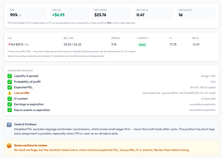
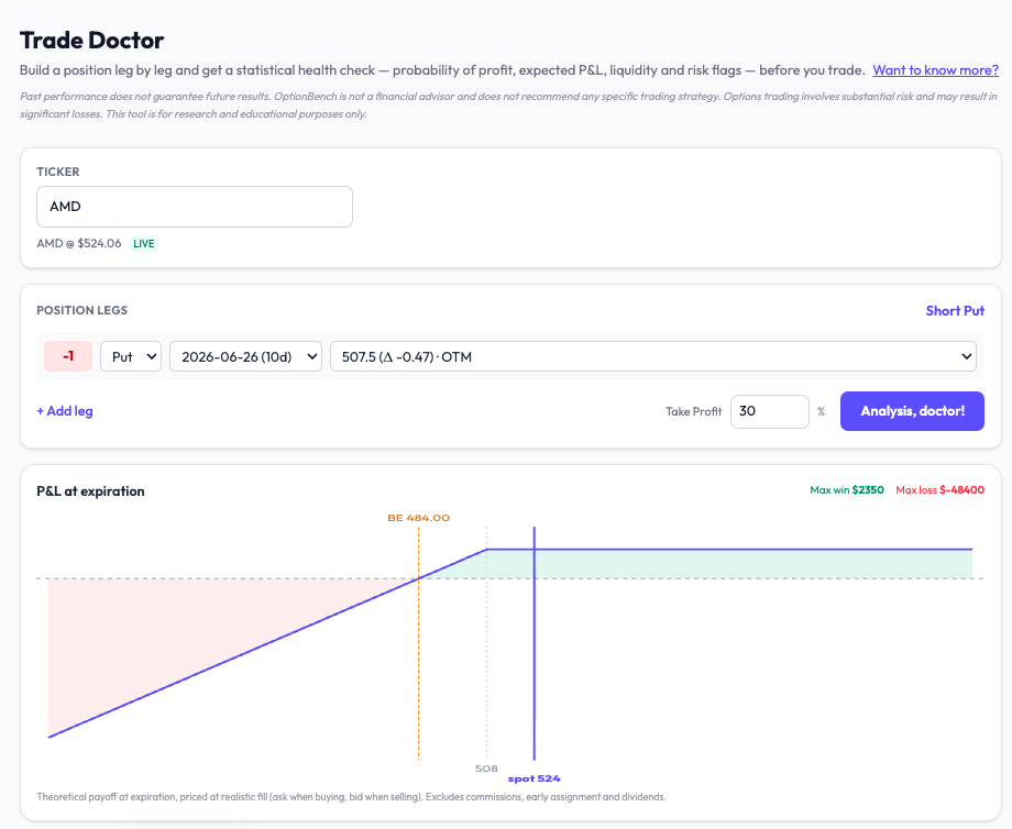
A 90% win rate on a naked put — what the probability doesn't tell you One of the things I hoped for in this beta was that testers would find uses of the tools I hadn't spelled out myself. This week one of them did — and it turned into a good illustration of why a high probability of profit, on its own, can be quietly dangerous. The workflow a tester found A beta tester was hunting for naked-put entries using Forecast by Options (the implied-probability tool). The steps: Pick a ticker and an expiry Set the target to Probability, with a lower threshold (he used 85%) Turn backtest validation on Read the implied-probability curve across strikes, and choose a strike sitting at a comfortable distance in the left tail (he anchored around the 15% line) It's a disciplined way to enter: instead of guessing a strike, you let the options market's own implied distribution tell you how far out you are. I liked it enough to want to share it. But it also surfaces the limit of choosing a strike on probability alone — so here's the second half of the workflow I'd add. Probability is not the whole story The implied-probability curve tells you how likely the spot is to reach a strike. It says nothing about how much you lose if it does. For a naked put, that downside is open-ended — the loss can run to many times the premium you collect. A strike that looks safe at "85% it won't get there" can still carry a heavy left tail. So I took a representative trade through Trade Doctor: a short AMD put near the money, ~10 days out, take-profit 30%. Here's what comes back: POP: 90% — looks great Expected P&L: +$6.93 — positive IV Rank 92%, liquidity good, no earnings before expiry — all green And then the line that changes the picture: Loss profile: open-ended risk — average loss ~$33, worst-5% tail ~$74 — roughly 3× the credit collected What that means A 90% probability of profit is sitting on a tail that, when it bites, gives back about three times the premium you took in. You win often and small; you lose rarely and large. That's not automatically a bad trade — plenty of people sell premium in high IV on purpose — but it's a profile you want to see before you size it, not discover afterward. This is the same lesson I keep coming back to: a win rate tells you how often, not how much. On a defined-risk spread the damage is capped. On a naked put it isn't, and the only honest way to judge the trade is to put a number on the tail. That's what the new Loss profile does — it shows the average loss and the worst-5% (CVaR) side by side, so the gap between them tells you how fat the tail is. When they're close, the loss is contained. When the tail is several times the average — as here — the downside is the thing to respect. Two tools, one decision The point isn't that Forecast by Options is wrong and Trade Doctor is right. They answer different questions, and they're meant to be used together: Forecast finds you a strike; Trade Doctor tells you what that strike risks. Probability picks the entry; the loss profile sizes the position. Used in sequence, you get a trade you've actually stress-tested rather than one that merely looked good on a single number. Try it This is all live in the OptionBench beta — free through the summer. If you sell premium, the Loss profile on naked and uncovered positions is the piece I'd most want your eyes on. And as always: tell me where I'm wrong. The best feedback in this beta has come from testers using the tools in ways I didn't anticipate — this post exists because of one of them. Launch waitlist: https://www.optionbench.com
 1 point
 -
Apologies if I am asking about something super obvious, but how is it possible to get an average return of about 22.7% if the TP is set at 10%? Is it because many days option prices will simply gap up in the morning and you get higher than the TP fill?1 point
-
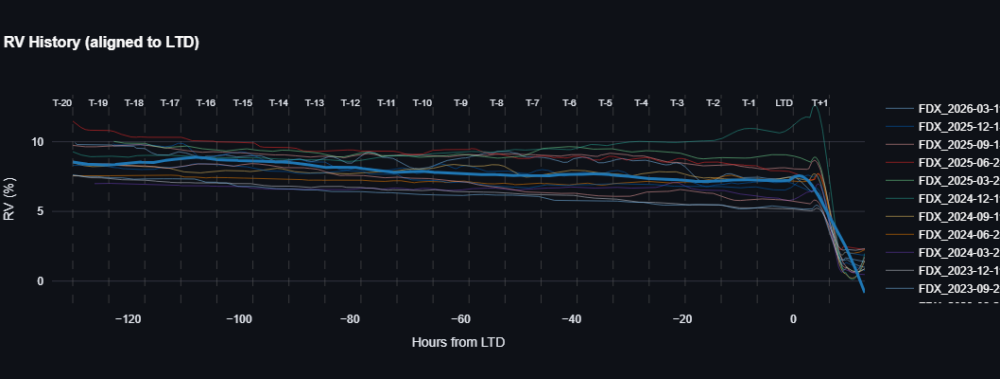
FDX is because they split the company to FDXF and stopped options data for FDX (atleast for now).1 point
-
Maybe this chart will help
 1 point


This leaderboard is set to New York/GMT-04:00