All Activity
- Past hour
-

Pre-Earnings Entry Price: What 31,000 Cycles Say
TrustyJules commented on Romuald's article in SteadyOptions Trading Blog
Thank you - great insight. A side remark, in options trading it is standard that high probability trades create frequent serial wins and incidental massive losses whereas low-probability ones give incidental high returns and frequent series of low losses. This is a pattern that returns all the time in any strategy and cannot be defeated. The entry and management of the trade is therefore always essential to gain the edge - as you put it a high probability trade is not an edge but neither is a low probability trade the lack of an edge. If you can find low probability trades and reduce your number of losses you will come out ahead - same with high probability trades avoiding the one killer loss is the real edge. Iron Condors are the most simple example of them - opening them on a low vol. underlying like SPY will get you profits most of the time and then one loss that will swallow 5 wins. End of the year - barring management is a zero sum game. - Today
-
A comment regarding M: As of 10PM Eastern on Macy's Investor's URL, the Earnings date is not confirmed. https://www.macysinc.com/investors/events-presentations-and-investor-updates/events/default.aspx
- Yesterday
-

Pre-Earnings Entry Price: What 31,000 Cycles Say
Romuald posted a article in SteadyOptions Trading Blog
 So I tested it. What was measured Every completed pre-earnings cycle in the backtest history, restricted to long straddles and strangles: 31,027 of them, once the test conditions below are applied. For each cycle, I computed the entry cost as a fraction of spot, then ranked it against the same figure on previous cycles of the same setup — same ticker, same strategy, same buy day. That gives a percentile: today's entry is cheaper than X% of the cycles that came before it. Then I sorted every cycle into five buckets by that percentile and looked at what each bucket returned. The part that matters: previous cycles only This is the detail that makes the test worth anything, and it is easy to get wrong. If I ranked each cycle against the full history — including cycles that had not happened yet at the time of the trade — I would be using information no trader could have had. Every result would look better than reality, and the error would be invisible. So the percentile for a cycle in March 2023 is computed only from cycles before March 2023. A setup enters the test only once it has enough prior history to rank against. That is what walk-forward means, and it is why the sample drops from 46,717 completed cycles to 31,027 testable ones. It is a costly constraint. It is also the only version of the test worth reporting. The result Entry percentile Cycles Win rate Median return Cheapest 20% 5,985 46.3% +4.5% 20–40% 5,932 44.5% +3.6% 40–60% 5,934 42.6% +1.4% 60–80% 5,938 41.3% +0.5% Richest 20% 7,238 40.9% 0.0% Read the columns downward. Win rate falls monotonically from the cheapest bucket to the most expensive. So does the median return, from +4.5% to zero. Expectancy behaves the same way: the cheapest quintile came out 2.1 percentage points better than the most expensive. Three different measures, roughly six thousand cycles each, all pointing the same direction with no reversal along the way. That is about as clean as this kind of test gets. It also says something plainer: on this data, the single most useful thing you can know about a pre-earnings volatility trade is what you are paying for it relative to what that same trade has cost before. The uncomfortable half I ran the same walk-forward test on the other filter people use — and on the one my own table sorts by. Filtering on historical win rate does exactly what it says: it raises the realized win rate, from 44.5% across all cycles to around 58% on the strictest setting. That part works. But expectancy moves the other way. Every threshold I tested — 60%, 70%, 75%, 80%, across three different history requirements — improved the win rate and degraded the expectancy. Twelve combinations, no exception. The mechanism is not mysterious once you see it. The exit rule caps the gain: the position closes on the first close at or above +10%, so a winner books roughly ten percent and no more. Nothing caps the loss. Filtering for setups that hit their target often selects positions that win small and often — and lose large when they miss. This is the same trap I wrote about in June under a different name. A high probability of profit is not an edge. It turns out the point applies to my own default sort. What happens when you combine them Cheapness and win rate are independent, and they pull in opposite directions. At any fixed win-rate threshold, cheap entries beat expensive ones by 2.4 to 2.6 percentage points of expectancy — consistently, at every level. And at any fixed cheapness bucket, raising the win-rate threshold lowers expectancy. Crossing the two does not rescue the second effect; the best bucket in the whole test is simply cheap entries with no win-rate filter at all. What I am doing about it The honest answer is: not yet decided, and I would rather say that than pretend. Sorting a table by win rate is what users expect, and the figure is not meaningless — it describes how often a setup has worked. But if the number people sort by moves expectancy the wrong way, the default is doing something I would not defend if asked to justify it from first principles. What is already true is that the entry-price block is not decoration. It measures the one thing in this data that improved every metric at once, and it sits on every card. Caveats worth stating The percentile needs history: a setup with four prior cycles produces a percentile that means very little, which is why the test requires a minimum before a cycle enters it. The buckets are wide. "Cheapest 20%" is not a threshold you can trade — it is a direction, measured across the whole population. And none of this says a cheap entry will work. It says that across thirty-one thousand cycles, cheaper entries returned more than expensive ones, on three measures at once, with no crossover. That is a tendency, not a promise, and the distinction matters more in this business than in most. OptionBench is a research and analysis tool, not an investment advisor. Nothing here is a recommendation to buy or sell any financial instrument. Backtested results are hypothetical and do not guarantee future performance. The original article was first published here.
 -
@Romuald .really like the changes to the entry readings the scales help show now vs historical ..... are there plans to introduce a short strategy to the mix - would be interesting to see how say a put credit spread has fared over the last number of cycles ... thanks for all your work to keep tweaking (improving) the tool
-
Clarification in case it wasn't clear enough in the initial post: All services bundle members get a free access to the tool as long as they keep their All services bundle subscription. The rest can subscribe at incredible introductory price of $39.99. As @krisbee continues adding new exclusive features, the price will go up, but those who join now are always grandfathered at the price they joined. Personally I think the tool is worth at least $100-120/month, and it will get there eventually.
-
We see your account. Next steps, please check your email.
-
@krisbee @Kim Thanks for bring this tool to us! I just registered my account. Do I need to let them know I am a member of SO community? I don't have the all service bundle, so how long does it take to have the access to all the functions? Thank you
-
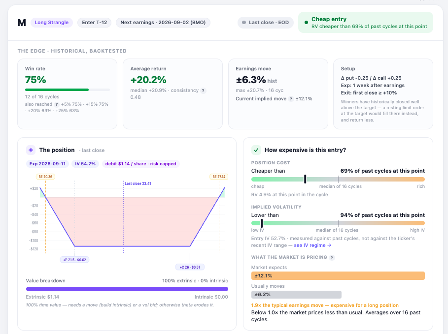
What a pre-earnings card looks like now Several people asked what the scanner actually shows once you open a row, so here is one from Friday — Macy's, long strangle, entry window opening at T-12. Two things I reworked this week. The entry readings now sit on a fixed scale. Cheap on the left, rich on the right, needle where this setup falls against its own history at the same point in past cycles. Position cost is a little below the median of 16 cycles; implied vol is near the bottom of the range. Before, the bar filled from the left in both cases and you had to read the label to know which direction it meant. Below that, what the market is pricing against what the stock usually does: ±12.1% implied versus a ±6.3% average earnings move. Roughly twice the usual — which matters, because this position is bought, not sold. The line worth pointing at, though, is on the setup tile. The exit rule is "first close at or above +10%", and a close is not the threshold — it is wherever the market happened to finish that day. Across the backtest history the median winner books well above the target. So a resting limit order at +10% would fill at +10% and return less than the numbers on the card. Worth knowing before you place the order. Free to look at: https://optionbench.com Not investment advice — the tool describes what setups have done historically, your broker's chain is where you check whether it fills.
-
 Because most option traders live in 15-45 days-to-expiration land, there’s a myriad of factors they have to take into account when considering a trade in LEAPS options which aren’t present in short-term options. Implied Volatility is Higher in LEAPS Because of the long time to expiration for LEAPS, they carry higher implied volatility levels. This is intuitive, as in standard times, the VIX term structure is typically in contango, meaning future months get more expensive as you go into the future. Here’s an example of the VIX term structure at the time of writing, which is in contango: In other words, more can happen in more time. So the price of uncertainty goes up with time and hence the IV on LEAPS is expensive. Furthermore, there’s less selling pressure in LEAPS from option sellers. Premium sellers tend to pick shorter-dated options (<15 days) so they can quickly recycle their capital quickly. Selling LEAPS ties up your capital for long periods in exchange for a marginal increase in yield. It’s generally a bad trade, at least when it comes to systematic premium selling. They stay out of LEAPS and that keeps the IVs in LEAPS high. It might be obvious, but the best time to buy LEAPS is when the VIX is below its long-term average, and ideally when the underlying stock has a low IV Rank. The general consensus among academics who study volatility is that it clusters and trends in the short-term and mean-reverts in the long-term. For this reason, buying LEAPS at a low VIX and IV Rank puts extra wind at your back. Interest Rates and Dividends Actually Matter The average options trader lives in 15-45 days-to-expiration land. They seldom need to think hard about how their positions are impacted by the distributions of dividends, or changes in interest rates (Rho). But when it comes to LEAPS on a stock that pays a dividend, there’s going to be several dividend payments throughout the life of the option, and as we well know, interest rates can change dramatically over the course of 1-3 years. While these factors are mostly priced into market prices already, future changes in rates or dividends can impact your position in ways you don’t understand if you go into LEAPS blindly. Below is a chart from Lawrence McMillian’s excellent book Options As A Strategic Investment displaying a series of expirations and how their pricing differs with changes in interest rates. Note that the bottom line is value at expiration. And here’s a chart from the same book displaying how changes in dividends affects call option pricing: These two factors are of special importance in 2022’s market environment of rising interest rates and energy being the leading sector. Due to a myriad of factors, energy companies often choose to distribute earnings as dividends in lieu of investing in growth as tech companies might. Traders holding LEAPS in energy equities have probably learned a thing or two this year. LEAPS Have Far Less Liquidity Besides having less interest from option traders, market makers are generally less active in LEAPS and tend to quote very wide spreads. This can make establishing a position of any reasonable size a pain. Because option prices have definitive and knowable characteristics allowing you to ascribe a theoretical fair value to them, it’s far easier to get someone to trade with you if you’re will to pay a premium to the theoretical value. However, as good traders often say, getting into a trade is seldom a problem, getting out when out when you need to is the issue. How Traders and Investors Use LEAPS? Position Trades Many short-term traders who are used to holding their positions in the area of hours or days don’t like to/aren’t experienced at managing a longer-term delta-one position. Instead, they’ll often use LEAPS to express these longer-term views. Whatever their initial risk (perhaps 1% of their trading equity) would have been on the trade, they’ll use that to buy LEAPS, which they can kind of “set and forget” and not fiddle with stop losses and gap risk. This has the added benefits of providing leverage to their positions as well as not tying up much of their capital for long periods. An Alternative to Index Investing Whatever you think of the Boglehead philosophy of index investing being nearly the only way to invest smartly, they’ve had a pretty good track record for the last few decades when compared to actively managed fund options. But skeptics of passive investing still have a problem with blind faith in long-term return averages continuing into the future, but don’t want to miss out on potentially amazing yield. One way to replicate a return profile similar to that of passive index investing is to use LEAPS on index ETFs like SPY by periodically rolling at-the-money calls forward and funding the negative carry with the dividends supplied by a modestly sized high-yield dividend portfolio. Enhancing Returns of Long-Term Holdings Many hedge fund managers for whom their largest position is asymmetrically larger than the rest of their positions are presented with a problem. They’re loaded up to full size and then the position declines in value, creating an excellent opportunity to buy more at a great price. But they don’t have the capital or simply can’t risk more on what is already their largest position. In this case, they might use LEAPS to increase their upside for a small relative cost. Betting Against a Short Seller’s Nightmare Tesla (TSLA) is the perfect example of a stock that many traders desperately want to short exposure to, but the volatility is simply too high. There’s a whole graveyard of long/short managers who got taken to the cleaners shorting Tesla (TSLA). This is where buying LEAP puts would be a viable alternative. You still get the upside if your thesis is correct In the situation of Tesla, the bet was binary in nature for many of the company’s skeptics. They’re sure that the company is an eventual zero and if not unless they can find a strategic buyer like Volkswagen before the worst happens. Do note that this isn’t our view, instead, we’re just explaining the thinking of many Tesla shorts. In a binary situation like the one above, the put premium paid isn’t even of much concern if you expect such a dramatic move to the downside. The only concern is timing, of which LEAPS provides plenty. There’s a number of stocks in the same camp as Tesla in that the volatility is too difficult to deal with. Protecting Long-Term Positions Just as the Tesla bear might opt to use LEAPS calls to express their bearish view in a risk-defined manner, the Tesla bull might, too. With a stock like Tesla being such a high-risk, high-reward bet, even the bulls are aware of the significant risks to their thesis. For them, the trade is semi-binary in nature as it is for the shorts, at least far more so than buying the S&P 500 is. This is where they might use out-of-the-money LEAPS to protect their worst case downside while still benefiting from the same upside. Bottom Line While LEAPS aren’t very popular among traders due to opportunity cost on capital, they provide an excellent avenue for traders to limit their risk while making long-term leveraged bets. It’s for this reason that LEAPS are frequently overpriced, because there are few natural sellers. If you dip your toe into LEAPS, make sure you take heed of the differences between LEAPS and short-term options: Lower liquidity Higher IV Dividends and interest rates actually have a significant impact on LEAPS positions.
 - Last week
-
 4337manpreet joined the community
 -
thanks @Romuald I need to spend more time poking around the pre-event screener and this will help - just not comfortable with it yet to make an informed decision
-
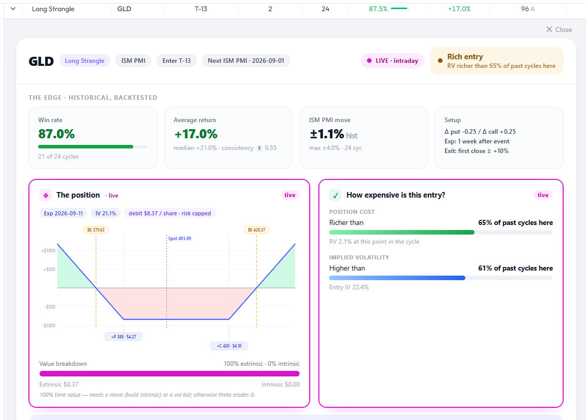
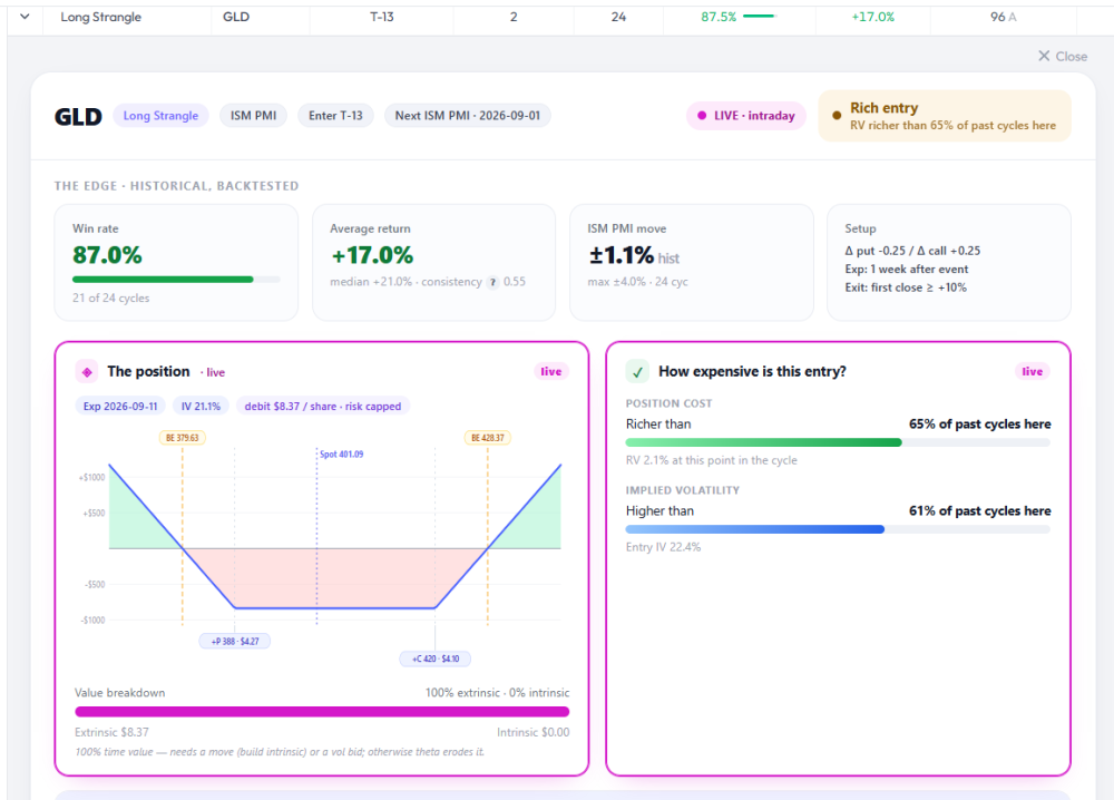
Good question, and it's two separate things: one is a deliberate decision, one is a gap. The deliberate part. On earnings I show a third line in the entry block: the ATM straddle against the stock's average past earnings move. I measured it on events yesterday and it doesn't transfer. Across the nine live event combos, that ratio runs 3× to 7×, against a 1.72 median on earnings. The reason isn't calendar randomness, it's that a one-week straddle prices a full week of ordinary sessions, and on earnings the gap dominates that price while an ISM PMI moves GLD about 1.1%. So the same number means something completely different, and published with the earnings thresholds it would read "expensive" on every line, permanently. It's absent rather than wrong. The honest version would be a self-referential one — "event premium richer than X% of past cycles here", same grammar as the two lines above it. That needs the ATM straddle history per cycle, which I don't store yet. It's on the list. The gap. You're right that the implied move is missing from the tile itself. On pre-earnings the move tile shows "Current implied move ±X%" alongside the historical average; on pre-events it only shows the historical. That's an oversight rather than a choice, and it's the cheaper of the two to fix. Thanks for spotting it, the tile and the block are different questions and I'd conflated them.
-
@Romuald curious why historical and implied moves are not included on GLD pre-event card ,,, they seem pretty important to decision making for pre-earnings ... is it because pre-events are a bit more random than earnings dates cycle to cycle
-
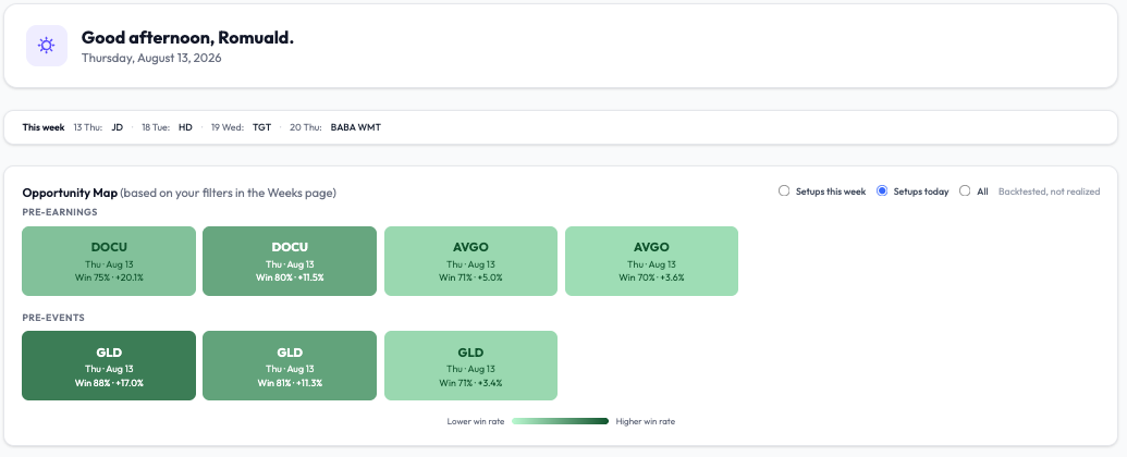
@Romuald nice will add GLD to my to do list DOCU is already there
-
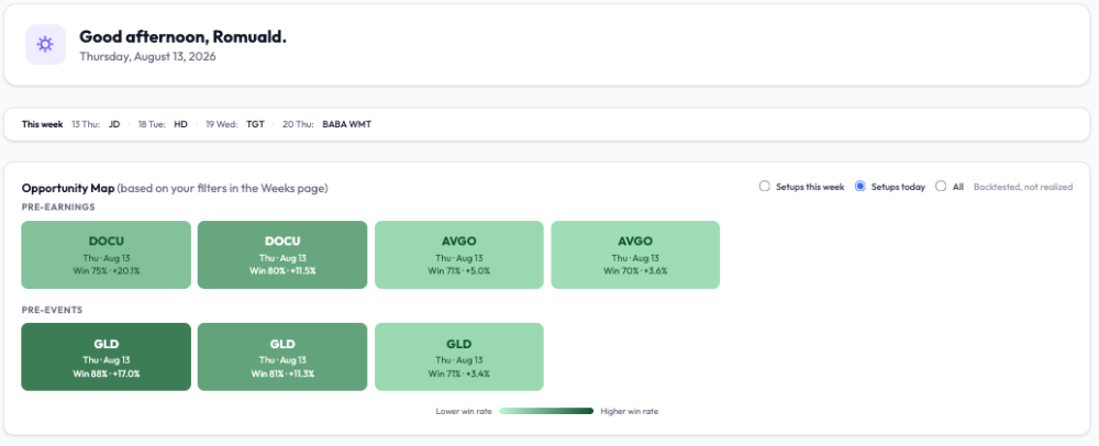
Today's entry windows Three names open an entry window today on the scanner. My filters: win rate ≥ 70%, positive average return, at least 20 earnings cycles of history, at least 2 years on events, and liquidity B or better. The 20-cycle floor matters more than the win rate itself. A 100% win rate on four cycles tells you nothing, and my own scanner flags those rather than showing them off. But everything above is backtested history : win rate and average return across past cycles. It says nothing about whether today's entry is priced well or not. That part only exists once the options data comes in, roughly half an hour after the open, and it's the part that decides the trade. What I'd look at on each card once quotes are live: — Entry cost against its own history. Am I buying early or late in the volatility ramp? — Entry IV against its own history. How much ramp is left to build? — Earnings premium. The ATM straddle against what the stock has actually delivered across past reports. This is the only one whose denominator is something real. Those three can disagree, and the disagreement is usually the interesting bit. A setup can read cheap against its own history while still pricing more move than the name typically produces. Yesterday's example: three earnings names cleared the same filters and all three came back rich on cost, IV and premium at once. Good history, wrong price. I didn't take any of them. The reasoning behind those three readings is here if it's useful: https://optionbench.com/blog/expensive-compared-to-what Happy to answer methodology questions — those are the ones I enjoy. Romuald - optionbench.com
-
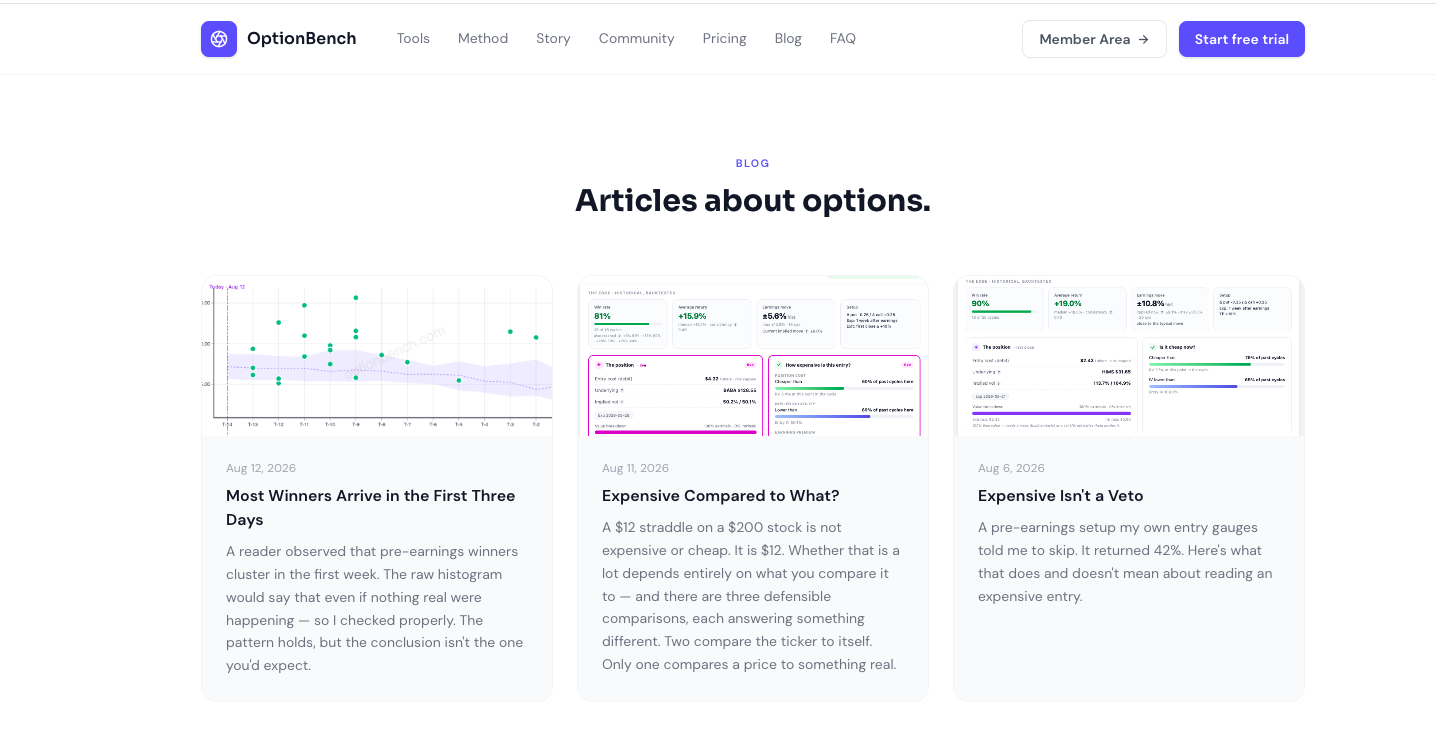
A blog, and what's in it I've added a blog to my site optionbench.com — mostly write-ups of things I had to measure while building the scanners, rather than marketing pieces. The latest one came directly out of a conversation here. Yowster noticed that on the scatter charts, most cycles reaching the P&L target do so within the first week. I ran it across all 46,717 completed backtest cycles: he's right, median day 3, 87.5% within seven sessions. But the raw count would look like that even if nothing real were happening — a cycle that hits on day 3 leaves the pool. The proper test is the hazard rate among positions still alive, and that one does decay, from 10.2% on day one to about 6% from day eight. The part I didn't expect: there's no time stop worth using. Cutting a position that hasn't worked by day seven saves 0.4 points versus holding it. The loss is already there by the time you can see it isn't working. https://optionbench.com/blog/winners-arrive-early Two earlier ones on what "expensive" means for a pre-earnings entry, and why comparing a straddle to its own history isn't the same as comparing it to what the stock actually delivers. For anyone who wants to look at the tool itself, the first seven days are free at optionbench.com. Happy to answer methodology questions here: in fact, those are the ones I enjoy Happy trading, Romuald

-
Thanks @krisbee for adding the macro events to the charts. One thing to note, and it's an obvious thing but deserves to be noted - the macro events are for this cycle only, the prior cycles have no such ties to those event on a given T-x day.
-
Yes, we released it last night. Check out "What's new" menu.
-
is there a feature where you can save your scans or filters
-
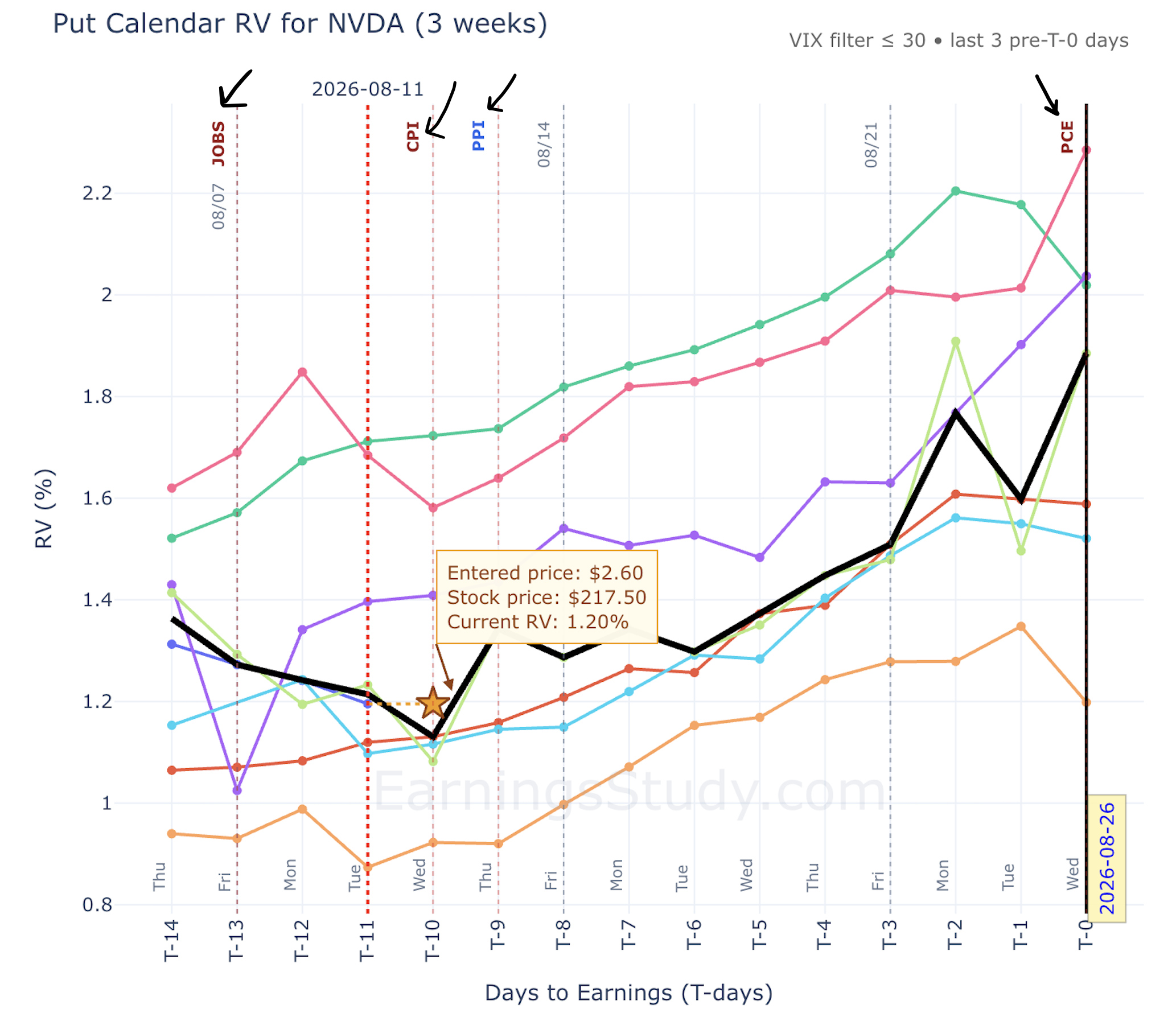
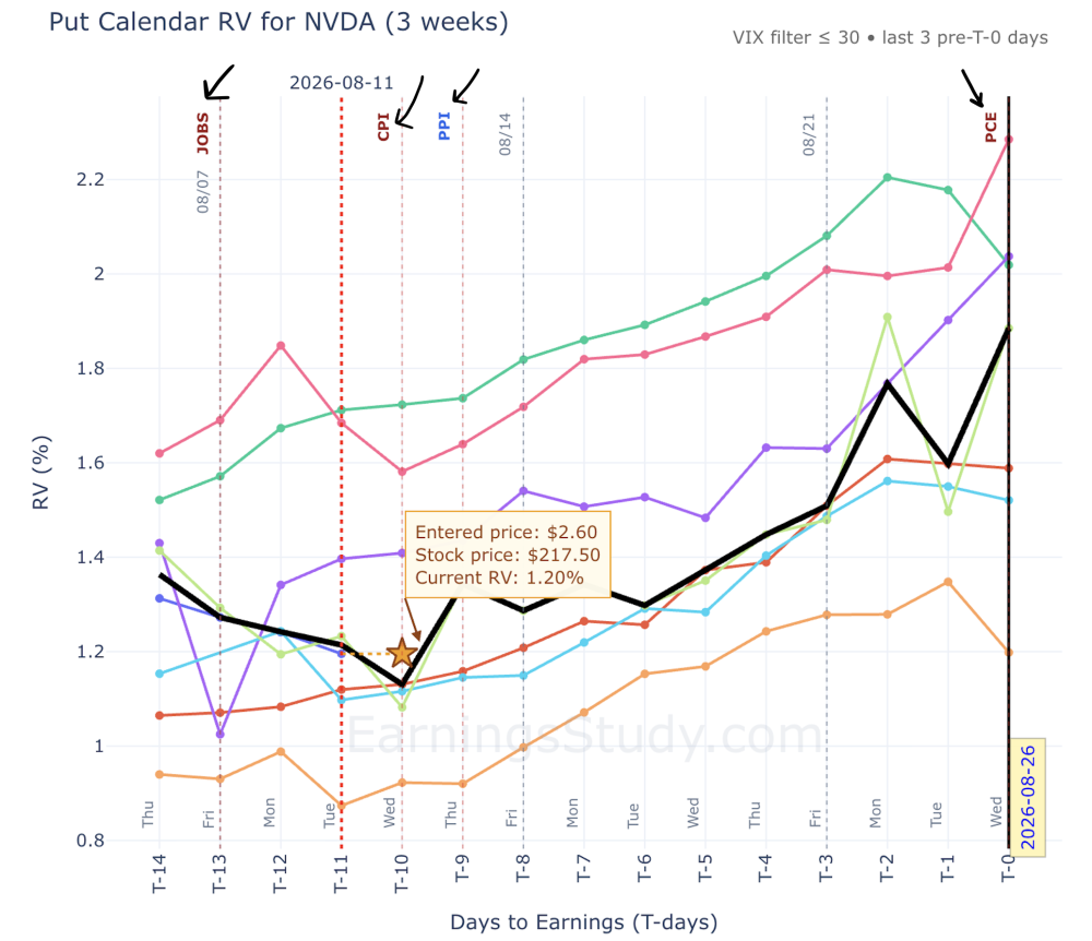
Macro events are now drawn on the charts themselves — CPI, PPI, FOMC, JOBS, GDP, PCE Quick feature note, because this one changes how the charts read. You've had the macro events calendar next to the earnings calendar in the app for a while — FOMC, CPI, PPI, JOBS, GDP, PCE, laid out against the reporting slate. As of this week, those same events are also marked directly on the strategy charts: straddle, strangle, calendar, and long options pages all now show a marker on the exact trading day each macro event lands, both on the days already traded this cycle and on the days still ahead of the print. Why I wanted this on the chart and not just on a separate calendar page: 1. It explains the bumps you're already looking at. When the RV line kinks up mid-cycle, the first question should always be "was that earnings drift, or did CPI print that morning?" Before, answering that meant flipping between the chart and the calendar and counting days. Now the answer is sitting on the chart at the exact T-day it happened. 2. IV builds into known events — and your entry day might be one of them. Options premium tends to firm up going into a scheduled macro release and deflate after it passes. That means a position entered at T-5 the day before CPI is not the same instrument as one entered at T-5 the day after — even at the same distance from earnings. Part of what you're paying (or collecting) is macro vol, not earnings vol. Seeing the marker next to your intended entry day makes that visible before you commit, not after. 3. Event-on-event risk stops being a surprise. The screenshot below is [NVDA] — note [PCE] landing [right against T-0]. An earnings print with a major macro release stacked next to it is a different bet than a clean print: two catalysts, one position. That's exactly the kind of thing that's obvious on a chart and easy to miss on a list. 4. The days ahead are marked too, not just history. The chart shows the remaining trading days into the print with upcoming events already flagged — so if you're planning an entry at [T-x] and there's a [FOMC] marker two days before it, you can decide on purpose whether you want to be positioned through that release or enter after the dust settles. Usual caveat, because I'd rather over-say it: these markers are context, not signals. Nothing about a CPI flag tells you which way vol resolves. What it does is make sure that when you're reading a median path across [N] historical cycles, you know which of those days were carrying a second event — and whether your planned path is carrying one now. This came out of my own annoyance flipping between pages during CPI week — if there's an event type you'd want added, or you'd rather be able to toggle the markers off, say so here. That's how most of these features get built.
-
 Whether that is a lot depends entirely on what you compare it to — and there are three defensible comparisons, each answering something different. This is what the entry block on every OptionBench card is built around. Three reference points, three questions Position cost, against its own history. The same setup on the same ticker at the same point in the cycle has been priced many times before. Twenty past cycles, twenty entry costs, each divided by the spot at the time. Today's cost sits somewhere in that distribution. This answers: am I buying early or late in the ramp? The value of a pre-earnings long-volatility position comes largely from implied volatility rising as the announcement approaches. If today's cost already sits in the upper half of past cycles at the same T-x, much of that rise has happened. If it sits low, there is more room ahead. Implied volatility, against its own history. Closely related to the first, but not the same. The cost of a position depends on volatility, but also on time remaining and — for a long strangle — on how far apart the strikes sit. The two readings can diverge, and when they do it tells you something: a position that is expensive while its IV is ordinary is expensive for structural reasons, not because the market is bidding up volatility. This answers: how much ramp is left to build? Earnings premium, against what the stock delivers. The first two compare the ticker to itself. This one compares a price to a real counterpart: the ATM straddle divided by spot is what the market charges for the move, and the average past earnings move is what the stock has historically produced. This answers: what is the market valuing today? Why the third one is different The first two are self-referential. They will tell you a $30 straddle on a violent biotech is "cheap" if that stock usually prices even higher. That is useful — it means you are getting a better-than-usual price for that particular name — but it says nothing about whether the price is reasonable in absolute terms. The third comparison is the only one where the denominator is something real. On the BABA card above — captured on August 11, ten business days before the August 20 report — the market is asking for a ±8.8% move, and the stock has averaged ±5.6% across its last sixteen earnings. The ratio is 1.6. Measured across thirteen tickers inside their entry window on a single day, that ratio had a median of 1.72. Not 1.0. The market consistently charges more than the historical move — which is exactly what you would expect if the seller of volatility is being paid a risk premium. One caveat that matters: the straddle used sits on the chain that expires about a week after earnings, so it prices the announcement gap plus a handful of ordinary sessions. Part of the ratio is mechanical, which is why the reading is not centred on 1. Cheap against yourself is not cheap against reality Here is a real case from the scanner. BABA, twelve business days before the report. The entry cost sat below 56% of past cycles at that same point, and entry implied volatility was lower than 69% of them. Both gauges green. Nothing about this entry is expensive by the ticker's own standards. And yet: the market was pricing a ±8.9% move against a ±5.6% average earnings move over sixteen cycles. A ratio of 1.6. Both readings are true. The first says this entry is cheap for BABA. The second says you are still paying more than this stock typically delivers. Neither one is the answer. Holding both at once is the answer. What the Color does and does not mean On the card, the first two readings turn green when the entry is favorable to a volatility buyer and amber when it is not. The bar fills with distance from the median, so a full green bar is not good news by itself — it means this entry is cheaper than every cycle on record, which is worth knowing, not worth acting on alone. The third reading carries a number rather than a percentile, because the number is intuitive on its own: 1.6× the typical move means the market has priced in 160% of what the stock usually does. The color flags the extremes; the figure does the talking. None of this is a signal. It is context — the difference between a number on a screen and a decision. The reading that should actually stop you If you take one thing from this: the gauge that ought to give a volatility buyer pause is not the premium being high. High implied volatility on a long-volatility position is the price of admission to a wide distribution, not evidence of a bad trade. What should stop you is paying for a move the underlying does not historically deliver. That is the third reading, and it is the one most screeners never show — because it requires comparing what the market charges with what the stock has actually done, cycle after cycle. Next: why the position exits before the announcement, and what that changes about all of this. OptionBench is a research and analysis tool, not an investment advisor. Nothing here is a recommendation to buy or sell any financial instrument. Backtested results are hypothetical and do not guarantee future performance. The original article was first published here.
 -
 Shikhar joined the community
 -
No, I wasn't aware of their new structure.
-
@Kim and my other fellow Canadian traders I am curious if any one has picked up on Questrade's $0 commissions? It looks legitimate even the fine print. Monthly subscriptions of 9.95 and 11.95 look like they will cover CAD and US stocks and US options. Set up 2 margin accounts but have not funded them yet as I have been checking on the power of its API to feed data to some apps I have been developing. IB restricts this to one account per user (or at least that is the case based on my research) whereas Questrade will work for at least 2 which meets my needs. If any one else has set up an account with Questrade I would be interested on their thoughts to open and start trading with them. Thanks
-
There is a new coupon on the first post of this thread.
-
 EricfromMaine joined the community
 -
Looking to subscribe, can the coupon code be extended? THanks, Eric
- Earlier
-
Thanks for adding the spread filter. I find that helpful to weed out unrealistic trades.