All Activity
- Past hour
-
 Thanks Sarang, really appreciate it! More to come with other analyses. Encouragement like yours on my work helps me move forward!
 - Today
-
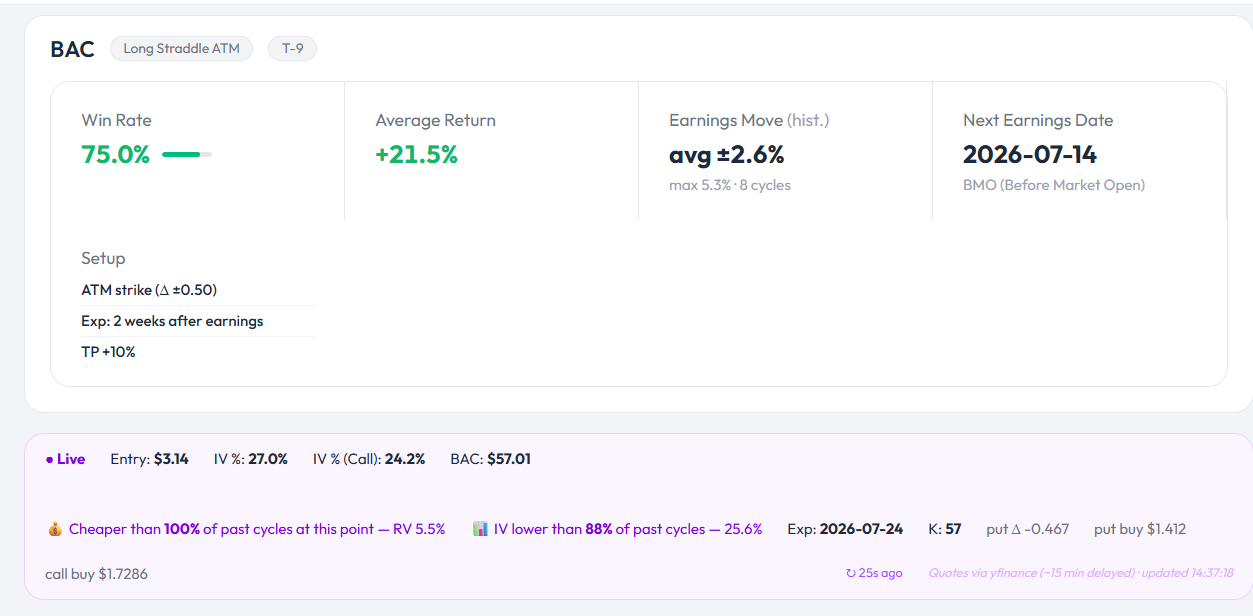
 @Romuald first test run was a success as BAC hit 10% target just after open .... that write up is awesome very worthy of a second or even third read ... thanks
 -
 Why new developments call for a fresh look at pinning here are, however, specific reasons to revisit pinning as a retail option investor strategy and the first and foremost of this was the announcement on April 16 by the SEC as reported (in this case) by Schwab: "...Under the new rules, traders will no longer be required to maintain a minimum account balance of $25,000 to engage in frequent margin day trading. Instead, eligible margin accounts of more than $2,000 will gain access to intraday margin buying power set by individual brokerages based on current positions and maintenance margin requirements. Currently, under the old rules, four or more day trades in five business days triggers a "pattern day trader" designation and the $25,000 requirement. Under the new framework, the pattern day trader designation will be eliminated, and day trades will no longer be counted...." (or see this video) 1) The biggest limitation to use pinning or expiry strike price effects was the pattern day trader issue. Inevitably strike price effects whilst usable from the Thursday before expiry to the Friday concentrated on the last trading day. Relatively complex positions are required with three or more legs and therefore pattern day trading was unavoidable. This in turn meant that $25,000 had to be in your account and yada yada. Well this is no longer the case and we can trade freely with most brokers; 2) The advent of 0DTE options has contributed massively to an increase in strike price effects. Older research attributed strike price effects to market makers unwinding massive static open positions built up over month at the crunch time of the 3rd Friday expiry. The effects being strongest at the so called ‘triple witching hour’ when stock index futures, stock index options and stock options would expire (3rd Friday of March, June, September and December respectively). With the multiplication of expiries this has decreased dramatically but the advent of shorter options drives market maker gamma hedging. Positive gamma (net long options) forces market makers to buy shares when a stock drops and the reverse if it rises. This creates a mean-reversion mechanism that drives stocks towards strike price levels. 3) A great deal more study was expended looking at the 0DTE options and they have validated something noted in the 2019 article: mid-strike pinning. At the time it was an empirical observation that stocks prone to pinning sometimes gravitated to the exact mid-point between strikes and pinned there instead. This phenomenon is now known as the gamma wall. Competing hedging behaviour finds an exact equilibrium which causes a pin at the mid-level as every hedge needs to be either over or under the current stock price. As the market is a random phenomenon market, makers cannot choose altogether to go for the one or the other. The stock then becomes stuck in a liquidity pocket halfway between strikes. In other words pinning and strike price effects are alive and well and in fact exploitable more than ever. Strike price effects: pinning, crosses, wild trading Steady Options is a unique service in that it proposes strategies that are typically appropriate for the retail investor. Most of us are unable to harness quant strategies or massive positions exploiting minute arbitrage pricing differences. Many people feel that the game is therefore rigged in favour of big money. Sure, if you go head to head with Goldman Sachs you will be crushed. What else would you expect? It’s like going head to head boxing with Mike Tyson in his prime. The retail investor benefits from his ability to trade small, which means better prices than those opening very large positions. Furthermore, there are certain phenomena like rising volatility towards earnings or the effect of additions to the S&P index that cause predictable effects on elements involved in option pricing. A retail investor can count on those and exploit them where a larger investor would find the market as a whole moving if he attempted the same. Pinning is a phenomenon that certain stocks gravitate towards the strike price of an option on the expiry of that option (generally Friday). Pinning is deemed to occur if the stock price remains (and ends) within 15% of strike spacing. This is an adaptation of Jeff Augen’s approach which used static values to determine whether pinning occurs or not. Nominal Stock Price Strike Spacing Old Static Threshold Dynamic Threshold (15% of Spacing) $40.00 $1.00 $0.40 (Too loose) $0.15 $150.00 $2.50 $0.40 (Perfect) $0.37 $350.00 $5.00 $0.40 (Too tight) $0.75 $600.00 $10.00 $0.40 (Impossible) $1.50 This simple visual from my previous article with a live example by AAPL speaks plainly enough as regards to the phenomenon of pinning itself: Figure 1: APPLE 17 March 2017 Expiry The Y-axis is in dollars representing the amount that the stock was trading away from a strike price. The X-axis represents the number of minutes since trading started (a total of 390 minutes). As noted, a stock can also pin in between strikes – a so called mid-way pin. One needs to analyse specific stocks to make a choice but the phenomenon sometimes takes the shape of the above with a sudden plunge or rise towards a strike. At other times a stock will cross a strike price over and over during the final trading day. Another known strike price effect is the sudden inflation of IV towards the day prior to expiry (usually Thursday) around 4 p.m. and the deflation of that IV in the first half hour of trade on the Friday morning. Same as with our earnings or SPY addition trades, no effect is repeated 100% of the time, in fact even in ideal conditions the effect occurs only 50% of the time. Any strategies must therefore be combined with clear risk limitation tactics taking into account we also know that IV will rise exponentially as we near the bell for ATM strikes. Which stocks are suitable? Broad research shows all stocks are affected – oddly even ones without options – however most option strategies that can be used to exploit them require liquidity and narrow spreads. Here is a list of requirements that need to be fulfilled, ideally in all cases but in any case not massively off target: Liquid large cap optionable stocks with small spreads and a stock price over 100$ or more. The general environment must be one of low VIX – if VIX is high you will get ripped because of underlying market effects. Absence of macro catalysts, so no morning CPO, FOMC, significant earnings by market moving stocks and above all shield us from Trump tweets. Check open interest on the day – it should be heavily stacked on a single psychological strike generally a round number or at least a multiple of 5. This should be quite asymmetric to the remainder of stock open interest at other strikes. The expiry day strike price effects occur over a slightly broader range than my original article averred. You can start looking for effects around 11 a.m. right up to even 1 p.m.. Closing always before the end of day and a minimum of 15 minutes as closing minutes get crazy. If we speak of volatility effects of the end of day before expiry the opening should be around 4 p.m. and closing maximum 30 minutes after the opening. With the proliferation of expiry dates, Friday is not necessarily the only day but liquidity remains the biggest issue. AAPL remains a pinning stalwart and before its company split FDX was the loose electron that would gravitate over and under a strike. GS, MA, NVDA and similar stocks are all worth examining for potential strike price effect opportunities. What option strategies are suitable? In options trading nothing beats being right on direction whatever that direction is, so this includes the stock being stationary. How to exploit that knowledge really has no limit due to the flexibility of options as a trading instrument. Here are just some scenarios with stocks that you believe will pin. The ideas can be tweaked based on the situation. Exploiting the day before expiry This builds on the brief collapse in volatility after 4 p.m. on Thursday, its reinflation on Friday morning and the fall again after 10 p.m. that day. A simple way is the ratio trade for example if the stock is between strikes S and S+1 (the +1 in this case being the next optionable strike not 1$ necessarily). The position is to be opened on Thursday around 4 p.m. if the other criteria for strike price effects (see above) have been met. Buy 10 calls of next day expiry at S Sell 30 calls of next day expiry at S+1 The position should be closed at 10a.m. on Friday and will generate substantial profits even if the stock rises to the S+1 strike price. This is due to volatility decreasing and theta decay. A heavy drop in the stock will be buffered and losses should be manageable. Likewise an unexpected strong rise of the stock is temporarily buffered by the volatility loss and the long underlying position. The position is not proof to all circumstances but simply sufficiently flexible to bail if it goes sideways. If the stock is really pinning at S+1 you should hold till the end as that will maximize profits. On the hand a massive, runaway gap up past represents a maximum risk zone, which is why a disciplined hard exit at Friday's 10 a.m. open is non-negotiable. The classic pin This strategy presumes that you see pin occurring at a particular strike S. As stated, that should become apparent between 11 a.m. to 1p.m. on the expiry day. The lull in trading caused by lunch is helpful to get good prices. Buy 10 calls at S-1 Sell 30 calls at S Buy 20 calls at S+1 or Buy 20 calls S=2 to limit margin and have an open balanced wing butterfly. This position should be closed at the latest 10-15 minutes before the bell when ideally the value of the ATM calls has been bled dry by theta. It relies fully on a real pin at a strike occurring and will lose money in free trading or mid-pin outcomes. A less trade intensive variant is to sell a call or put at S (the pinning strike) and buy the same one week out. You then wait for the short option to bleed its premium whilst the smaller amount of theta bleeding from your long still protects you in case things go sideways. The mid-way pin If you foresee the stock sticking between two strikes one can open an Iron Condor ‘Plateau’ spread (again between 11 a.m. to 1 p.m. on the expiry day). Buy 1 Put at (OR S-1) Sell 1 Put at -1 (OR S) Sell 1 Call at (OR S) Buy 1 Call at (Or S+1) Like all these strategies, you can’t afford to walk away whilst this is playing out but the set-up works in case of a mid-strike pin and if held to (near) the end even if S-1 or S+1 are reached. The biggest issue used to be that not many stocks provide sufficient premium to make it worth one’s while to open this but it is possible with some high volatility high priced stocks. With the current run of high value tech stocks, however, the story is different and IC premiums can be attractive. Utilizing crosses-gamma scalping As mentioned some stocks are known– FDX was notorious for this at least until their stock divestment – for not pinning in a fixed manner but continually crossing a pinning strike either to the upside or the downside. The idea in this case is to utilize the lull in trade as of 11am to 1pm to open a straddle at S if the stock happens to be there. If the stock moves up or down, one or the other side of the spread will make a gain. Occasionally this in itself will be enough to take a profit but usually it is not. The trick is then to delta hedge by either going long or shorting shares to neutralize your delta. Option software to know how many shares to sell is helpful here but one can eyeball it to a degree. Once the stock moves back to S one can close the stock position (or the whole position) and make small gains. Beware of attempting to sell short straddles when the stock is away from S, pinning happens tops 50% of the time so you can find yourself with a huge loss if the stock goes to S+1 or S-2 whilst the profits from all the above strategies are modest. Finding candidates As mentioned above, we need high liquidity stocks with massive option volumes and a clear indicator in the open interest that a pinning situation or crossing is on the books. With the advent of AI, things have become considerably simpler compared to 2019 when the previous article was published. At the time there was nothing for it but to laboriously download data and run analyses through excel on it (at least as a retail investor). With the help of AI we have created a number of little python scripts which can help you. They can be run from python directly if you have that installed but you can also run it in Google Colab. When you run this simple script (see file below entitled simple script), you will be asked to input a ticker, a date for which you want to run the analysis – limited in this case to the previous 4 weeks as the source is Yahoo which is free for that period – and then an entry time. You will get – for example for MSFT – an output like this: So in this example MSFT did a min pin level for most of the trading and a strategy utilising that and closed in time would have yielded a good result. Historical outcomes do not guarantee a repeated pattern but the idea is to visualise for you how you can identify what the potential pinning level might be and see where trades might have been successful. This can then help you to open positions. The second script (see file below called complex script) is a little more involved, it requires you to have a polygon.io account (free) so that the minute by minute stock data can be downloaded. If you register, your dashboard will give you an API Key that you need to paste in to run it. The script requires 10 minutes+ to run because there is a limit on the amount of data you may download. It gives the following output for, again, MSFT in this case: Note that the values for the option spreads are based on Black & Scholes and not downloaded data. They are not going to be identical to what’s in the market but not a million miles away either. In this case we asked the script to determine the best entry price rather than asking it to pick one as that wouldn’t make sense during a whole year. The outcome is that actually the midday lull – after major morning institutional activity is over – remains the best time to take the jump to open a position. Waiting until at least 12 noon reduces the number of Free Trading outcomes – that is where no perceptible pinning occurred – to 25% or less. What is also clear is that when VIX is higher – i.e. over 16 – more free trading failures occur, whereas below this the number of successful trades is almost double. The cross count column is a powerful indicator of market maker positioning. The distributions across your 39 weeks reveal a stark reality: Intraday Gravity Days: Feature a massive average of 20.2 strike crosses. Classic Pin Days: Feature a clean average of 7.3 strike crosses. Mid-Pin Trap Days: Feature a low average of just 4.4 strike crosses. If you enter a trade during the midday lull and the stock begins to continuously slice back and forth across your target strike, market-maker gamma walls are actively trapping the asset. The heavy volume is forcing a tight mean-reversion around that strike pivot. However, if you establish a position and the stock drifts away without crossing your strike at least twice within the first 30 minutes, the gravity is absent. Given the low cross average on trap days, the asset is likely locked into a clean, low-friction trajectory straight toward a mid-pin hit. For MSFT – based on the last year – a good guide seems to be to open after 12 noon, to avoid ratio strategies if VIX is under 16 but to use an Iron Condor instead. Note that this requires a stock that has a high price – around $300+ although a high beta-stock will also work. Finally, if within 30minutes of opening the trade there are few crosses you should consider that the position might migrate to a mid pin. Change your position in function of that. Finding what works Without boring everyone with the various back-tests that were carried out, analysing stocks with rather different characteristics in the manner described above yielded an interesting playbook of strategies to play. Check the VIX. If it is printing above 20.0, walk away. Institutional fear is too high for pinning to work. If trading a High-Priced Mega-Cap (e.g., MSFT): Check the morning session's realized volatility proxy. If it passes your 17% VIX floor, deploy an OTM Iron Condor (Short Put / Short Call). It provides an airtight, 100% historical safety net. If trading a Mid-Priced, Low-Beta Tech Asset (e.g., AAPL): Completely avoid the OTM layout—the market won't pay you enough to justify the margin. Instead, deploy the ATM Iron Fly to harvest a premium cushion that neutralizes the mid-pin traps. If trading a High-Beta Volatility Outlier (e.g., FDX): Again deploy the OTM Iron Condor. The asset's native whipping action guarantees a good premium payout to sit safely behind a wide strike wide protective boundary. Remember also that the cross-count is a key indicator whether things are going as you expected or not. This is not a fire and forget kind of strategy but one where you sit behind your computer and watch the skies err... the market. Conclusions Pinning is alive and well and there are opportunities for retail traders for the very good reason that institutionals cannot profitably trade such tiny volumes easily. Whether it is a good strategy does depend on the environment and low VIX at the minimum is required or it becomes too risky. Oddly, another factor that is important is the high prices of current high liquidity stocks – this facilitates the use of Iron Condors or Iron Flies which can show excellent outcomes based on holding a position for just a few hours or less. As usual, you do have your eggs in one basket so you’d better watch that basket. In 2019 we estimated a 6% per month return was possible taking into account inevitable losses. With the refinement and encompassing of mid-pin outcomes which enables us to be >60% in having a pin, mid-pin or mid-day gravity outcome, we should have better results than before.
 -
 Good morning Romauld, Great Analysis and discussion! Thank you. Sarang
 -
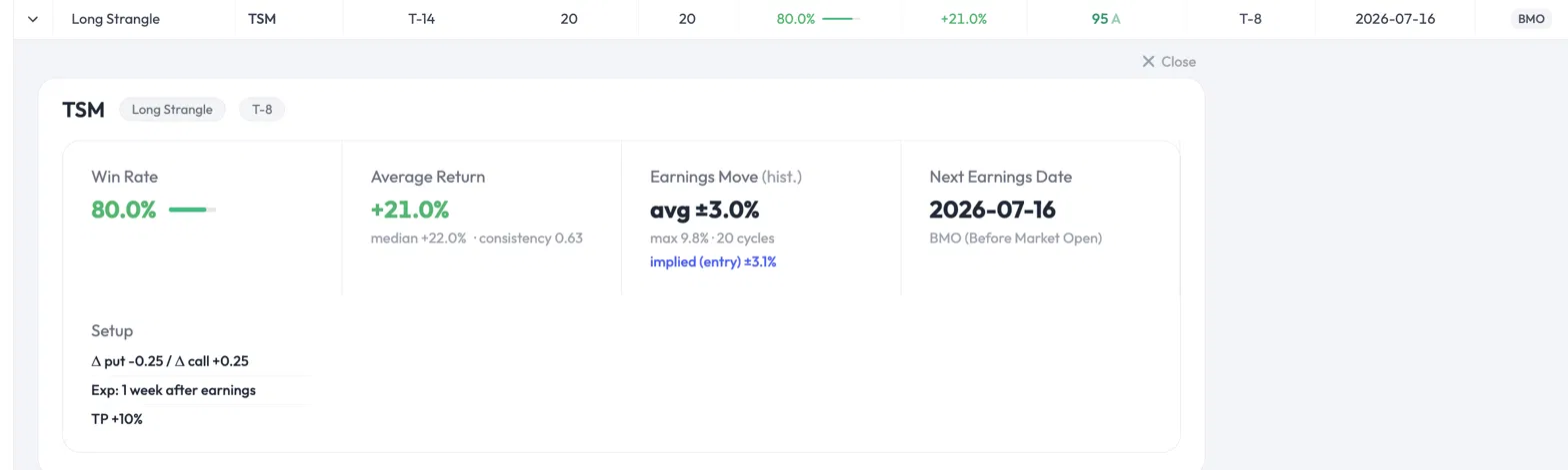
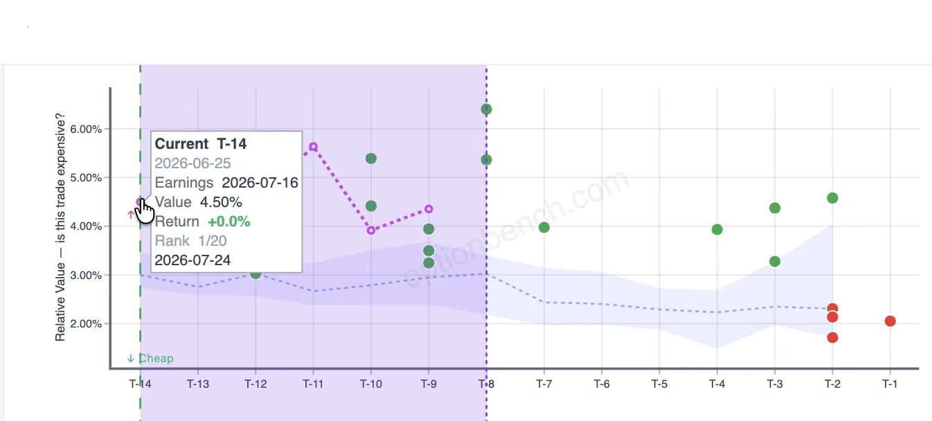
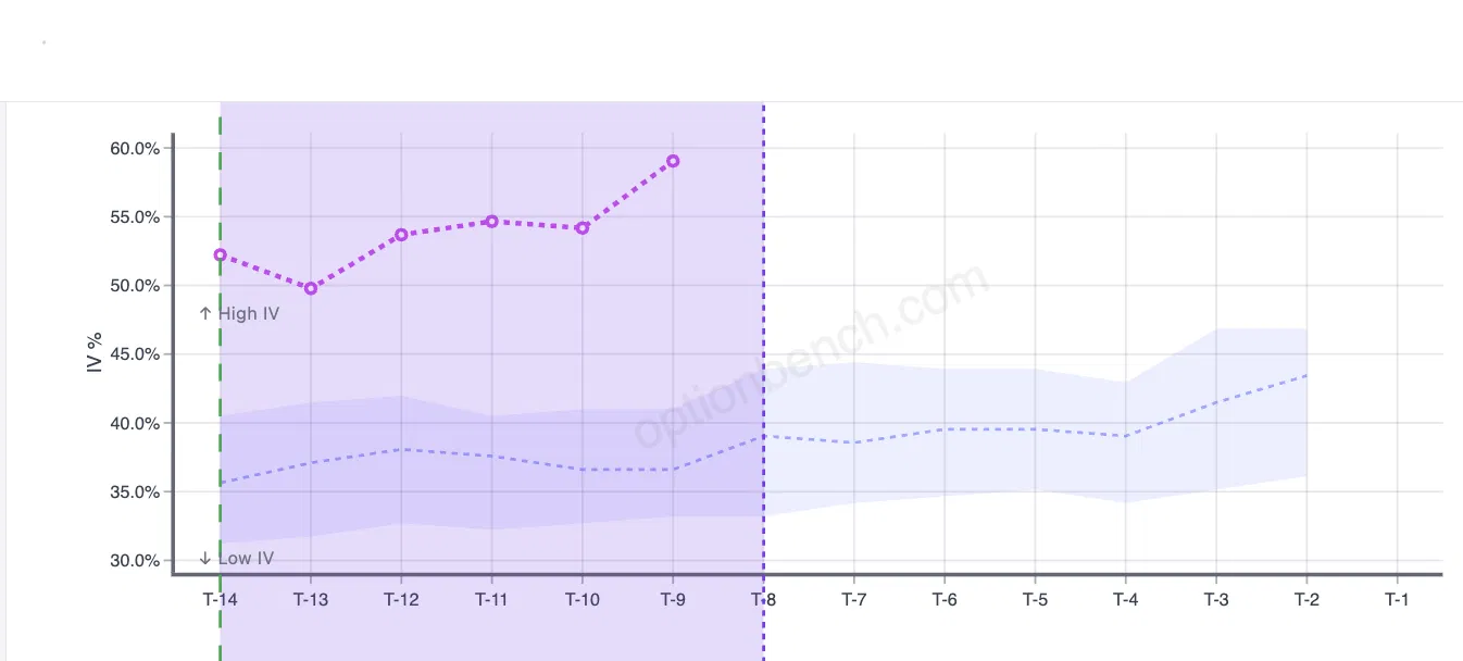
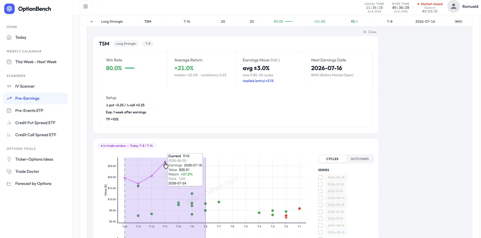
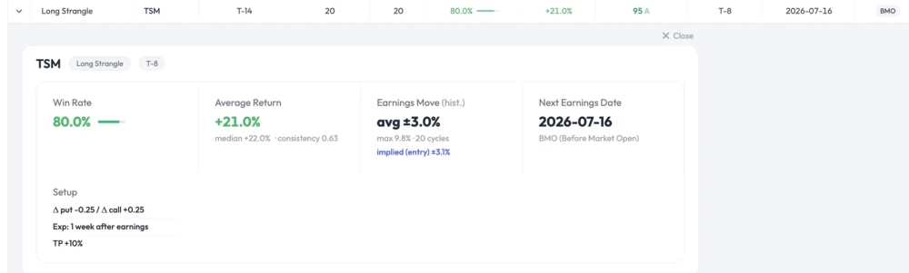
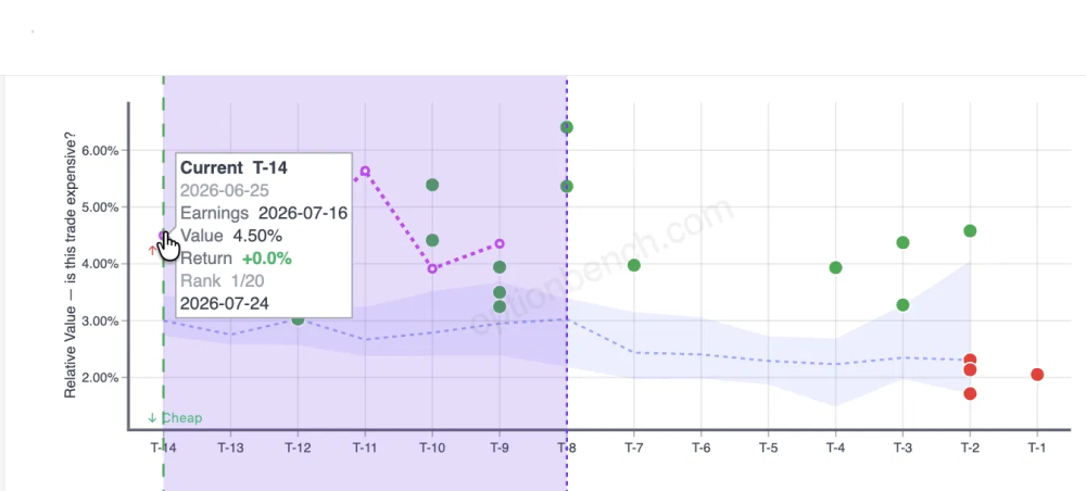
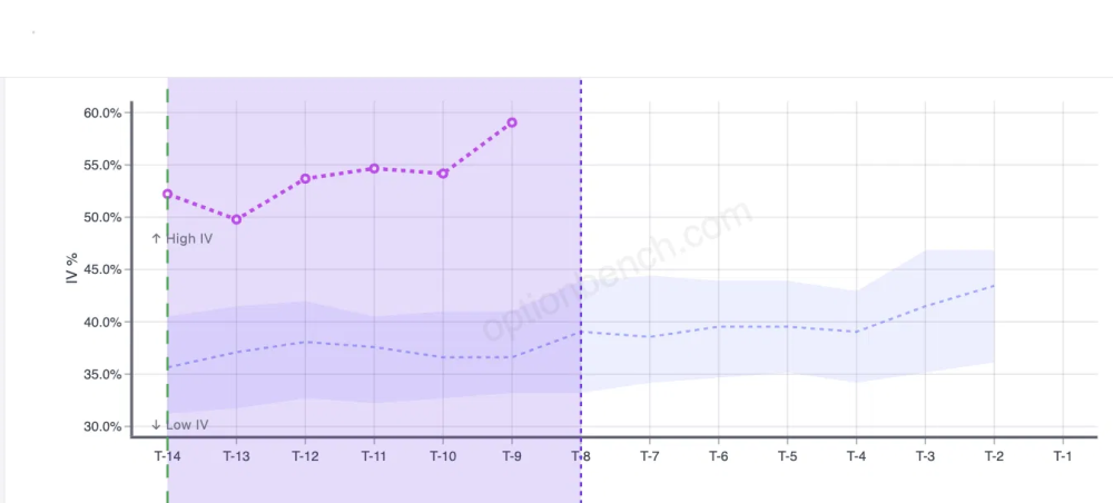
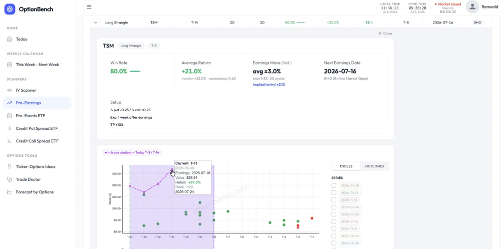
An 80% Win Rate on One of the Most Expensive Entries in the Ticker's History. Would You Take It? Here's a trade the OptionBench pre-earnings scanner flagged, and a question worth sitting with before you read the answer. [CAPTURE 1 — Win Rate 80% / Average Return +21% (median +22% · consistency 0.63) / Earnings Move avg ±3.0% implied ±3.1% / Next Earnings 2026-07-16] TSM reports earnings on July 16. The scanner flags a Long Strangle entered fourteen trading days out — on Thursday, June 25 — with Δ ≈ 0.25 on each side, expiring one week after earnings, taking profit at +10%. The headline numbers look strong: an 80% win rate over 20 past cycles, a +21% average return, a +22% median. Then you look closer, and two things should make you hesitate. First, the strangle is expensive. Its cost as a share of the underlying — the entry's relative value — sits at 4.5%, against a historical average of about 3.1% at this point in the cycle. Second, implied volatility is elevated: around 52% at entry, climbing toward 59%, well above the ~37% this name usually carries here. Every instinct trained on "buy low, sell high" says the same thing: it's expensive, IV is high, wait for it to come back down. And here's the part that should really give you pause — this entry isn't just above average. It ranks among the most expensive entries the scanner has on record for TSM at this point in the cycle, with implied volatility near the very top of its historical range. So: one of the most expensive entries on record, IV at its highs, and every reflex telling you to pass. Would you take the trade? The instinct that costs you the trade Most traders pass here, and their reasoning feels airtight: if it's the priciest it's ever been, mean reversion says it gets cheaper, so I'm overpaying. That reasoning conflates two different things — the price of the option and its expected value. They are not the same axis, and treating them as one is the single most common way traders talk themselves out of good pre-earnings trades. Let me show you why, with this exact trade, using numbers you can pull from the scanner yourself. "Expensive" is not the same as "overpriced" The first question a rigorous trader should ask isn't "is this expensive?" It's "is the market pricing the move correctly?" [CAPTURE 2 — Relative Value « is this trade expensive? », tooltip T-14 : 2026-06-25, Value 4.50%] The scanner answers this directly. Two figures sit side by side in the banner: Implied move at entry: ±3.1% — the move the strangle prices in, averaged across the 20 past cycles at this entry point. Realized earnings move: ±3.0% — the actual average move TSM has made on earnings, same 20 cycles. These are essentially equal. The market is not systematically underpricing TSM's earnings move, and it isn't wildly overpricing it either. The strangle is priced fairly relative to what the stock actually does. So if the option is fairly priced on the move, where does an 80% win rate come from? If the market gets the move right, the edge can't be coming from a mispriced move. It isn't. And that's the whole point. Where the edge actually lives The edge in this trade is not a bet that TSM moves more than the options imply. It's the capture of IV expansion into the event. [CAPTURE 3 — IV % : IV rising from ~52% (T-14) to ~59% (T-9), above historical band ~37%] You enter at T-14. The plan is a good-till-cancelled order to take profit at +10%, exiting before earnings and the volatility crush. And if the +10% never triggers? You still exit before the print — the position is closed at T-2 (for a before-market report) or T-1 (for an after-market one), no exceptions. You never carry the trade through earnings. That's the key risk control: this strategy has no exposure to the earnings gap itself, win or lose. In the window you hold the position, the option premium tends to inflate as the market crowds into the event. You're not holding through the print and hoping for a big move. You're buying anticipation and selling it a few days later, richer. [CAPTURE 4 — Value $, tooltip T-11 (2026-06-30) : Value $26.91, Return +37.5%, Rank 1/20] On the current cycle, that's exactly what played out. Entered at T-14 near $19.57, the strangle was marked at +37.5% by the close of T-11 (June 30) — and earnings hadn't even happened yet. Now, you wouldn't have pocketed +37.5%: your +10% GTC would have filled well before that, somewhere in the intraday tape as the position ran up. The realized gain is +10%, the take-profit. But that +37.5% end-of-day mark is the evidence that the target was hit comfortably, and early. The move you'd have been "waiting to see" is irrelevant to this trade, because you're out before it happens. This reframes "expensive" and "high IV" completely. They aren't warning signs to avoid. They're the fuel. A cheap, low-IV strangle would have far less premium to expand. You want the anticipation. You're selling it, not buying into it. (One honest note for the careful reader, because it matters: the "realized move" measures the one-day earnings gap, while the "implied move" is priced by an option that lives a full week past the event. They're not a perfect apples-to-apples comparison — the option captures the gap plus residual post-earnings vol. If anything, that makes the "fairly priced" read conservative. I'd rather flag it than have someone catch it and assume I was hiding it.) What should have driven the decision Not the price. Not the IV level. The conditional statistics — the numbers the scanner exists to surface: Win rate: 80%, conditional on entering at T-14, over 20 cycles — meaning 80% of those cycles hit the +10% take-profit before the event. (It's a TP-hit rate, not a vaguer "was it green" rate; worth being precise, since it's the number the setup is actually built around.) Average return +21%, and — this is the one that kills the "it's an outlier" objection — median return +22%. The median sitting at or above the mean tells you the average isn't propped up by one lucky cycle. The typical outcome is a strong winner. This is a regular edge, not a lottery ticket. That distinction is everything. An 80% win rate with a median of +22% is a fundamentally different animal from an 80% win rate where the average is dragged up by a single monster cycle while everything else limps. The scanner shows you which one you're looking at, and here it's the good kind. The honesty that makes this defensible I'm not going to pretend this is a free lunch, because it isn't, and the scanner won't let me pretend. There's a consistency ratio of 0.63 on this trade — mean return divided by the standard deviation of per-cycle returns. It measures how regular the edge is, and 0.63 is moderate. The edge is real and it repeats, but there's genuine dispersion: the 20% of cycles that lose, lose meaningfully. This is a trade to size with control, not to back up the truck on. That's not a caveat buried at the bottom. It's the point. A tool that only ever tells you a trade is great is a marketing tool. A tool that hands you an 80% win rate and a 0.63 consistency ratio in the same breath is giving you what you need to size the position honestly. And one more line I won't blur: the current cycle is a single live data point, and a single data point proves nothing. That the take-profit was hit early this time is encouraging, not evidence. The case for entering doesn't rest on it. It rests on the 20-cycle conditional distribution: 80% of cycles hitting the +10% target, a +22% median across all of them. The live cycle is an illustration of that statistic playing out, not the proof of it. If you take one thing from this piece, take that sentence. The takeaway Don't confuse the price of an option with its expected value. They live on different axes. An option can be among the most expensive it has ever been — near the top of its own historical range, IV at its highs — and still be the right trade, because the price of the option and the odds of the trade are two separate questions. "Expensive" answers the first. The 80% win rate, the +22% median, and the 0.63 consistency ratio answer the second. That second set is what should drive the decision. The whole reason a tool like this earns its place is that it puts both answers on the same screen — so you're not passing on a good trade because an instinct trained on the wrong axis told you it looked expensive. Numbers in this piece are pulled directly from the OptionBench pre-earnings scanner (TSM, Long Strangle, T-14 entry on June 25, 2026, 20-cycle sample). Every figure — implied vs. realized move, median return, consistency ratio, entry relative value — is visible in the tool. Verify them yourself; that's the point. Beta-testing is ending by the end of July but you can still give your feedback and ask for signing in on the OptionBench Beta Web Site.
- Last week
-
 pran1512 joined the community
 -
 Lawyer joined the community
 -
@Romuald here we go wish me luck 😁
-
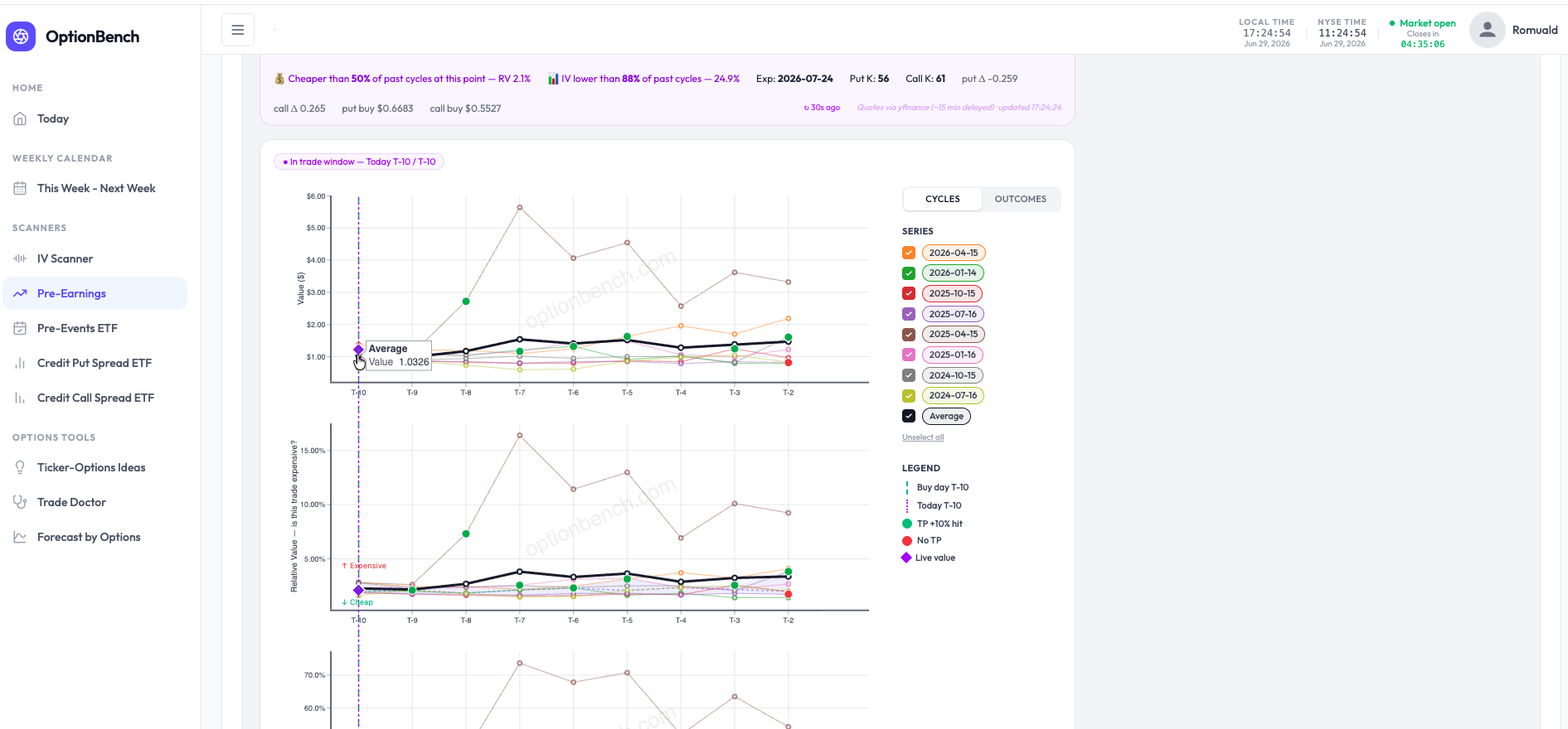
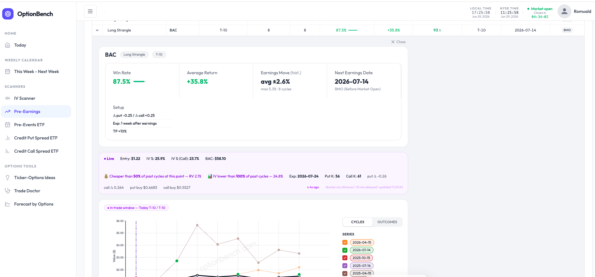
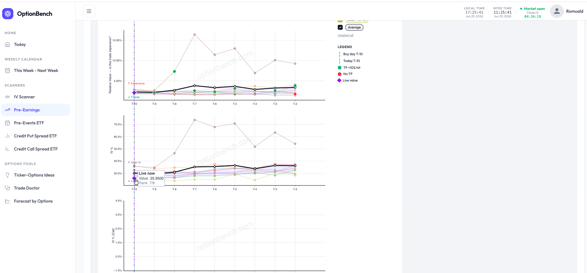
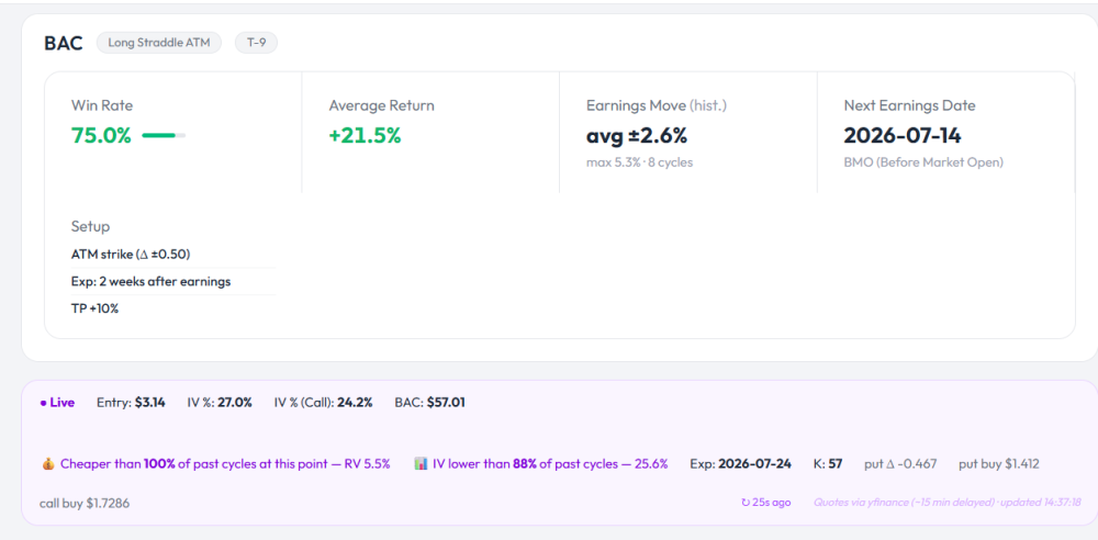
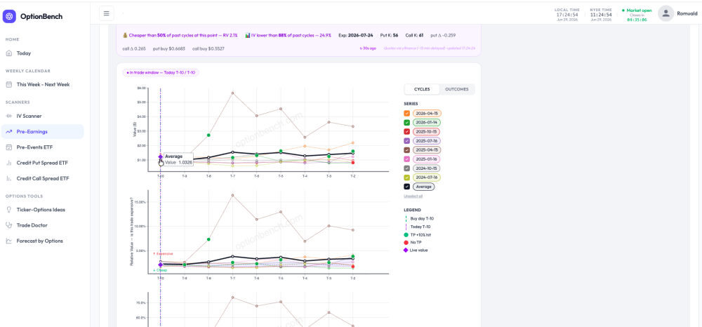
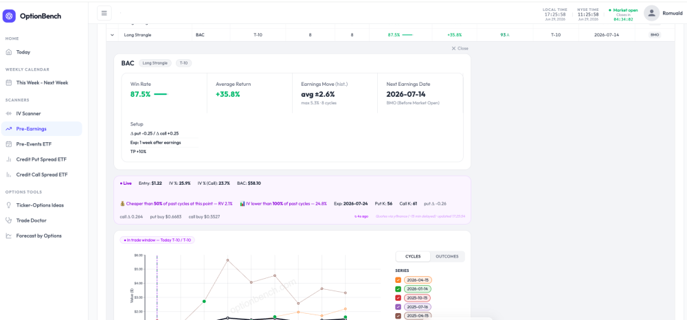
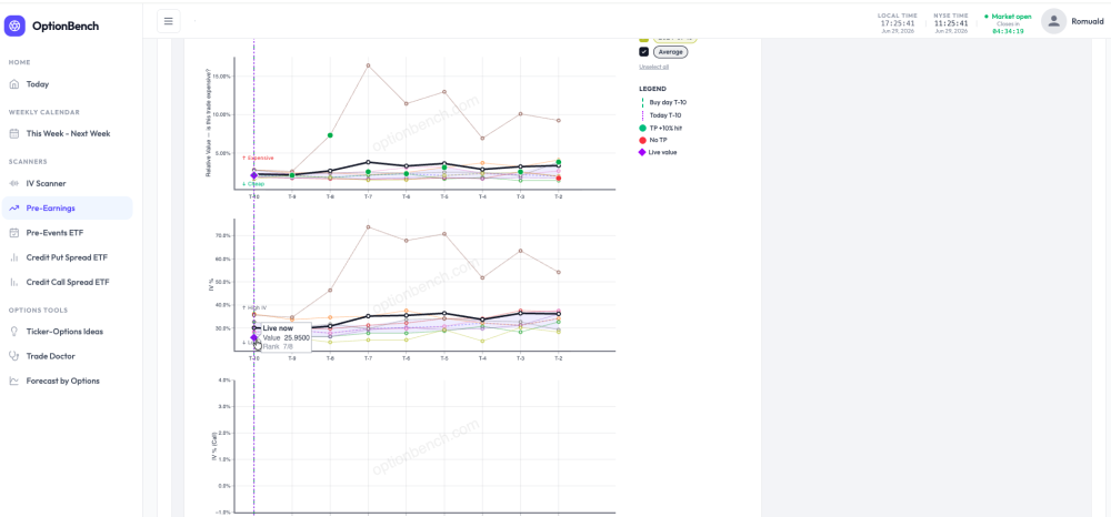
Building OptionBench with you, not just for you What three weeks of beta feedback changed When we opened the OptionBench beta a few weeks ago, the plan was simple: put the tool in front of real options traders and listen. Sixteen of you took us up on it. A handful have been relentless — sending detailed questions, catching things we missed, pushing back when something didn't add up. This post is a thank you to those of you who've been active, and a look at what your feedback actually changed. Because it changed quite a lot. The thread running through all of it is one idea: put yourself in the trader's seat. Not "here is some data" — but "here is what you need to see, at the moment you're deciding whether to take this trade." You questioned the live values — so we built entry context One of you noticed that the live value of a position on the chart didn't line up cleanly with the historical cycles plotted next to it. A small thing on the surface. But it pointed at a bigger gap: the chart showed you where past cycles went, but not where you stand right now relative to them. So we added it. When the market is open and you're inside the entry window, the live banner now tells you exactly how today's entry ranks against every past cycle at the same point in time: 💰 Cheaper than 50% of past cycles at this point — RV 2.1% 📊 IV lower than 88% of past cycles — 24.9% Hover the live marker on any sub-plot and you'll see its rank there too — Rank 2/8, 5/8, whatever it is — so you can tell at a glance whether you're getting in cheap, average, or rich versus the stock's own history. This is the part we're most happy with, because it's exactly what experienced traders already do by eye when they read a relative-value chart. We just made it explicit, and put a number on it. You asked how much the stock actually moves — so we measured it A recurring question: how much does this name typically move on earnings? It's the first thing you want to know before buying a straddle or a strangle into a report. We now compute the realized earnings move directly from each stock's history — the average and maximum one-day move of the underlying on its past earnings reactions, properly aligned to whether the company reports before the open or after the close. We cross-checked the numbers against two other websites on several names and they line up. It's shown as a plain historical fact — this is how the stock has moved — not a prediction. What you do with it is your call. You read the RV chart by eye — so we drew the distribution If you trade calendars or volatility setups on SteadyOptions, you already live in relative-value charts. The usual approach is to eyeball the average line and ask "am I above or below it?" That works, but it hides something: a single average line tells you nothing about how spread out the past cycles were. Being "below average" means very different things depending on whether the cycles were tightly clustered or all over the place. So each RV and IV sub-plot now shows the dispersion band — the middle 50% of past cycles (25th to 75th percentile) plus the median — at every point before the event: Now "cheap" isn't a guess. You can see the full range the stock has traded in at this point in its cycle, and exactly where today sits inside it. The common thread None of these are flashy. They won't promise you an edge or a win rate. What they do is the same quiet thing: make visible, at the moment you decide, what you used to have to estimate in your head. Where does today's entry rank against history? How much does this stock really move? How wide is the range I'm trading inside? Those are the questions a careful trader asks anyway. We're just trying to answer them on the same screen, while it still matters. That's what "putting ourselves in the trader's seat" means to us — and honestly, we've only been able to get close to it because you've been telling us, in detail, where we were getting it wrong. Keep it coming The beta is free until 31st of July, and the feedback loop is the whole point. If something looks off, if a number doesn't match what you expect, if there's a question the tool should answer but doesn't — tell us. The most useful changes so far have all started as a message from one of you. Thank you for building this with us. Romuald & The OptionBench team
- Earlier
-
 MAITrading joined the community
 -
 Lopiccolo and Heyde changed their profile photo
 -
Lopiccolo and Heyde joined the community
-
 FinSoft changed their profile photo
 -
FinSoft joined the community
-
 vbattu joined the community
 -
 regulus12 joined the community
 -
We've Partnered with EarningsStudy — Free Core Access for SteadyOptions Members (with all services bundle subscription) Every so often we come across a tool that fits what this community is actually about — doing the work, understanding the trade, and not paying a fortune for the privilege. We've found one, and we've arranged something for you. We're pleased to announce a partnership with EarningsStudy, an earnings-focused options analytics platform. As a SteadyOptions member with Subscription to all service bundle, you get access to EarningsStudy's full core platform at no cost — the same membership their private members pay for, opened up to our community. Why we partnered with EarningsStudy We don't put the SteadyOptions name behind tools lightly, and we don't recommend anything we wouldn't use ourselves. What won us over is that EarningsStudy isn't a product spun up overnight to ride a trend. @krisbee along with me @Kim has been building and refining the platform for more than four years — through every kind of earnings season and every kind of market. That's the same patient, do-the-work mindset our members will recognize. Just as important is the intention behind the offer. Our goal is simple: give back to the trading community by putting the core features in as many serious traders' hands as possible — free, for as long as possible. That's not a limited-time gimmick to harvest sign-ups. It's the reason this partnership exists, and it's why it sits so naturally alongside what we do here. What you get as part of core features Everything below is part of the access you're being given: Earnings calendar — Every upcoming report across 1,000+ tracked symbols, so you spot high-conviction setups early instead of scrambling the morning of. 12 options strategy models — Straddles, strangles, iron flies, calendars and double diagonals, call debit spreads, and long options — each modeled and ranked by expected edge so you compare apples to apples. Expected move & volatility — See exactly what move the market is pricing into the print, before and after it happens, instead of guessing. Side-by-side strategy comparison — Stack candidate strategies against one another for the same name and event, and let the numbers pick the winner. Post-earnings outcome analysis — Learn how comparable setups actually resolved after the report, so your decisions are grounded in history, not hope. Peer earnings view — Read a company against its peer group to catch the read-through plays others miss. Personal watchlists & favorites — Track only the names and setups you care about, and surface them instantly. Track your strategy setups — Follow a setup from the moment it catches your eye all the way through the print. Pin the strategies you're watching, see how their pricing and expected move shift as the event approaches, revisit the history behind each one, and review exactly how it played out afterward — so every setup you track becomes a lesson that sharpens the next one. Fresh data, daily — The whole platform is refreshed every day, so you're acting on what's true now. …and a lot more — These are the headlines, not the full list. The platform rewards the curious, and you'll keep finding tools the deeper you go. And this is just the core. EarningsStudy also has an additional layer of advanced features still in the wings — capabilities that aren't part of the free core offer yet. As they're released, our members will be among the first to see them. How to get in EarningsStudy has set this up in two paths, depending on your SteadyOptions plan. All services bundle SteadyOptions members — you're already pre-approved If you hold the all services bundle SteadyOptions membership, your EarningsStudy application is pre-approved. There's nothing to wait for. Go to https://earningsstudy.com/ Sign in with the same email address you use here on SteadyOptions Complete the short onboarding questionnaire That's it — every core feature unlocks immediately Because you already hold the full membership, EarningsStudy has cleared the approval step in advance. Just bring your existing email, answer a few quick questions, and you're in. On another SteadyOptions plan — register and you're on the list Not on the all services bundle membership? You're still welcome. Register at https://earningsstudy.com/ using the same email you use on SteadyOptions You'll join EarningsStudy's early-access waiting list Access is opening in waves as EarningsStudy scales up its servers to handle the volume — so registering now secures your spot in line. The sooner you sign up, the sooner you're in. In the spirit of SteadyOptions This is exactly the kind of thing we like to do. SteadyOptions has always stood for educating traders and handing them the real tools to stand on their own — not gatekeeping, not hype, just giving our community what it needs to trade independently and well. Most of the time that means writing: breaking down strategies, sharing trades, explaining the why behind every decision. This goes a step further. Rather than only writing about how to read an earnings setup, we're putting the actual platform that does it into your hands. Articles teach; tools empower — and today you get both. Consider it a thank-you to a community that has always given generously, alongside a partner who clearly wants to do the same. Earnings move fast. Now you'll see them coming. — The SteadyOptions Team NOTE: Any questions/issues, send DM to @krisbee @Kim
-
 LotusAcademy joined the community
 -
 Mortgage Vintage changed their profile photo
 -
Reading a low-IV name with the OptionBench IV Scanner: TLT today Every morning OptionBench flags the highest and lowest average IV Rank among the tickers we scan — not the whole market, just our watchlist. This morning (Monday, June 22), TLT came up as the lowest: an average IV Rank of 0, with 30-day IV at 8.8%. At the other end, TSM topped the list around 50.8% — the scan surfaces both extremes, so on any given day you can see which names are sitting at the cheap end of their own vol range and which are at the rich end. Here I'll walk through the low end. A low IV Rank on its own isn't a signal — it just says "this name's implied vol is near the bottom of its own recent range." It's easy to glance at a low rank and reach for a reflexive conclusion ("vol is cheap, buy premium" or "nothing to do here"), but the rank alone doesn't tell you whether that low IV is actually cheap relative to how the stock tends to move. That's the gap the scanner is built to close: it tells you what that low IV has historically meant for TLT's actual movement. That's the piece I want to show. What the IV is actually pricing Here's the line that I think earns its keep. Pulling three years of TLT history, the scanner compares what IV priced (the 1-sigma implied move) against what the stock actually did: Over 45 trading days, IV priced 68% more move than realized (median ±6.4% implied vs ±3.82% realized, 756 observations). Right now, IV is pricing a ±4.34% move — in the cheapest 2% of the last three years, 14% above what this name typically realizes. When IV priced a move like today, TLT historically realized ~±2.05% (median, n=128 comparable days). So instead of "IV is low," you get "IV is in the cheapest 2% of its three-year range, and historically when it was priced this way, TLT moved about ±2% — meaning even this cheap IV has tended to overstate the realized move." That's a far more actionable read, and it's grounded in this ticker's own history rather than a generic rule of thumb. The supporting context The scanner rounds it out with a few descriptive reads, each measured against TLT's own 12-month history rather than absolute thresholds: Mean reversion: IV is currently below its 12-month median — historically the lower-premium regime for this name. Volatility premium: IV 30D 8.8% vs HV20 7.3% is a 1.2× ratio, sitting at the 35th percentile of its own range. IV carries its usual premium to realized vol here — nothing unusual, no strong edge from IV/HV alone. I want to be clear about what this is and isn't. None of it is a forecast. IV can stay compressed for weeks, and "cheapest 2% of three years" is a description of where we are, not a prediction of where we're going. What the scanner gives you is context: a precise, ticker-specific picture of how today's implied vol compares to this name's own behavior, so you can decide whether a setup makes sense for your thesis. In practice, that's how I'd use a read like this — not as a trigger, but as a starting filter. A name showing cheap IV that has also tended to underdeliver on realized move is a different proposition from one that's cheap but has a history of surprising to the upside. The scanner won't make the call for you, but it puts the relevant history in front of you in a few seconds instead of an afternoon of spreadsheet work. Try it From the daily "Today" view, the lowest-IV-Rank badge links straight to the TLT scanner page — one click and you're looking at everything above. If you're in the beta and want to poke at it, this is one of the tools I'd love feedback on. EXAMPLE-IV-TLT.mp4
-
OptionBench beta — a few updates, and a big thank-you We now have 16 beta testers putting OptionBench through its paces, and the feedback over the past couple of weeks has been genuinely useful. Whether you reached out by private message here on SteadyOptions, by email, or on our Discord — thank you. A lot of what changed recently came straight from those conversations. If you haven't taken a look yet: optionbench.com — overview of what the platform does app.optionbench.com — the app itself (beta access is free through until end of July) What's new Average return now sits next to win rate. Across all three calendars — Weekly, Pre-Earnings, and Pre-Events — each trade now shows its historical average return alongside its win rate, color-coded so positive and negative jump out. There's also a new Return filter (Any / >0% / ≥5% / ≥10% / ≥20%) so you can narrow down to setups that clear a threshold you care about. Win rate tells you how often a trade worked; return tells you how much it paid when it did — you want both in view. Current-trade tracking is more reliable. The live "Current Trade" curve on the Pre-Earnings and Pre-Events scanners now renders correctly for the cycle in progress, so you can see exactly where the open trade stands relative to past cycles. Market holidays are handled properly. Reference dates and trading windows now account for NYSE holidays (Juneteenth being the recent one), so the "as of" dates and day counts line up with the actual market calendar. A handful of smaller things came along too — win-rate figures now match exactly between the calendar tiles and the detail pages, and the BOSS and CPS scanners have clearer in-app explanations of why certain names show up (and why others don't). Keep it coming There's plenty still on the list, and your input is shaping what gets built next. If something feels off, confusing, or just missing — tell me. Bug reports, workflow friction, feature ideas: all of it is welcome, and the beta is exactly the time for it. The fastest place to reach me is Discord, but email and DMs work too. Thanks again for helping make this better. EXAMPLE-RETURN-WR.mp4
-
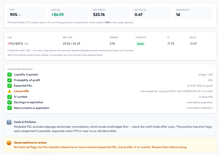
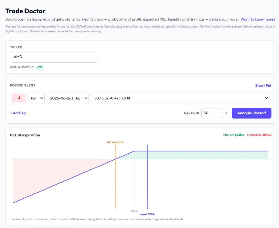
A 90% win rate on a naked put — what the probability doesn't tell you One of the things I hoped for in this beta was that testers would find uses of the tools I hadn't spelled out myself. This week one of them did — and it turned into a good illustration of why a high probability of profit, on its own, can be quietly dangerous. The workflow a tester found A beta tester was hunting for naked-put entries using Forecast by Options (the implied-probability tool). The steps: Pick a ticker and an expiry Set the target to Probability, with a lower threshold (he used 85%) Turn backtest validation on Read the implied-probability curve across strikes, and choose a strike sitting at a comfortable distance in the left tail (he anchored around the 15% line) It's a disciplined way to enter: instead of guessing a strike, you let the options market's own implied distribution tell you how far out you are. I liked it enough to want to share it. But it also surfaces the limit of choosing a strike on probability alone — so here's the second half of the workflow I'd add. Probability is not the whole story The implied-probability curve tells you how likely the spot is to reach a strike. It says nothing about how much you lose if it does. For a naked put, that downside is open-ended — the loss can run to many times the premium you collect. A strike that looks safe at "85% it won't get there" can still carry a heavy left tail. So I took a representative trade through Trade Doctor: a short AMD put near the money, ~10 days out, take-profit 30%. Here's what comes back: POP: 90% — looks great Expected P&L: +$6.93 — positive IV Rank 92%, liquidity good, no earnings before expiry — all green And then the line that changes the picture: Loss profile: open-ended risk — average loss ~$33, worst-5% tail ~$74 — roughly 3× the credit collected What that means A 90% probability of profit is sitting on a tail that, when it bites, gives back about three times the premium you took in. You win often and small; you lose rarely and large. That's not automatically a bad trade — plenty of people sell premium in high IV on purpose — but it's a profile you want to see before you size it, not discover afterward. This is the same lesson I keep coming back to: a win rate tells you how often, not how much. On a defined-risk spread the damage is capped. On a naked put it isn't, and the only honest way to judge the trade is to put a number on the tail. That's what the new Loss profile does — it shows the average loss and the worst-5% (CVaR) side by side, so the gap between them tells you how fat the tail is. When they're close, the loss is contained. When the tail is several times the average — as here — the downside is the thing to respect. Two tools, one decision The point isn't that Forecast by Options is wrong and Trade Doctor is right. They answer different questions, and they're meant to be used together: Forecast finds you a strike; Trade Doctor tells you what that strike risks. Probability picks the entry; the loss profile sizes the position. Used in sequence, you get a trade you've actually stress-tested rather than one that merely looked good on a single number. Try it This is all live in the OptionBench beta — free through the summer. If you sell premium, the Loss profile on naked and uncovered positions is the piece I'd most want your eyes on. And as always: tell me where I'm wrong. The best feedback in this beta has come from testers using the tools in ways I didn't anticipate — this post exists because of one of them. Launch waitlist: https://www.optionbench.com
-
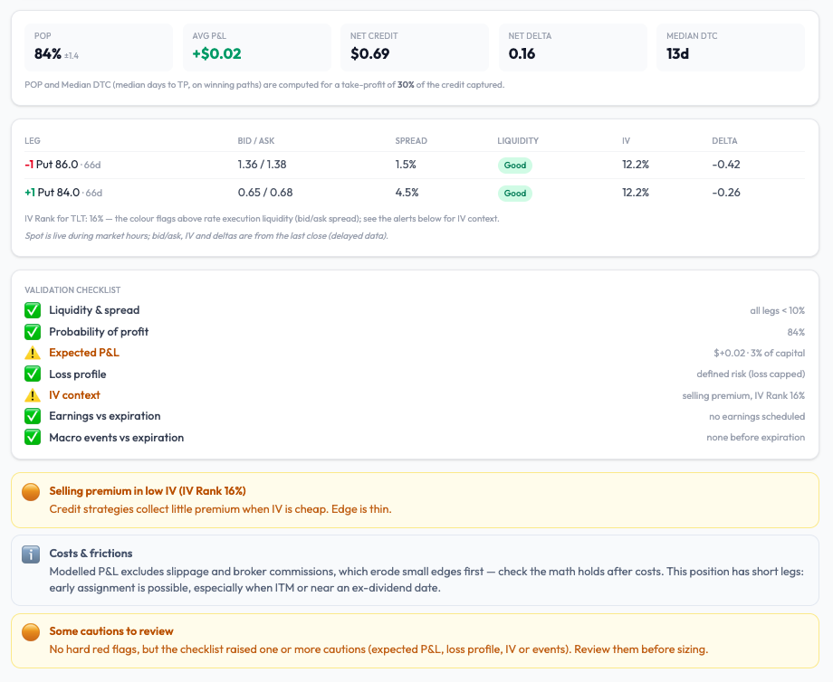
An 84% probability of profit — would you take this trade? Here's a credit put spread on TLT that a scanner happily surfaces. Before you read on, look at the headline number and decide for yourself: would you put this on? TLT — sell the 86 put / buy the 84 put, ~66 days out Probability of profit: 84% Net credit: $0.69 Take-profit: 30% of the credit An 84% win rate sounds like the kind of trade you'd want a book full of. So let's run it through a diagnostic instead of trusting the headline. VIDEO-TD.mp4 What the diagnostic actually says The probability is real: 84% ±1.3 of the simulated paths reach the take-profit. But look one line down. Average P&L: +$0.03 per share (about $3 per contract) The tool labels it: Expected P&L — $+0.03 · 4% of capital ⚠️ IV Rank: 16% — Selling premium in low IV. Edge is thin. ⚠️ So here is the trade in plain numbers. The spread is $2 wide and you collect $0.69, which means you're risking $1.31 to keep at most $0.69 — and with a 30% take-profit, you're actually working toward roughly $0.21. Across thousands of simulated paths, the average outcome is +$0.03. It's not a losing trade in expectation. It's something more dangerous: a trade with a barely positive edge wrapped in a reassuring 84% win rate. Now add commissions and slippage — which eat small edges first — and that $0.03 is gone. You'd be taking real tail risk for an expected outcome indistinguishable from zero. The point: POP is not edge A high probability of profit tells you how often you win. It says nothing about how much you make when you win versus how much you lose when you don't. An 84% POP with a 4%-of-capital expected return, sold into cheap implied volatility, is exactly the kind of setup that builds a string of green days — until one red day gives it all back. This is why the diagnostic doesn't stop at POP. It puts expected P&L, the loss profile, and the IV context side by side, and it flags when a pretty win rate is hiding a thin edge. Here it lands on "Some cautions to review" — no hard red flag, but enough to make you think twice before sizing. A note on why you can trust these two numbers There's a second story in that screen recording worth calling out. The POP from the scanner and the POP from the diagnostic match. That isn't a coincidence — it's the result of forcing both tools to value a trade the exact same way: Same fill convention — every leg is priced at a realistic fill (mid ± 0.5%), not the optimistic theoretical mid and not by crossing the full spread. Same volatility — the simulation uses the underlying's at-the-money implied volatility, not the skewed IV of one particular strike. Same engine — identical Monte-Carlo, identical seed. If a scanner and a stress-test tool disagree on the same trade, you can't trust either. Making them agree was the whole point: a number you find while screening should survive when you inspect it more closely. (Full disclosure on the model: paths are simulated with geometric Brownian motion at the market's ATM IV. It's forward-looking, but it assumes broadly log-normal moves, so genuine fat-tail events can be underestimated — a limitation I'd rather state plainly than hide.) Try it yourself This is part of the OptionBench beta. The scanner finds candidates; Trade Doctor tells you when a good-looking win rate isn't backed by an edge. The beta is free through the summer — if you'd like to stress-test your own spreads the same way, the invite list is open. Happy to be told I'm wrong about this TLT trade, too — that's what the comments are for. Launch waitlist: https://www.optionbench.com
-
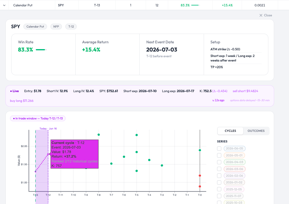
Good eye, and a fair question — let me clear it up, because there are two different things on that screen and the distinction matters. The strike the tool actually tracks for this cycle is the ATM put at entry (T-13), which was the 757 line — SPY was trading around there when the setup was flagged. The fuchsia curve in the chart is that fixed 757 calendar (short Jul10 / long Jul17, same strike both legs), marked day over day and valued at the resale/close price — sell the long at the bid, buy back the short at the ask, the conservative side. You can verify it yourself: hover any point on the curve and it shows K=757 throughout. So the position being tracked is a 757/757 Jul10-Jul17 put calendar, not a 752.5 or 753. Where the 752 / 752.5 you spotted comes from: the "Live" banner above the chart is a separate, near-real-time snapshot that re-reads the current ATM on each refresh. Spot has drifted to ~752, so today's ATM reads 752, and on the long Jul17 chain that rounds to a strike that doesn't cleanly exist — exactly as you noted. That banner is informational; it is not the strike the cycle is tracking. Showing a different strike there than the one the curve follows is genuinely confusing, and that's on me — I've now relabelled it to show the fixed entry strike (Entry K: 757) right next to today's ATM, and switched its valuation to the same conservative resale basis the curve uses, so the two can't be mistaken for each other. On your 753 going down while mine goes up: that's the strike difference doing the work. With spot sliding toward 752, a 757-struck calendar sits closer to ATM and picks up value, whereas a 753 behaves differently over the same two days — on a calendar, a few points of strike around a moving spot can flip the short-horizon direction. We're not contradicting each other; we're marking two different instruments. And honestly, this is exactly why OptionBench is still in beta right now rather than fully public. This kind of scrutiny — someone actually checking which strike is on which leg and whether the numbers hold up — is precisely what the beta phase is for: finding the rough edges, fixing them, and testing again before any of this goes to a wider audience. A banner showing one strike while the curve tracks another is exactly the sort of thing I want surfaced now, not after launch. So thank you — feedback like yours is doing real work here. One last honest caveat: the fuchsia curve refreshes once per daily scan (fixed strike, prior close), while the banner updates on delayed intraday data — so "live" is a touch generous for the curve, and I'll tighten that wording too. For anyone following along, the platform is in beta until August. Beta site (current testers): https://app.optionbench.com/ Launch waitlist: https://www.optionbench.com Keep the skeptical questions coming — they make the tool better.
-
 @Romuald The trade here depicts a Jul10/Jull17 752.5 put calendar on SPY. However, only the Jul10 expiration has this strike available - so what strike are you tracking for the Jul17 leg?
 -
Follow-up on the SPY calendar put from earlier today — the live mark just crossed the take-profit threshold: Return +37.2% against the +20% TP (Value $1.78, ranked 2/12 historical cycles at this stage). A couple of honest qualifications, because this depends on details: The +37.2% is referenced to the entry price the tool tracks ($1.78 here). Your own return depends on where you actually got filled. Someone who entered yesterday at a lower price would be showing a different number — higher or lower. The TP is always relative to entry, so the percentage isn't universal. A GTC take-profit order at +20% would likely have triggered — but the live valuation here is on delayed data (15-30 min) and based on the mark, not an execution quote. So crossing +20% on the delayed mark strongly suggests an intraday TP touch, without guaranteeing the exact fill price. On a calendar spread specifically, the bid/ask you cross matters. This is still an unrealized mark on an open position. NFP is on 2026-07-03; the event itself hasn't happened. The setup reaching its TP this early in the window is one cycle's path, not a rule. Net: the workflow did what it's meant to — flag the setup, track it live, and surface when it reaches target. Whether your specific entry hit TP is down to your fill. Just wanted to close the loop on the trade I showed live earlier. Past performance does not guarantee future results. OptionBench is not a financial advisor and does not recommend any specific trading strategy. Options trading involves substantial risk and may result in significant losses. This tool is for research and educational purposes only.
-
Live tracking demo — SPY Calendar Put into NFP (Pre-Events scanner) Quick follow-up to show a feature rather than just a backtest number: the Pre-Events scanner tracks the recommended setup live while it's open, so you can watch the position against its take-profit in real time. The setup (flagged by the scanner) Underlying: SPY Strategy: Calendar Put, ATM (Δ -0.50) Event: NFP, 2026-07-03 Entry: T-12 (entered yesterday, inside the entry window) Structure: short exp 1 week / long exp 2 weeks after the event TP: +20% Historical context: 83.3% win rate, +15.4% average return across prior cycles What the video shows The Live row updates every ~20-30s (options data delayed 15-30 min — flagged in the UI, not hidden). Over the clip, the position's live return on the open trade ticks up from +9.6% to +18.8% as the calendar put gains value, closing in on the +20% TP. Hovering the current-cycle point shows it ranked 3rd of 12 historical cycles at this stage. So this isn't a hypothetical or a static backtest screenshot — it's the actual recommended trade being marked-to-market against its target while it runs. [video: SPY Calendar Put live tracking] A few honest notes The live valuation uses delayed data (15-30 min), so it's a near-real-time mark, not a live execution quote. Your real fill on a calendar spread will differ from the mid-based mark, usually by the bid/ask you cross. +18.8% is the unrealized mark at that moment, not a closed result. The trade hasn't hit TP yet and could still reverse — NFP hasn't even happened. The historical 83.3% / +15.4% figures are the backtest context, not a promise about this specific cycle. The point I wanted to show is the workflow: the scanner flags the setup, you enter in the window, and the tool tracks it to TP instead of leaving you to babysit a spreadsheet. The platform is in beta until August: Beta site (current testers): https://app.optionbench.com/ Launch waitlist: https://www.optionbench.com Happy to answer questions on the methodology or the live-tracking logic — and as always, skeptical feedback on the data assumptions is welcome. Past performance does not guarantee future results. OptionBench is not a financial advisor and does not recommend any specific trading strategy. Options trading involves substantial risk and may result in significant losses. This tool is for research and educational purposes only. SPY-EXAMPLE-CP-PRE-NFP.mp4
-
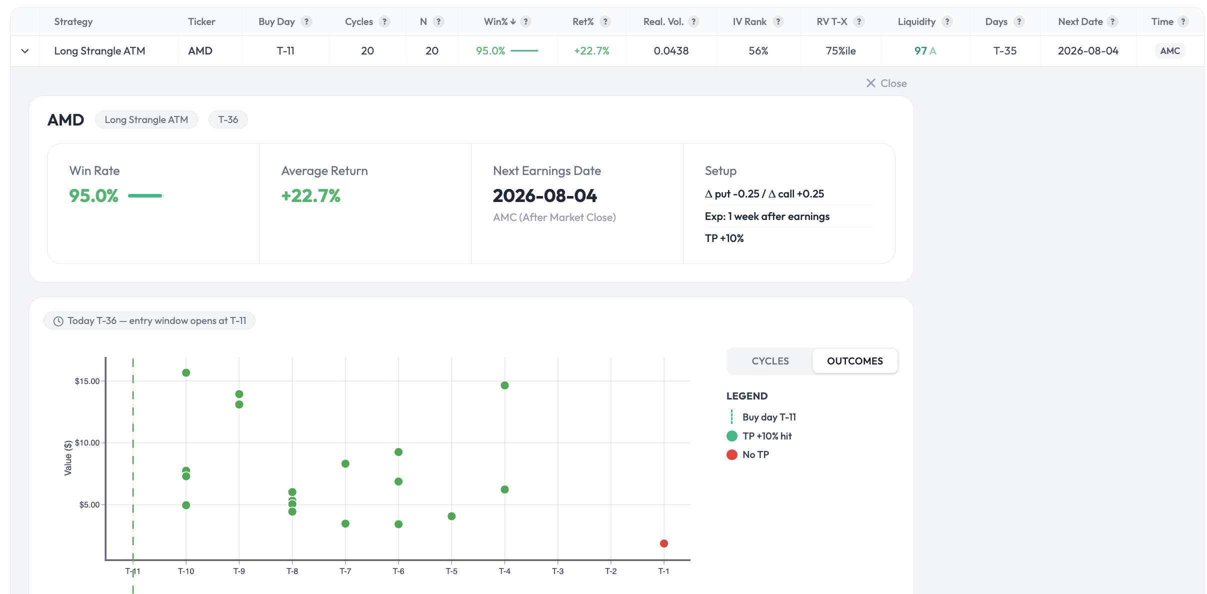
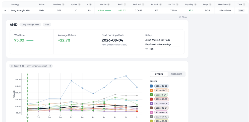
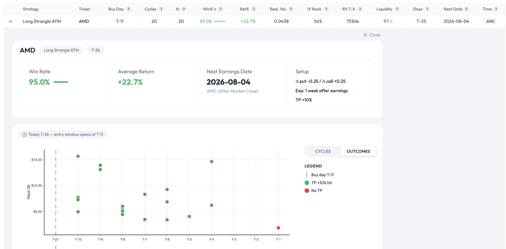
Good question — not obvious at all, and you're thinking about it the right way. Your intuition (fills above the TP) is correct; the mechanism is slightly different from morning gaps though. Two things combine here: 1. The +10% TP is a trigger, not a cap. The backtest checks the position once per day, on the close. So the exit isn't "sell exactly at +10%" — it's "the first day the position closes at or above +10%, exit at that day's actual value." On a long strangle during a post-earnings move, the position is convex: when the underlying moves hard, the value doesn't stop politely at +10%. By the time a daily close crosses the threshold, it's frequently already at +20%, +30%, or more. So most winning cycles exit well above the nominal TP. You can see this directly in the Outcomes screenshot — the green dots (TP hit) are scattered across a wide range of values, not clustered at a single +10% line. Each dot is the real value captured that day, not the threshold. 2. The average blends those winners with the one loss. 19 of 20 cycles hit the TP (most above +10% for the reason above), one didn't. Average those real outcomes together — losing trade included — and you land around +22.7%. The winners running past +10% is what pulls the mean well above the trigger level. So it's not primarily about morning gaps (though intraday a gap can absolutely overshoot even further — the daily-close method doesn't capture that, which makes the backtest conservative on that specific point). It's mostly the daily-check granularity plus strangle convexity letting winners run past the trigger before the exit registers. One honest caveat in the other direction: because the check is daily-close only, the backtest can also miss an intraday TP touch that reverses by the close — so the method isn't uniformly favorable. It's just a consistent, simple rule applied identically across all 20 cycles. Happy to go deeper on any of this if useful.
-
 Apologies if I am asking about something super obvious, but how is it possible to get an average return of about 22.7% if the TP is set at 10%? Is it because many days option prices will simply gap up in the morning and you get higher than the TP fill?
 -
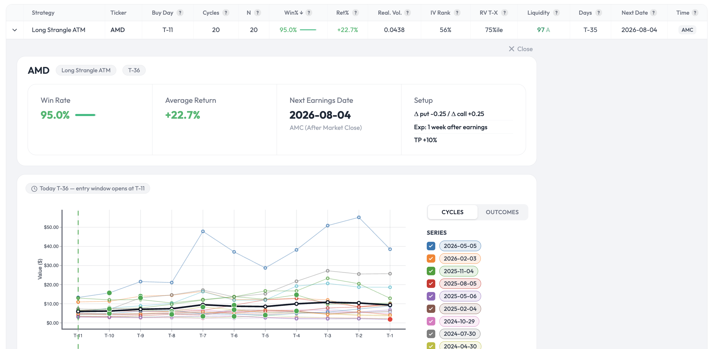
AMD pre-earnings Long Strangle — WinRate 95% 20-cycle backtest data (earnings 2026-08-04) Sharing a specific data point from the OptionBench Pre-Earnings scanner ahead of the upcoming AMD earnings on August 4, 2026 (AMC). Setup tested Strategy: Long Strangle ATM Buy day: T-11 (entry window opens July 20) Strikes: Δ put -0.25 / Δ call +0.25 Expiration: 1 week after earnings Take-profit: +10% Backtest result over the last 20 earnings cycles Win rate: 95% (19 / 20) Average return including losing trades: +22.7% Liquidity grade: 97 (A) — fills should not be the constraint The first screenshot shows the per-cycle value curves from T-11 to T-1. The black line is the average across cycles; green dots mark cycles that hit TP +10%, the single red dot the one that didn't. The second screenshot is the Outcomes view, which strips the cycle curves out and just plots when each historical TP was hit — useful to see the time-to-TP distribution. What this is and isn't This is a statistical observation across 20 historical earnings cycles on AMD with that exact setup. It is not a prediction for the August 4 trade, and I'm not a financial advisor. A 95% historical win rate does not mean the next trade is a winner — it means that if the underlying behavioral pattern continues to hold, the setup has had favorable historical expectancy. The pattern can break at any cycle, and earnings outcomes are path-dependent on factors (guidance surprises, macro tape, IV crush dynamics) that no backtest can fully encode. That said — a documented pattern across 20 real cycles is more useful than vague intuition. Two caveats worth flagging explicitly: 20 cycles is a meaningful but not large sample. Confidence in the 95% point estimate is bounded accordingly. The backtest uses synthetic (Black-Scholes) option pricing. Actual fills on real spreads will diverge from the modeled P&L — typically lower realised return than the +22.7% figure suggests. Where this comes from This is one row in the Pre-Earnings scanner on OptionBench. The platform is in beta until August: Beta site (current beta-testers): https://app.optionbench.com/ Public launch site (waitlist for August launch): https://www.optionbench.com If you'd like to join the launch waitlist, the form is on the homepage. Happy to discuss the methodology in this thread or by PM — especially if you're skeptical about the backtest assumptions, that's exactly the kind of feedback I want to hear before the public launch. Past performance does not guarantee future results. OptionBench is not a financial advisor and does not recommend any specific trading strategy. Options trading involves substantial risk and may result in significant losses. This tool is for research and educational purposes only.
-
Hello does anyone use robinhood for steadyoptions service trades? how has the experience been? thanks
-
Does anyone use Robinhood for steadyoptions? thanks
-
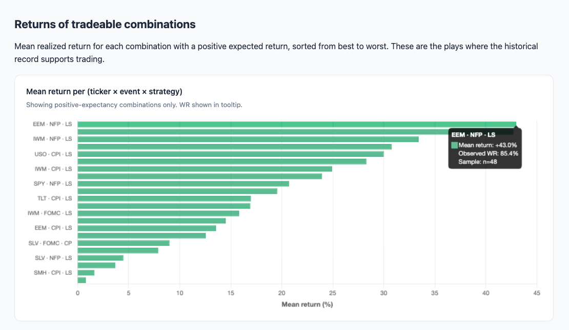
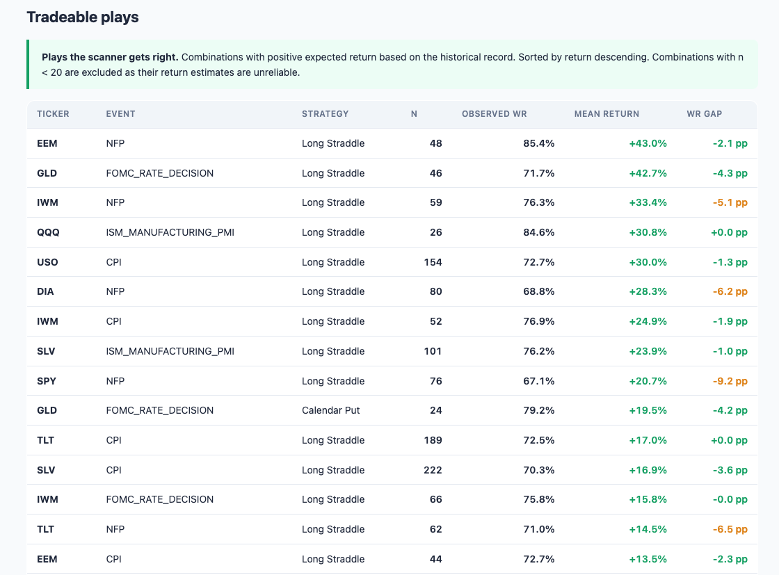
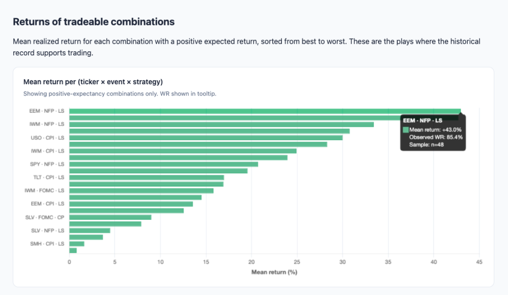
I have made some backtests on my tool "Pre-Events Scanner on ETF" from my website OptionBench. Here are some results : Opening a Long Straddle on EEM pre-NFP has worked 85.4% of the time and goe a +43.0% return. And here are some interesting tradeable plays :
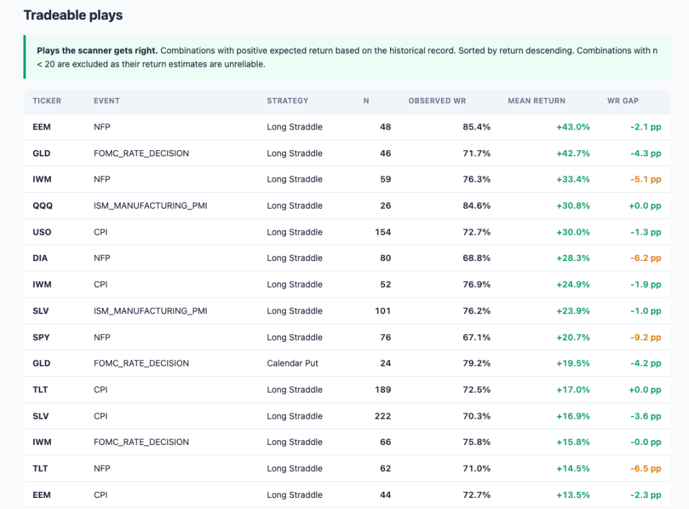
-
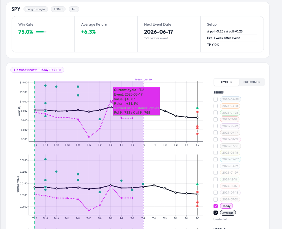
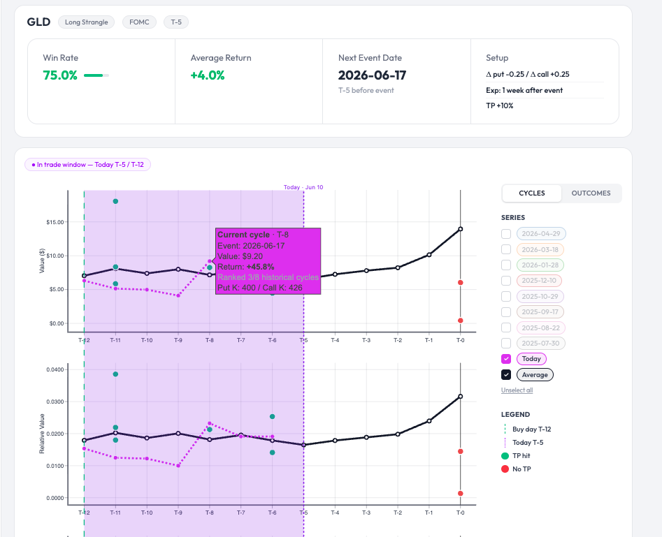
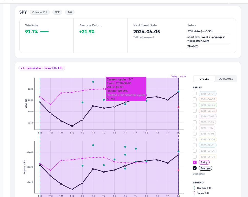
Here is an example of a presentation on Option Bench showing the evolution of the value and the relative value of a Long Strangle on SPY (fuchsia line) taken on T-15 before the FOMC. A return of +31.1% was achieved on T-8. The green dots represent winning trades over the last 16 cycles, the red dots represent losing trades, and the black line is the average curve. An another one on GLD : Or this other one : Calendar Put T-13 before NFP :
-
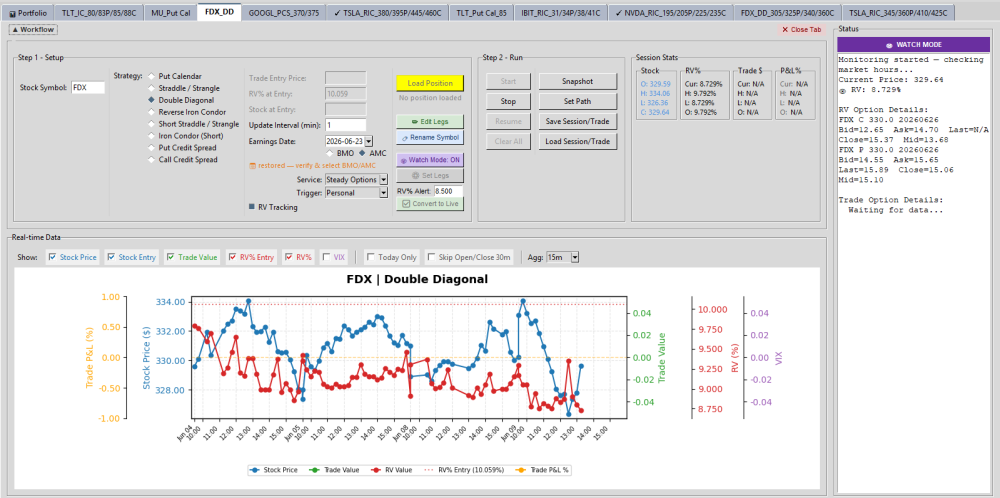
@krisbee thanks for that note ... I have been able to track it with the code @Bhavan1986 and I worked on and went with a DD when RV% went below 9 this morning
-
FDX is because they split the company to FDXF and stopped options data for FDX (atleast for now).
- 1137 replies
-
- 1
-

-
- rv chart
- volatilityhq.com
- (and 1 more)