Leaderboard


Popular Content
Showing content with the highest reputation on 03/27/19 in Posts
-
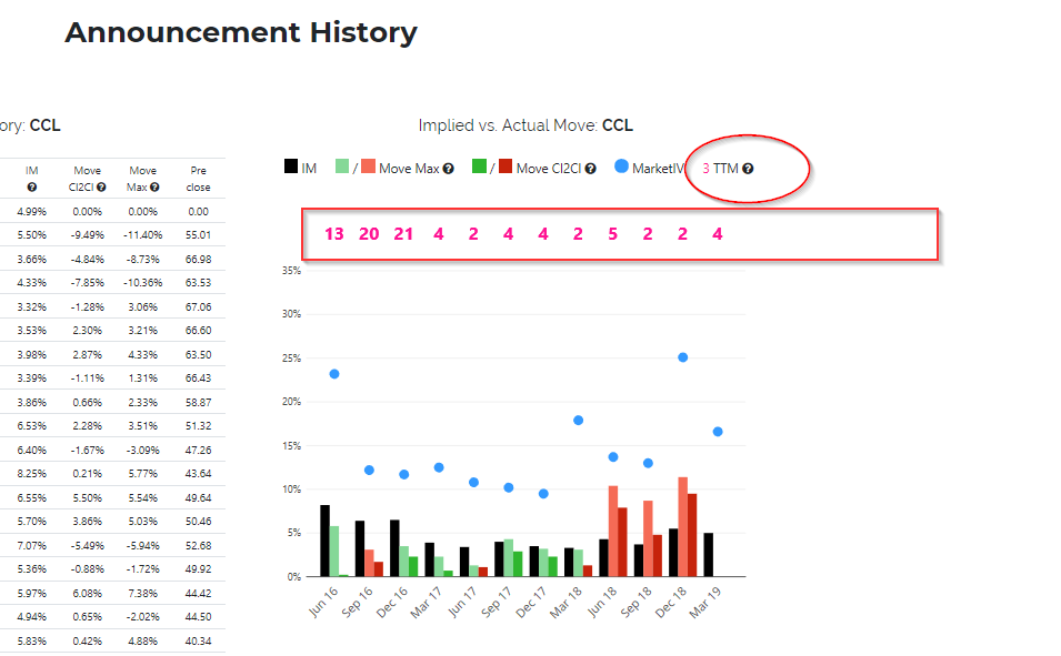
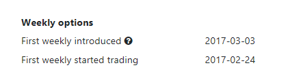
In the Historical Earnings Announcement section I have added a bar chart to compare the implied against the actual earnings move (intraday in lighter color, and at day end in stronger color graphically, and for a longer history in a table). The blue dots represent VIX values, should help to see in one glance how the overall market IV may have influenced the implied move. The pink numbers represent the remaining life of the options used to calculate the implied move at the time of the earnings announcement (TTM = time to maturity. If the TTM is further out, the implied move (IM) might be inflated). So in the CCL example, you see in the top table that weekly options started trading in February 2017, which corresponds with the longer TTM values prior to 2017-03 in the chart above. The pink numbers have caused some confusion, and I agree one needs to get used to it. I tried to add a '?' with tooltips everywhere. But if you still have a better idea please let me know.
 2 points
 -
I've added 3 new columns to track the RV rise of the calendars (double, put, call). RV rise is calculated as the change in % in RV for calendar between the previous day and the current RV. So calendar_price(latest available date) / calendar_price(latest available date - 1) - 1.0. @craigsmith might be interested as well.2 points
-
Thanks for the replies, at least I know its not specifically to my case. If it doesn't affect fill prices its fine otherwise it is a big issue. Il contact TWS and let you know what they say. The blue thing happened to me sometimes but after a restart the problem went away. The bid not showing up is something new though...2 points
-
This feature is deployed in production along with the open interest in the first monthly expiry after the earning date. If there are no weeklies or if the monthly expiry is the same as the weekly expiry, then the open interest is None.1 point
-
I also noticed this behavior in TWS lately, no idea what causes it. As of today, I still see combos which show bid/ask prices that are tighter than the bid/ask calculated using each leg's bid/ask, so the combo mid seems to be still affected by the combo limit orders. I'm totally confused. And during the past few weeks it happened to me several times that my order not only did not seem to alter combo bid/ask but also was shown in blue (Your order is being held and monitored) and not in green (Active on SMART). I had some doubts at that time that my order is really being taken into account. But then things got to normal after a few hours. Before that, I only noticed this behavior as I was playing with some OCA orders (they were shown in blue and their limit price did not alter combo's bid/ask even though they were clearly active => one of those OCA orders filled at some point while being shown in blue, but I had some doubts that it was a fill as good as it would have been if the order were shown in green - maybe I'm biased here). Then I stopped using OCA orders and reverted to regular ones. I added this in the hope that others can confirm whether it happened to them, too.1 point
-
I have seen this happening now, very confusing. The combo prices seem to be wrong. A few days back I thought I got a better fill but in fact, the prices were wrong.1 point
-
I've seen the exact same thing happen with IB... twice in the past two weeks. I have no idea why. I checked the COB and I don't see my orders either.1 point


This leaderboard is set to New York/GMT-04:00